Tigris: Condensed Identity
Tigris Japan needed a unified brand identity to scale its diverse wellness beverage portfolio. The client, working with Anywhere and Hakuhodo, sought a design system that could handle complex regulatory information while establishing a premium, recognizable market presence. The goal was to differentiate the brand in a crowded market by turning mandatory packaging requirements into a core, scalable asset that communicated trust and modern efficiency to consumers.
Creative Idea
The brand turned mandatory legal back labels into its primary, high-impact visual identity.
Tigris transformed mandatory back label information into its primary visual asset. By creating a custom condensed typography system, the brand turned regulatory requirements into a distinctive, scalable design language that builds consumer trust through radical transparency and information density.
Turning Regulatory Constraints Into Brand Assets
The Philosophy of Condensed Speed
The brand name Tigris draws inspiration from the ancient Mesopotamian river, symbolizing a rapid and rushing flow. This concept of speed serves as the foundation for the entire visual identity. By utilizing a custom, ultra-narrow condensed typeface, the design team sought to visually capture the essence of density and forward momentum. This aesthetic choice reflects the startup's core philosophy that true cultural innovation is born from the intersection of high-speed execution and efficient resource management.
A Seamless Fusion of Roles
The project represents a unique collaboration where the lines between client and agency were intentionally blurred. Tatsuro Miura, the founder of Anywhere Inc. and a former Executive Creative Director at Hakuhodo, served a dual role as the Chief Marketing Officer for Tigris Japan. This arrangement allowed for an unusually high level of creative control, enabling the team to bypass traditional corporate friction and implement a radical design system that prioritized intellectual rigor over conventional marketing trends.
Engineering the Point of Verification
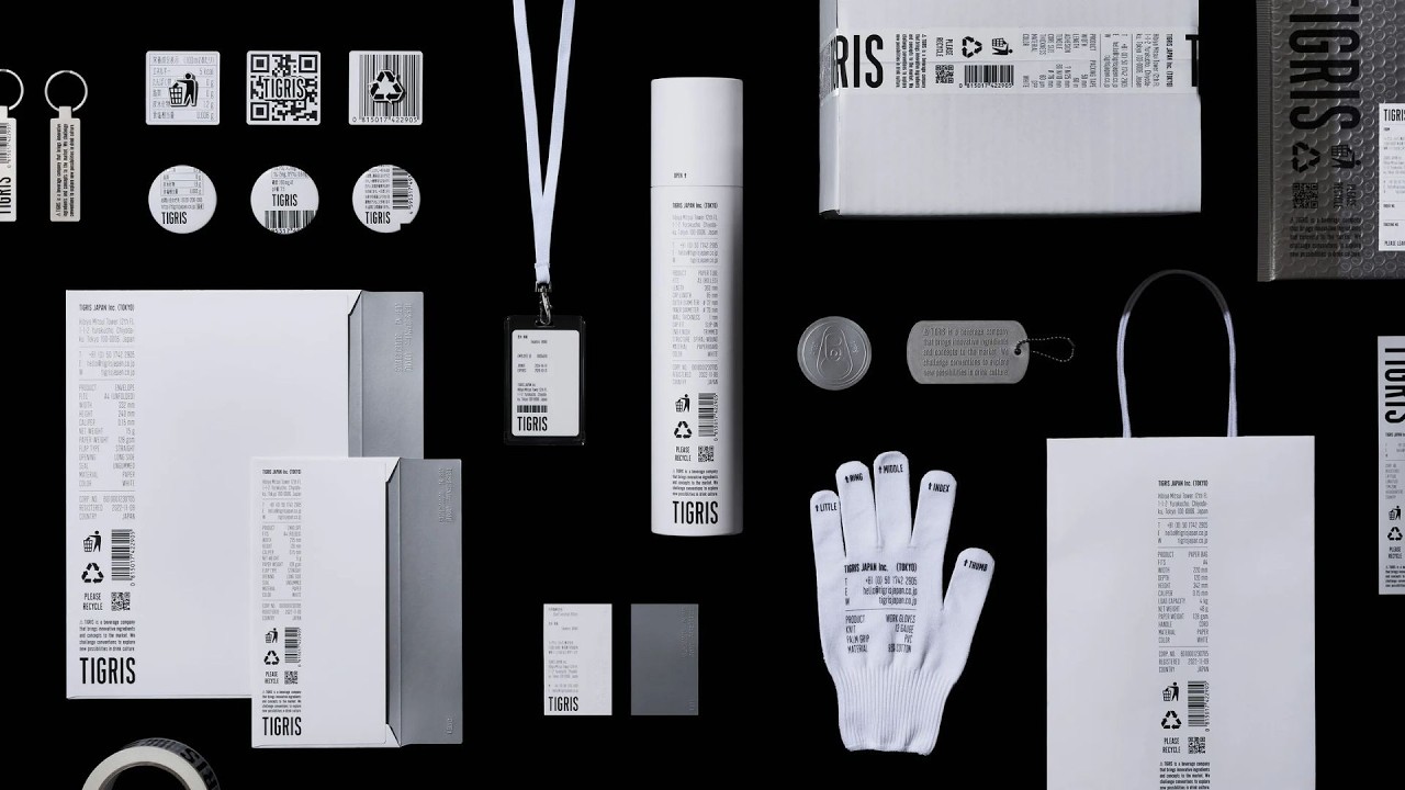
The design team identified the "point of verification"—the moment a consumer turns a bottle to inspect ingredients and health claims—as the most critical touchpoint for building brand trust. Rather than treating this as a legal necessity to be hidden, they engineered a modular grid system that embraces information density. By applying high-contrast typography and strict alignment rules to mandatory allergen and nutrition data, the team transformed legal overflow into a sharp, modern, and unmistakably premium visual signature that stands out on crowded retail shelves.
Creative Strategy Deconstructed
Company
A high-density, modular typography system capable of unifying diverse product lines under a single, rigorous design language.
Category
Beverage brands typically treat mandatory ingredient and nutrition labels as legal overflow, hiding them on the back of packaging.
Customer
Consumers increasingly seek radical transparency and verification at the point of purchase to build trust in wellness products.
Culture
The rise of minimalist, information-heavy design aesthetics in Tokyo's competitive wellness market demanded a more intellectual, honest visual approach.
Company
A high-density, modular typography system capable of unifying diverse product lines under a single, rigorous design language.
Category
Beverage brands typically treat mandatory ingredient and nutrition labels as legal overflow, hiding them on the back of packaging.
Strategy:
Convert unavoidable regulatory constraints into the primary visual signature of the brand identity.
Customer
Consumers increasingly seek radical transparency and verification at the point of purchase to build trust in wellness products.
Culture
The rise of minimalist, information-heavy design aesthetics in Tokyo's competitive wellness market demanded a more intellectual, honest visual approach.
Strategy:
Convert unavoidable regulatory constraints into the primary visual signature of the brand identity.
Results
The campaign achieved significant business and brand growth, including a +400% wholesale channel growth, a 10x SKU count growth, a peak media reach of 417M, and ranking as the No.1 water brand on TikTok Shop.
+400%
wholesale channel growth
10x
SKU count growth
417M
peak media reach
Strategy Technique
Turn Weakness Into Strength
The brand embraced the regulatory burden of mandatory labeling as its primary design constraint. By weaponizing legal requirements, they transformed a boring necessity into a unique, ownable competitive advantage.
Explore Technique
Creative Technique
Spotlight the Overlooked
The campaign elevates the typically ignored back label into the brand's core visual identity. It turns mandatory legal overflow into a high-impact design feature that defines the entire brand aesthetic.
Explore Technique
Craft Breakdown
This campaign's craft is exceptional due to its brilliant graphic design system that transforms a dry, legal requirement into a beautiful, cohesive brand language. The meticulous development of a custom multi-language typeface elevates the work from a simple design concept to a comprehensive corporate identity.
The core idea of using the nutrition facts label as the primary visual identity is executed with flawless grid systems and layout precision across dozens of physical and digital touchpoints.
Developing a custom typeface with nearly 3,000 glyphs across Latin, Kana, and Kanji characters ensures absolute consistency and brand ownership across global markets.
The strict monochromatic, minimalist aesthetic is beautifully maintained across photography, video, and physical merchandise, creating a premium feel.
The physical execution of the brand guidelines binder, custom apparel, packaging tape, and stationery shows an incredible attention to detail and material quality.
“The magic of this campaign lies in the synergy between Design and Typography, where the custom-built typeface perfectly serves the rigid grid-based layout system to make mandatory product data look like high-end art.”