Best Cossette Toronto Campaigns of All Time
Cossette Toronto has a peculiar habit of making everyone else in the room look like they are trying far too hard. While most agencies are busy shouting into the void, Cossette tends to lean in and whisper something profoundly clever - whether they are decapitating iconic golden logos for a directional sign or turning a hospital into a literal battlefield. It is high-stakes strategy disguised as effortless craft. Browse the work below.
3 campaigns
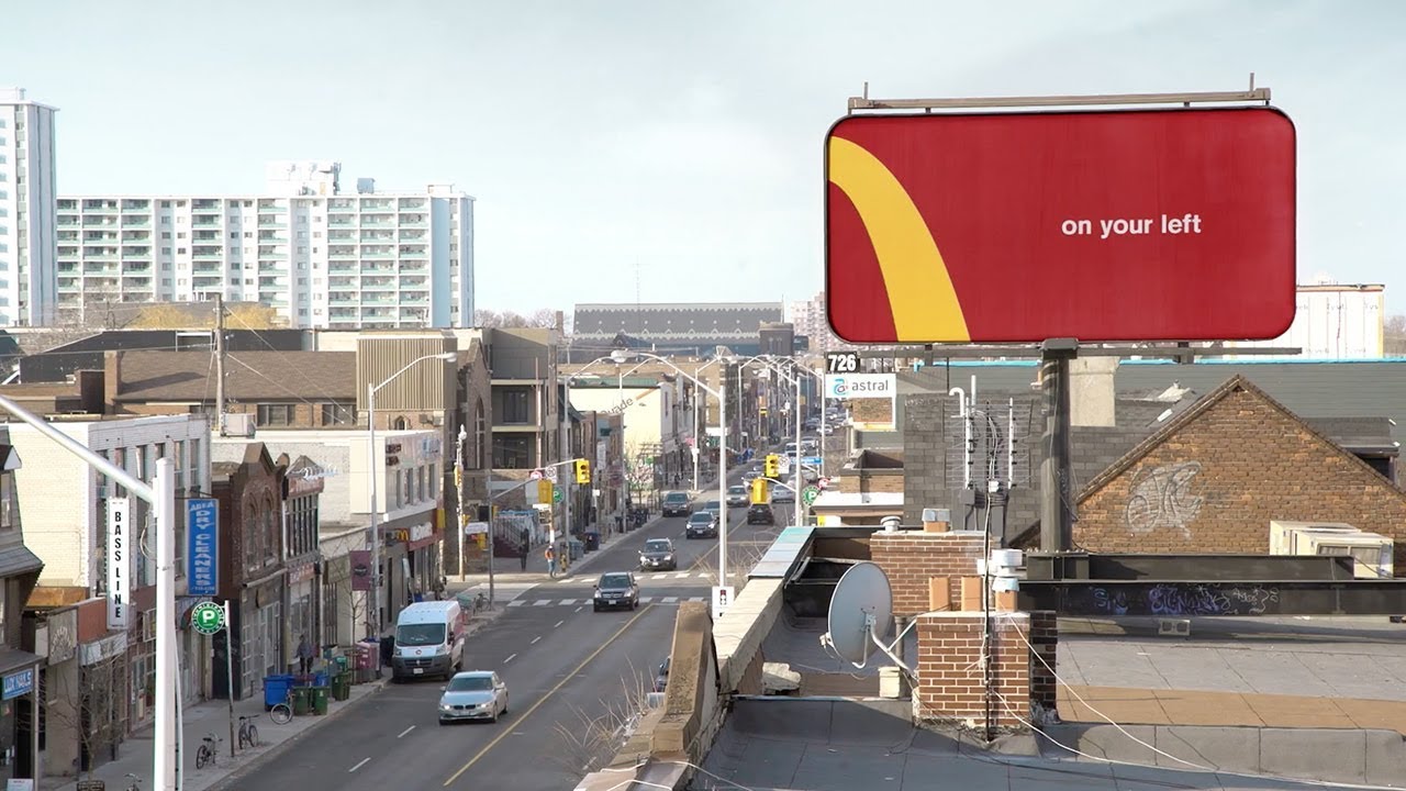
McDonald's: Follow The Arches
McDonald's transformed its iconic Golden Arches into a minimalist wayfinding system by cropping the logo into directional arrows. This worked because the brand's visual identity is so globally ingrained that even a fraction of the logo provides instant, functional recognition.
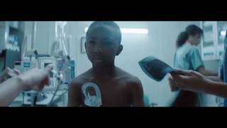
SickKids: This is Why
SickKids powerfully depicted the raw, emotional reality of children battling severe illnesses, using a poignant song and defiant imagery. This campaign shifted the narrative from just "VS" to a deeper "WHY," inspiring empathy and donations by connecting viewers to the children's unwavering spirit and the staff's dedication.

SickKids: Vs
SickKids Hospital created a powerful marketing campaign that portrays fighting serious childhood illness as a battle, positioning the hospital as warriors actively fighting against disease. The campaign "VS" metaphorically frames medical treatment as an aggressive, confrontational struggle, transforming patients from victims into powerful fighters who are determined to overcome health challenges.