McDonald's: Follow The Arches
McDonald's Canada tasked Cossette Toronto with creating a unified wayfinding system to replace inconsistent roadside signage. The goal was to increase footfall and reinforce brand recognition among highway commuters by making the path to the nearest restaurant as clear and iconic as the brand itself, without relying on traditional, cluttered advertising tropes.
Creative Idea
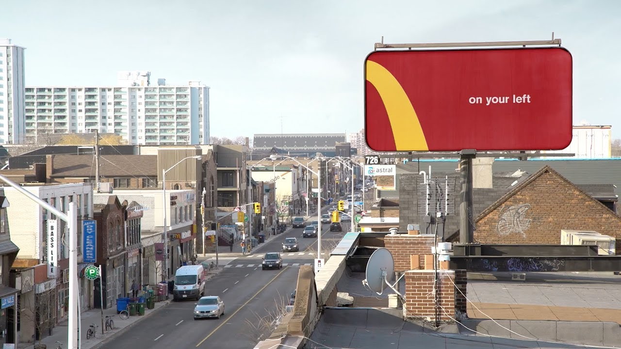
Cropped the Golden Arches logo to function as minimalist directional arrows for roadside billboards.
McDonald's transformed its iconic Golden Arches into a minimalist wayfinding system by cropping the logo into directional arrows. This worked because the brand's visual identity is so globally ingrained that even a fraction of the logo provides instant, functional recognition.
The Art of Navigating by a Fragment
The Coca-Cola Bottle Standard
The creative team at Cossette drew inspiration from the legendary 1915 Coca-Cola design brief, which demanded a bottle so iconic it could be recognized even if shattered on the ground. By applying this "shattered" logic to the Golden Arches, Art Directors Spencer Dingle and David Théroux proved that the brand's visual equity was so high it didn't require a name or food photography. The campaign functioned as a "parlour game" for drivers, challenging them to identify the brand from a mere curve of yellow against a red backdrop.
Engineering the Perfect Crop
To ensure the billboards were functional at highway speeds, the team distance-tested the legibility of four specific crops: "Next Exit" (the top curve), "On Your Left" and "On Your Right" (the side curves), and "Just Missed Us" (a sharp U-turn curve). The typography was meticulously sized to match official road signage standards, allowing commuters to process the directional data in seconds. This transformed the logo from a static asset into a utility, cleaning up a previously cluttered landscape of inconsistent local signage.
Global Scale and Footfall
What began as a local execution in Toronto and the GTA quickly became a global brand playbook, scaling to over 120 countries. Beyond the millions of organic social impressions, the campaign delivered a measurable increase in customer footfall at the specific restaurants the boards pointed toward. Chief Creative Officers Peter Ignazi and Carlos Moreno oversaw the project, which ultimately influenced a wave of minimalist OOH advertising for other major brands like Oreo and KitKat.
Creative Strategy Deconstructed
Company
McDonald's possesses one of the most globally recognized visual assets in the Golden Arches logo.
Category
Fast food roadside signage is typically cluttered, inconsistent, and relies on heavy branding and food photography.
Customer
Drivers need quick, legible directions and often experience signage fatigue from visual noise on highways.
Culture
Modern design trends favor extreme minimalism and logo-less branding that rewards consumer intelligence and recognition.
Company
McDonald's possesses one of the most globally recognized visual assets in the Golden Arches logo.
Category
Fast food roadside signage is typically cluttered, inconsistent, and relies on heavy branding and food photography.
Strategy:
Leverage extreme brand familiarity to transform a static identity asset into a functional, minimalist utility.
Customer
Drivers need quick, legible directions and often experience signage fatigue from visual noise on highways.
Culture
Modern design trends favor extreme minimalism and logo-less branding that rewards consumer intelligence and recognition.
Strategy:
Leverage extreme brand familiarity to transform a static identity asset into a functional, minimalist utility.
Results
The campaign successfully transformed an under-utilized media space into a simple, unified design system. It proved to be adaptable to any market around the world, appearing in multiple languages including Russian, Chinese, Spanish, and French. The billboards were noted for being immediately recognizable using only the brand's signature colors and a fraction of the logo.
100%
brand recognition with partial logo
Global
market adaptability
Strategy Technique
Create a New Mental Shortcut
The campaign leverages the brain's ability to complete familiar patterns, turning a fragmented brand asset into an intuitive navigational tool that bypasses the need for traditional, cluttered roadside advertising.
Explore Technique
Creative Technique
Unexpected Utility
By deconstructing the world's most famous logo into functional directional signs, the campaign proves that the brand's visual equity is so strong it can guide consumers without needing a full logo or name.
Explore Technique
Craft Breakdown
This campaign is a masterclass in minimalist design, proving that a brand's visual equity is so strong it can be deconstructed and still remain functional.
The clever deconstruction of a global icon into functional wayfinding is a brilliant use of negative space and brand recognition.
The strict adherence to the brand's color palette and the bold, clean layout creates a high-impact visual language.
“The synergy between the iconic logo design and the strategic placement of the billboards creates a seamless brand experience.”