Independent: Litany
The Independent sought to reinforce its brand as a champion of independent thought and defiance against conformity. They aimed to attract readers who felt constrained by societal norms and desired an alternative perspective, ultimately increasing readership and brand relevance.
Creative Idea
A relentless list of "don'ts" was used to encourage defiance and independent thought.
The campaign brilliantly used a rapid-fire litany of societal "don'ts" - from mundane to profound - to create an oppressive atmosphere, then subtly positioned The Independent as the essential tool for those who choose to defy conformity and think for themselves, thus empowering true independence.
The Anti-Ad That Told Readers Not to Buy
The Punk Poet and the Piano
The campaign's abrasive energy was driven by the "punk poet" John Cooper Clarke, whose rapid-fire Mancunian delivery provided a rhythmic, cynical edge. To prevent the spot from feeling purely aggressive, composers Joe Campbell and Paul Hart layered a somber, classical-style piano piece underneath the narration. This emotional counterpoint transformed a list of commands into a haunting reflection on societal control. Director Rob Sanders utilized a "reportage" aesthetic, using grainy black - and - white cinematography by Bob Pendar-Hughes to mimic the high-quality photojournalism that defined the newspaper's physical pages.
Subverting the Censors
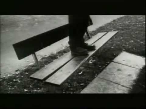 One of the most discussed frames involves a nude male model. As the voiceover commands "Don't stand out," the camera pans down to imply the man has an erection - a daring subversion of 1990s television censorship. Creative Director Charles Inge intentionally broke the "positive" rules of advertising; rather than showing a satisfied customer, the team presented a dark, oppressive world of regulations. This "anti-advertising" strategy was a calculated risk during the UK's fierce "price wars" between *The Times* and *The Guardian*.
A Badge of Honor for Skeptics
The campaign successfully repositioned *The Independent* as a "badge of honor" for a younger, design-conscious, and politically skeptical ABC1 audience. By ending with the command "Don't buy. Don't read," the agency utilized reverse psychology to pique the curiosity of a demographic that traditionally loathed being marketed to. It remains a gold-standard case study in using defiance as a brand pillar, proving that telling an audience what *not* to do can be more persuasive than a traditional call to action.
Creative Strategy Deconstructed
Company
The Independent credibly delivered unbiased news and critical perspectives, empowering readers to form their own opinions.
Category
News media often dictates opinions or reinforces societal norms, creating a passive consumption experience.
Customer
The audience felt constrained by societal rules and desired intellectual freedom and autonomy in their choices.
Culture
A cultural climate where individuals increasingly felt bombarded by rules, restrictions, and external pressures to conform.
Company
The Independent credibly delivered unbiased news and critical perspectives, empowering readers to form their own opinions.
Category
News media often dictates opinions or reinforces societal norms, creating a passive consumption experience.
Strategy:
Empower individual autonomy by challenging pervasive societal control and encouraging independent thought.
Customer
The audience felt constrained by societal rules and desired intellectual freedom and autonomy in their choices.
Culture
A cultural climate where individuals increasingly felt bombarded by rules, restrictions, and external pressures to conform.
Strategy:
Empower individual autonomy by challenging pervasive societal control and encouraging independent thought.
Strategy Technique
Stake a Contrarian POV
The campaign deliberately takes an opposing stance to the pervasive culture of restrictions and conformity. It positions the brand as the voice for those who challenge the status quo and think independently.
Explore Technique
Creative Technique
Reverse Expectations
The ad builds an overwhelming sense of societal control through endless prohibitions. It then subverts this by implying that true independence comes from rejecting these "don'ts," reversing the expected outcome.
Explore Technique
Craft Breakdown
This campaign's craft is exceptional in its use of bold copywriting, compelling cinematography, and stark art direction to create a powerful and iconic message against conformity. The relentless "Don't" narrative, synchronized with visually striking black and white scenes, masterfully builds tension before delivering a defiant brand message.
The repetitive and escalating list of 'Don't' commands is the core of the campaign's idea, masterfully crafted to highlight societal restrictions and then subvert them with an ironic twist.
The use of black and white imagery, diverse shot types, and a gritty, often documentary-style aesthetic effectively conveys the oppressive atmosphere and gives each 'Don't' a powerful visual anchor.
The meticulous selection and arrangement of scenes, from the mundane to the surreal, visually amplify the overarching theme of societal control and the suppression of individuality.
The melancholic and increasingly dramatic score perfectly underpins the voiceover's oppressive tone and emotional arc, contributing significantly to the ad's memorable impact.
“The powerful synergy between the relentless, authoritative voiceover, the quick-cut, symbolic black and white visuals, and the evocative, dramatic music creates an immersive and unforgettable experience that powerfully reinforces the campaign's defiant message of independent thought.”