Apple - Mac Pro commercial (fall 2013) feat. MUSE Supremacy
Apple approached TBWA\ Media Arts Lab. The client wanted to launch the new Mac Pro, a radically redesigned professional desktop. The challenge was to position it as the future of computing for creative professionals, highlighting its powerful, innovative, and futuristic cylindrical design. The brand needed to generate immense excitement and anticipation for its fall release, showcasing it as a groundbreaking departure from traditional desktops.
Creative Idea
Apple showed the Mac Pro's cylindrical design with intense music and industrial visuals.
Apple showcased the Mac Pro as a revolutionary, boldly designed computer by creating a dramatic, high-energy commercial that emphasized its futuristic, cylindrical black design. The campaign positioned the Mac Pro as a powerful, innovative professional desktop by using intense music and dynamic industrial imagery that portrayed the computer as a cutting-edge piece of technology unlike any previous desktop computer.
The Best James Bond Intro That Never Was
A Defiant Response to the Critics
The 2013 Mac Pro launch was a high - stakes maneuver to re - establish Apple’s innovative edge following the death of Steve Jobs. During the WWDC reveal that preceded the ad, Phil Schiller famously addressed skeptics with the line: "Can’t innovate anymore, my ass!" This quote became the unofficial rallying cry for the campaign, which aimed to silence critics who believed the company had lost its creative spark. The ad served as a "coming this fall" teaser, first appearing in cinema theaters in August 2013 before the Steve Jobs biopic *Jobs*.
Industrial Precision and Sonic Power
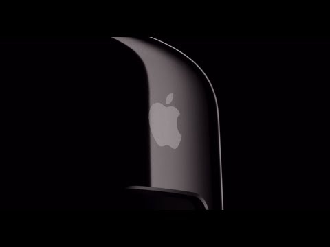 The commercial’s visual language was a departure from typical workstation advertising, focusing on the "unified thermal core" and polished black aluminum cylinder. To match this "villainous" and futuristic aesthetic, Apple selected "Supremacy" by Muse. The track was rumored to be a rejected pitch for the James Bond film *Skyfall*, leading fans to dub the commercial a superior 007 intro. The footage utilized rapid - fire cuts of precision machining and molten metal to emphasize that the device was assembled in the USA (Austin, Texas), a rare and strategic messaging point for the brand at the time.
Market Rebirth and the Trash Can Legacy
Beyond its viral success, the campaign had a significant commercial impact, helping the Mac division generate $5.8 billion in revenue in Q1 2014 - a 19% year - over - year increase in U.S. sales. Historically, the product also marked a "safety" return to the European market; the previous "cheese grater" model had been banned in the EU earlier in 2013 because its internal fans violated safety regulations. While the device’s unique shape earned it the permanent nickname "Trash Can Mac," the campaign cemented its status as the peak of Apple’s "form over function" era.
Creative Strategy Deconstructed
Company
Apple possessed the design-led audacity to completely re-engineer the desktop architecture into a radical, black cylindrical form factor that prioritized thermal efficiency and compact power.
Category
Professional workstations were typically bulky, beige or silver towers hidden under desks, focusing on utility and modularity over aesthetic appeal or industrial design innovation.
Customer
Creative professionals felt their high-end tools were stagnant and uninspired, desiring a workstation that felt as futuristic and powerful as the digital content they were creating.
Culture
A growing cultural fascination with 'dark mode' aesthetics and high-end industrial craftsmanship made the Mac Pro's sleek, polished finish feel like a luxury object.
Company
Apple possessed the design-led audacity to completely re-engineer the desktop architecture into a radical, black cylindrical form factor that prioritized thermal efficiency and compact power.
Category
Professional workstations were typically bulky, beige or silver towers hidden under desks, focusing on utility and modularity over aesthetic appeal or industrial design innovation.
Strategy:
Frame industrial power as a luxury design object to turn professional hardware into a symbol of creative status.
Customer
Creative professionals felt their high-end tools were stagnant and uninspired, desiring a workstation that felt as futuristic and powerful as the digital content they were creating.
Culture
A growing cultural fascination with 'dark mode' aesthetics and high-end industrial craftsmanship made the Mac Pro's sleek, polished finish feel like a luxury object.
Strategy:
Frame industrial power as a luxury design object to turn professional hardware into a symbol of creative status.
Strategy Technique
Break a Category Convention
The strategy was to boldly defy traditional desktop design norms. This positioned the Mac Pro as a groundbreaking departure, generating excitement.
Explore Technique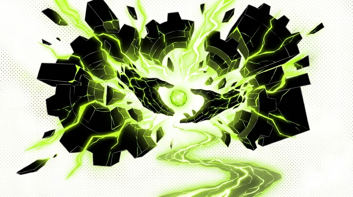
Creative Technique
Show the Future
The campaign dramatically portrayed the Mac Pro as the inevitable future of computing. It painted a vivid picture of innovation through futuristic design and high-energy visuals.
Explore Technique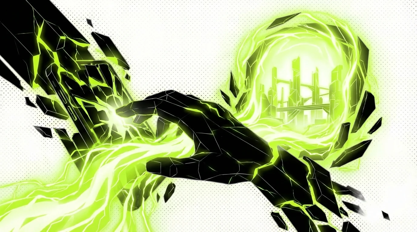
Craft Breakdown
This campaign's craft is exceptional due to its masterful combination of visual effects, sound design, and editing, which together create a highly immersive and impactful product reveal without showing the actual product until the very end.
The entire advertisement is a showcase of sophisticated CGI, creating abstract, metallic, and glossy forms that fluidly transform and reveal hints of the product's intricate design and aesthetic.
The industrial electronic soundtrack, combined with precise sound effects of metallic clicks, hums, and rhythmic impacts, is integral to building tension, conveying mechanical precision, and driving the ad's high-energy pace.
The rapid-fire cuts and seamless transitions between abstract shapes and conceptual visuals are expertly orchestrated, maintaining a dynamic rhythm and building a compelling sense of anticipation towards the product reveal.
The minimalist, high-contrast black and white aesthetic, coupled with expertly rendered glossy and reflective surfaces, perfectly communicates Apple's premium brand identity and the product's sleek, futuristic design.
“The true magic of this campaign lies in the synergistic interplay between the powerful visual effects and the meticulously crafted sound design, where each element elevates the other to create a deeply immersive and impactful sensory experience that builds excitement for the product.”