Makro: Life Extending Stickers
Makro Colombia wanted to address the massive issue of food waste, where 40% of produce is discarded for cosmetic reasons. They tasked Grey Colombia with educating consumers to stop throwing away ripe fruits and vegetables, aiming to extend product lifecycles and change the perception that 'ripe is wrong' among grocery shoppers.
Creative Idea
Repurposed fruit stickers as color-coded recipe guides based on the produce's specific ripeness.
Makro transformed the traditional fruit sticker into a functional tool by color-matching it to ripening stages, providing specific recipes for each phase to prove that 'ugly' or overripe produce is still valuable and delicious.
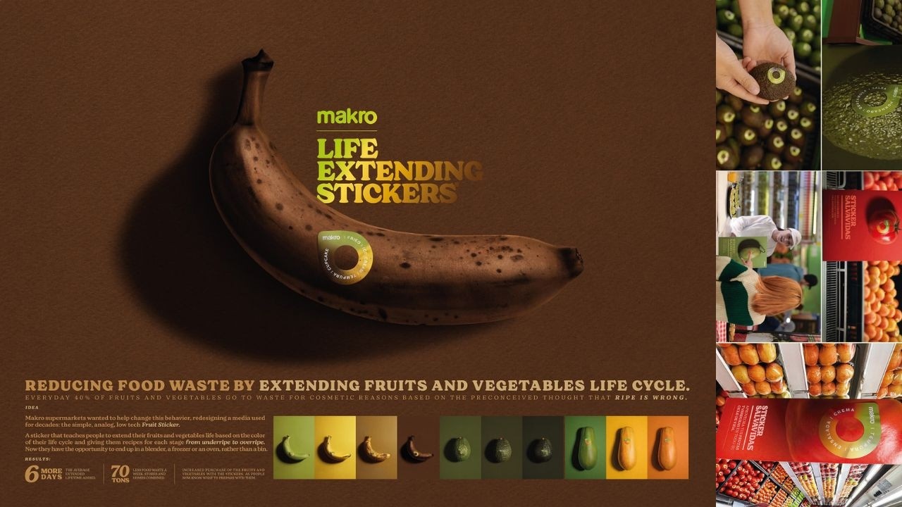
The Low Tech Sticker That Saved Seventy Tons
Color Matching the Ripening Gradient
To achieve the "magic" effect where the sticker appears to blend into the fruit, the creative team at Grey Colombia (now VML) meticulously photographed produce under neutral lighting. They sampled exact skin tones at every stage of decay, even adding "spots" to stickers for mangoes and bananas. This ensured that as the fruit ripened, the background of the 1x1 inch sticker became invisible, leaving only the recipe suggestion - such as banana tempura or papaya juice - visible to the consumer. To maintain sustainability, the team utilized ecological ink on biodegradable material.
From Initial Rejection to Global Scale
 The project nearly never happened; it was initially rejected by Makro. The agency was so confident in the concept they reportedly tested it independently before the brand saw the potential and rolled it out across 22 stores. Chief Creative Officer Juan Jose Posada championed the "upstream innovation" approach, intentionally avoiding expensive apps or QR codes. He has since publicly invited global giants like Tesco and Walmart to copy the initiative without fear of legal action, prioritizing global food waste reduction over intellectual property.
Measurable Impact on the Shelf
The campaign targeted the five most wasted items in Colombia: tomato, banana, avocado, mango, and papaya. Beyond the 264 million people reached, the initiative delivered hard business results: produce with the stickers outsold those without them, and in-store "exhibition time" increased by an average of 4 days. By implementing a dynamic pricing strategy where the riper the fruit, the cheaper it became, Makro successfully saved an estimated 70 tons of food waste per week.
Creative Strategy Deconstructed
Company
A massive inventory of fresh produce and a commitment to reducing operational and consumer food waste.
Category
Supermarkets typically discard imperfect produce or use generic stickers solely for internal inventory and pricing.
Customer
Consumers mistakenly believe that spots or color changes mean fruit is spoiled, leading to unnecessary disposal.
Culture
Growing global concern over food sustainability and the ugly food movement seeking low-tech, accessible environmental solutions.
Company
A massive inventory of fresh produce and a commitment to reducing operational and consumer food waste.
Category
Supermarkets typically discard imperfect produce or use generic stickers solely for internal inventory and pricing.
Strategy:
Reframe perceived product expiration as a transition into new culinary opportunities through functional design.
Customer
Consumers mistakenly believe that spots or color changes mean fruit is spoiled, leading to unnecessary disposal.
Culture
Growing global concern over food sustainability and the ugly food movement seeking low-tech, accessible environmental solutions.
Strategy:
Reframe perceived product expiration as a transition into new culinary opportunities through functional design.
Results
The campaign resulted in an average of 6 more days of extended lifetime for produce. It led to a reduction of 70 tons of food waste per week across stores and homes combined. There was a notable increase in the purchase of fruits and vegetables featuring the stickers, as consumers felt more informed about how to prepare them at every stage of ripeness. The initiative received praise from major publications, with Fast Company calling it 'clever design that is so chef kiss' and Contagious describing it as a 'great example of the creative potential of simple ideas.'
6 days
average extended lifetime added
70 tons
less food waste per week
Increased
purchase of produce with stickers
Strategy Technique
Build an Utility, Not an Ad
Instead of a traditional awareness campaign about food waste, Makro created a physical tool that integrated into the product itself to change behavior at the point of consumption.
Explore Technique
Creative Technique
Unexpected Utility
It takes a mundane, overlooked object - the fruit sticker - and gives it a new, helpful function that solves a problem exactly when and where the consumer encounters it.
Explore Technique
Craft Breakdown
This campaign excels through its brilliant use of minimalist design to solve a complex behavioral problem, turning a mundane object into a powerful educational tool.
The stickers are masterfully designed to be both aesthetically pleasing and highly functional, using color-matching to provide instant utility.
The visual consistency between the physical stickers, in-store signage, and the video's graphic style creates a cohesive brand experience.