KitKat: Listening, Strumming, Reading, Daydreaming
Nestlé challenged VML UK to promote KitKat in high-traffic UK transit hubs. The goal was to cut through extreme advertising fatigue without adding to the noise. The client needed a way to demonstrate the benefit of a break rather than just telling consumers to take one. The target audience consisted of overwhelmed, busy commuters who were constantly bombarded by messages.
Creative Idea
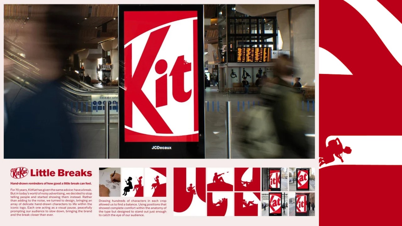
The logo became a quiet sanctuary by hiding tiny, relaxing scenes within its curves.
KitKat transformed its iconic logo into minimalist, hand-drawn landscapes featuring tiny characters taking breaks. By removing all copy and product imagery, the campaign acted as a visual antidote to advertising fatigue, rewarding busy commuters with a moment of profound quiet.
The Logo That Said Nothing At All
A Masterclass In Brand Equity
The campaign represents a rare exercise in radical minimalism. By stripping away the 70-year-old tagline "Have a break, have a KitKat," the agency relied entirely on the visual recognition of the brand's iconic red and white typography. This served as a high-stakes test of brand equity, proving that the logo’s silhouette is so deeply embedded in the consumer consciousness that it can function as a standalone visual asset without any supporting text or product photography.
Crafting The Quiet Landscapes
The production process shifted away from traditional photography or CGI to focus on bespoke illustration. Lead designer Jon Warner and the creative team meticulously mapped the curves of the KitKat logo to serve as the structural foundation for four distinct scenes: *Listening, Strumming, Reading,* and *Daydreaming*. These hand-drawn vignettes were designed to be discovered only by those who stopped to look closely, effectively gamifying the act of taking a break. The art direction was led by Jacqui Stecher, who ensured the illustrations maintained a grounding, low-effort aesthetic that contrasted sharply with the high-energy, cluttered visual environment of major transit hubs like King's Cross St Pancras.
An Antidote To Advertising Fatigue
The campaign was intentionally positioned as an "antidote" to the sensory overload of modern transit advertising. By refusing to "shout" at commuters, the work mirrored the brand's core promise. Wael Jabi, Global Head of Marketing and Communications at Nestlé, noted that the campaign successfully rewarded the audience for their attention rather than demanding it. This strategy of "quiet" communication ran in parallel with more aggressive, high-profile activations like *The KitKat Heist*, highlighting a dual-track strategy of balancing earned-PR spectacles with highly crafted, minimalist design.
Creative Strategy Deconstructed
Company
KitKat possessed seventy years of brand equity, allowing it to communicate its core promise without using any text or product.
Category
Confectionery brands typically rely on loud, slogan-heavy advertising to compete for attention in saturated, high-traffic outdoor media environments.
Customer
Overwhelmed commuters in busy transit hubs craved a moment of silence and relief from constant, aggressive advertising noise.
Culture
The rise of advertising fatigue made minimalist, non-intrusive visual experiences a refreshing and welcome departure from standard media clutter.
Company
KitKat possessed seventy years of brand equity, allowing it to communicate its core promise without using any text or product.
Category
Confectionery brands typically rely on loud, slogan-heavy advertising to compete for attention in saturated, high-traffic outdoor media environments.
Strategy:
Replace aggressive brand messaging with quiet visual cues to reward the audience with mental space.
Customer
Overwhelmed commuters in busy transit hubs craved a moment of silence and relief from constant, aggressive advertising noise.
Culture
The rise of advertising fatigue made minimalist, non-intrusive visual experiences a refreshing and welcome departure from standard media clutter.
Strategy:
Replace aggressive brand messaging with quiet visual cues to reward the audience with mental space.
Strategy Technique
Make the Invisible Visible
It highlights the quiet, mundane act of taking a break in high-traffic, noisy environments. By making this invisible behavior the focus, the brand transforms a simple concept into a tangible, shared experience.
Explore Technique
Creative Technique
Use Art
The campaign uses minimalist hand-drawn illustrations integrated into the logo's negative space. This artistic approach forces viewers to slow down and observe, mirroring the act of taking a break.
Explore Technique
Craft Breakdown
This campaign ingeniously transforms an iconic brand asset into the canvas for its brand promise through delicate graphic design and micro-illustration. By physically embedding moments of rest inside the KitKat logo itself, the artwork seamlessly unites identity and message.
The delicate hand-drawn silhouetted characters fit masterfully into the negative spaces and geometry of the classic KitKat logo.
Clever minimalist graphic design transforms an omnipresent corporate trademark into a poetic visual sanctuary.
“The brilliant graphic design concept relies entirely on the charm and precision of the micro-illustrations embedded within the iconic letterforms.”