Panera: Meet the new drink lineup
Panera needed to modernize its beverage menu and drive in-store foot traffic among Gen Z consumers. The client sought to move away from controversial past offerings by introducing a new, fruit-forward drink lineup. 72andSunny was tasked with creating a high-energy campaign that positioned these beverages as the primary reason for young adults to choose Panera as their preferred social hangout spot.
Creative Idea
Vibrant, rhythmic visuals transformed simple fruit drinks into an essential social accessory.
Panera revitalized its beverage image by pairing vibrant, high-energy visuals with a simplified menu of real-fruit drinks, effectively shifting the brand perception from a tired cafe to a trendy, social destination for younger, flavor-focused consumers.
Beyond the Charged Lemonade: A Strategic Pivot
Engineering a Safer Sip
The transition from the previous self-serve beverage model to the new lineup was a calculated operational shift. By moving the 28-milligram caffeine drinks behind the counter, Panera effectively mitigated the liability concerns that plagued their earlier, high-caffeine offerings. The production team leaned into this change by utilizing macro cinematography to emphasize the real fruit pieces and condensation, signaling a return to "fresh" and "hand-crafted" preparation methods that contrast sharply with the previous dispenser-based system.
The Claw Clip Marketing Blitz
The campaign’s most surprising success was the September 10, 2026 merchandise drop. By limiting the custom-designed claw clips to just 21 units per store, Panera manufactured a scarcity-driven frenzy that translated directly into morning foot traffic. The designs—a Baguette, a Strawberry, and a Cluster of Cherries—served as wearable brand assets that turned customers into walking billboards. This tactic successfully bridged the gap between a standard QSR promotion and the "drop culture" typically reserved for streetwear brands.

Reclaiming the Third Place
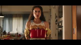
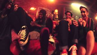
Analysts point to the ensemble cast of Gen Z actors as a deliberate effort to rebrand the physical cafe space. Following a post-pandemic decline in in-store dining, the spot’s focus on social interaction was designed to reposition Panera as a "third place" for younger demographics. This visual narrative was supported by the 4.0 Star rating from the System1 Group, which noted that the ad’s "Strong Fast Fluency" allowed the brand to land its message within the rapid 15-second window, proving that a product-focused promo could still resonate emotionally with a younger audience.
Creative Strategy Deconstructed
Company
Panera leveraged its reputation for fresh ingredients to launch a new, curated lineup of fruit-forward, low-caffeine and caffeine-free beverages.
Category
QSR brands often rely on generic, overly processed fountain drinks that lack visual appeal and fail to drive in-store social traffic.
Customer
Younger consumers sought refreshing, Instagrammable drink options that felt healthier and more artisanal than standard fast-food soda fountain offerings.
Culture
The rise of 'third place' social culture and the demand for visually vibrant, 'real' ingredients made these colorful drinks highly shareable.
Company
Panera leveraged its reputation for fresh ingredients to launch a new, curated lineup of fruit-forward, low-caffeine and caffeine-free beverages.
Category
QSR brands often rely on generic, overly processed fountain drinks that lack visual appeal and fail to drive in-store social traffic.
Strategy:
Associate a refreshed product line with vibrant social moments to redefine the brand experience.
Customer
Younger consumers sought refreshing, Instagrammable drink options that felt healthier and more artisanal than standard fast-food soda fountain offerings.
Culture
The rise of 'third place' social culture and the demand for visually vibrant, 'real' ingredients made these colorful drinks highly shareable.
Strategy:
Associate a refreshed product line with vibrant social moments to redefine the brand experience.
Strategy Technique
Create a New Mental Shortcut
By grouping the new drinks into clear, distinct categories, the campaign provides a simple mental framework for customers. This replaces confusion with an immediate, positive association between Panera and refreshing, real-fruit beverages.
Explore Technique
Creative Technique
Amplify the Small
The ad uses macro, high-definition close-ups of condensation and fruit to make simple beverages feel premium and irresistible. This sensory focus elevates the product experience beyond a standard menu item.
Explore Technique
Craft Breakdown
This campaign excels through its vibrant art direction and dynamic typography, which perfectly capture the refreshing, youthful energy of the new beverage line.
The use of high-contrast, saturated colors and bright outdoor settings perfectly complements the vibrant look of the drinks themselves.
The bold, playful yellow on-screen text is integrated seamlessly into the scenes, enhancing the energetic and modern feel of the ad.
“The synergy between the fast-paced music editing and the bold, colorful art direction creates an instantly engaging, sensory-rich experience.”