2025Deutsches Institut für NormungConsumer Services & B2BCase video
Deutsches Institut für Normung: The Magazine in All Formats
The Deutsches Institut für Normung (DIN) tasked RYSM with creating an anniversary publication to mark 50 years of the Normenvertrag. The goal was to engage political and cultural stakeholders by demonstrating the relevance of standardization in a creative, high-impact way. The client needed a solution that moved beyond traditional corporate communications to highlight the brand's foundational role in global design and industry.
Creative Idea
A magazine where every page size is a literal application of the DIN standard.
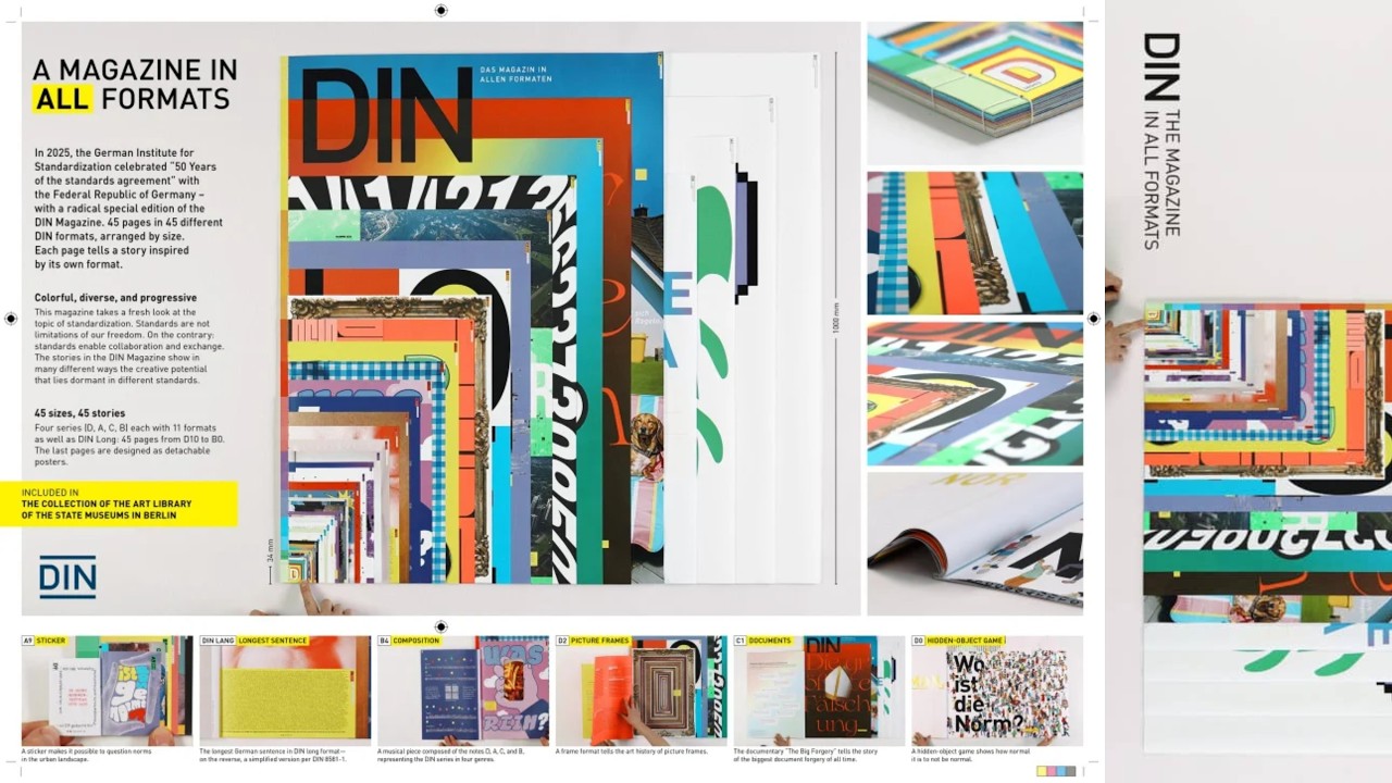
To celebrate 50 years of standardization, DIN created a magazine where every page strictly follows the ISO 216 paper format it represents. By turning the rigid rules of paper sizes into a creative framework, they transformed a dry technical standard into a tangible, celebrated cultural artifact.
Forty-Five Formats of Pure Paper Engineering
Engineering the Impossible Binding
The production process required a radical departure from standard printing workflows. To achieve the final object, the team utilized 45 unique trim sizes, 5 distinct paper types, and 6 different grammages. Because the magazine features escalating page sizes, the cover is a composite of all 45 page fronts visible simultaneously. The assembly demanded extensive manual labor, specifically hand-stitched Nadelstich-Bindung to ensure the varying paper thicknesses remained structurally sound. The team also integrated 4 different printing processes and custom spot colors to differentiate the series.
Content Hidden in Geometry
The editorial strategy turned technical constraints into narrative devices. The A0 page unfolds to reveal the genome of the lungfish, while the DIN Lang format houses the longest known single sentence in the German language. A unique musical score was composed specifically for the project, utilizing four notes corresponding to the series letters—D, A, C, B—arranged according to the rules of four distinct musical genres.
A Legacy Beyond Marketing
Rather than a commercial release, the magazine functioned as an exclusive artifact for political and cultural stakeholders. Its impact was solidified when it was accepted into the permanent collection of the Art Library of the Berlin State Museums. As Maud Radtke of RYSM noted, the primary challenge was ensuring the magazine functioned as a cohesive whole despite its radical, shape-shifting physical form. Annika Westera of DIN e.V. emphasized that the project successfully challenged the perception of standardization as rigid, proving instead that frameworks provide the necessary structure for creative growth.
4C Framework deconstruction
Company
DIN possesses the authority and historical data to define the global standards for paper formats.
Category
Corporate anniversary publications are typically dry, text-heavy brochures that fail to engage or inspire.
Customer
Stakeholders and designers crave meaningful, high-quality physical objects that demonstrate innovation rather than just reporting it.
Culture
There is a growing appreciation for 'analog' craftsmanship and tangible design artifacts in an increasingly digital world.
Company
DIN possesses the authority and historical data to define the global standards for paper formats.
Category
Corporate anniversary publications are typically dry, text-heavy brochures that fail to engage or inspire.
Strategy:
Transform technical infrastructure into a creative medium to elevate brand perception through physical experience.
Customer
Stakeholders and designers crave meaningful, high-quality physical objects that demonstrate innovation rather than just reporting it.
Culture
There is a growing appreciation for 'analog' craftsmanship and tangible design artifacts in an increasingly digital world.
Strategy:
Transform technical infrastructure into a creative medium to elevate brand perception through physical experience.
Results
The physical magazine was artfully bound, publicly displayed, exhibited in galleries, and officially collected in the Art Library of the Berlin State Museums.
Strategy Technique
Make the Invisible Visible
DIN's standards are ubiquitous yet ignored by the public. This strategy forces the audience to physically interact with the geometry of the standard, making the invisible framework of daily life impossible to ignore.
Explore Technique
Creative Technique
Turn Message into Product
The campaign physically embodies the brand's core purpose by making the magazine's structure a direct manifestation of the ISO 216 standard. It turns abstract technical rules into a tangible, interactive experience.
Explore Technique
Craft Breakdown
This campaign elevates standard print design into an extraordinary conceptual art piece through masterclass typography, graphic layout, and physical production design. Every page serves as an inventive homage to standard paper dimensions.
Each page creatively reinterprets the unique aspect ratio and traditional purpose of individual DIN paper sizes.
Features complex, highly varied typographic layouts across every format, including custom lettering and literary installations.
Impeccable physical print craft incorporating diverse paper stocks, fold-outs, inserts, and artisanal hand-binding.
Smart editorial curation linking technical paper dimensions with fascinating historical, scientific, and cultural narratives.
“The brilliant conceptual design is matched by extraordinary physical print production, turning technical standardization into a celebrated gallery piece.”