2026MoN TakanawaMedia & EntertainmentVideo ad
MoN Takanawa: The Museum of Narratives
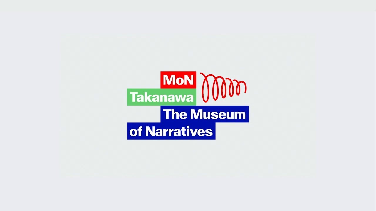
Pentagram London designed the brand identity and visual system for MoN Takanawa, a new museum opening in 2026. The work established a non-linear design language to support the institution's mission of connecting traditional Japanese heritage with future-facing digital experiences.
Creative Idea
A spiral identity system that visualizes culture as a continuous, non-linear loop.
Pentagram created a non-linear visual identity system for MoN Takanawa, using a spiral logo and dynamic bar to represent the concept of dimensional time, where cultural narratives loop and recur rather than following a traditional, static path.
Designing a Museum Without Any Walls
A Gateway to Circular Narratives
The naming of MoN functions as a deliberate linguistic bridge. Beyond the acronym for Museum of Narratives, the name invokes the Japanese word mon (門), referencing the site's history as a historic gateway to Tokyo. Simultaneously, it plays on mon (問), meaning question, reflecting the institution's mandate to challenge static perceptions of history. This duality is reinforced by the site's location on the former Shinagawa freight yard, the exact ground where Japan’s first railway crossed the ocean during the Meiji Restoration over 150 years ago.
Challenging Museum Conventions
In a radical departure from traditional curatorial practices, the brand identity explicitly rejects the use of vitrines and pedestal mounts. By banning these static display conventions, the museum forces a focus on interactive, digital, and live performance-based programming. This philosophy is mirrored in the design system, where the Frame Bar - a horizontal and vertical line - intentionally bleeds off the edges of layouts to signal that every cultural narrative is currently mid-story.
Precision in Dimensional Time
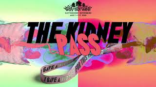
The identity system relies on a zoom mechanic that allows the spiral logo to scale from a 100-year strategic outlook down to the micro-level of single-evening event wristbands. To ensure the brand feels grounded in natural cycles, the color palette is strictly derived from Sun, Land, and Water. This visual language was developed in close collaboration with Maholo Uchida, the museum's Artistic Director, and architectural partner Kengo Kuma & Associates, who designed the 29,000 m² wood-and-glass structure. The launch was further supported by custom physical collateral, including invitations secured with intersecting rubber bands that require the recipient to physically unwrap the narrative.
4C Framework deconstruction
Company
A forward-thinking museum space in Takanawa Gateway City that bridges Japanese tradition with modern digital expression.
Category
Museums typically rely on static displays, pedestals, and linear historical timelines to present cultural artifacts.
Customer
Visitors seek immersive, interactive experiences that make history feel relevant and connected to their current lives.
Culture
The rise of digital storytelling and a desire for non-linear, experiential engagement with cultural heritage.
Company
A forward-thinking museum space in Takanawa Gateway City that bridges Japanese tradition with modern digital expression.
Category
Museums typically rely on static displays, pedestals, and linear historical timelines to present cultural artifacts.
Strategy:
Replace linear historical curation with a dynamic, circular system that treats all culture as ongoing.
Customer
Visitors seek immersive, interactive experiences that make history feel relevant and connected to their current lives.
Culture
The rise of digital storytelling and a desire for non-linear, experiential engagement with cultural heritage.
Strategy:
Replace linear historical curation with a dynamic, circular system that treats all culture as ongoing.
Strategy Technique
Break a Category Convention
The museum rejects static, linear curation in favor of a circular, interactive model. This strategy positions the institution as a living, breathing space that defies the rigid, outdated norms of traditional museum design.
Explore Technique
Creative Technique
Break visual expectations
The design rejects traditional museum display conventions like vitrines and plinths. Instead, it uses a dynamic spiral grid and bleeding layout bars to visualize the concept of continuous, non-linear cultural narratives.
Explore Technique
Craft Breakdown
This identity launch uses sophisticated motion graphics and precise typography to transform architectural concepts into an engaging narrative line. The seamless integration of 2D branding motifs with 3D structural wireframes elevates the visual presentation.
The bespoke Japanese and English kinetic typography moves fluidly alongside line elements to express the museum's core philosophy.
The visual identity system cleverly translates the concept of continuous 'narratives' into a versatile, colorful spiral design framework.
Smooth visual transitions seamlessly bridge abstract diagrams, kinetic line art, and photorealistic 3D architectural renders.
The detailed floor plan extrusions and building models vividly communicate complex architectural spatial design.
“The interaction between kinetic visual branding and 3D architectural modeling creates a unified expression of the museum's physical and conceptual space.”