2026Fabio Haag TypeConsumer Services & B2BVideo ad
Fabio Haag Type: Drika
Fabio Haag Type sought to launch their new typeface, Drika, to a global audience of designers. The client needed to differentiate the product in a saturated market by highlighting its unique versatility. The objective was to showcase how the font balances extreme legibility with raw, expressive character, proving it could handle both delicate editorial work and bold, chaotic display applications.
Creative Idea
Personified the typeface as a versatile character to demonstrate its extreme range.
Fabio Haag Type launched the Drika typeface by personifying it as a versatile, bold character, using motion graphics to demonstrate how its 14 weights shift from delicate whispers to chaotic, overlapping collisions to prove that legibility and raw expression can coexist.
Drika with a k and a punk rock soul
A Typeface That Collides
The design process for Drika prioritized a human, unpolished aesthetic that rejects the sterile perfection of modern digital fonts. Designer Ana Laydner, working under the creative direction of Fabio Haag, drew inspiration from early 19th-century sans-serifs. This influence is most visible in the font's eccentricities, such as the serifed capital I, the open-looped lowercase g, and the diagonal strokes that terminate at unexpected, sharp angles. The family includes 14 distinct weights, ranging from a delicate *Thin* to the extreme *Ultratouch*.
Engineering the Mosh Pit
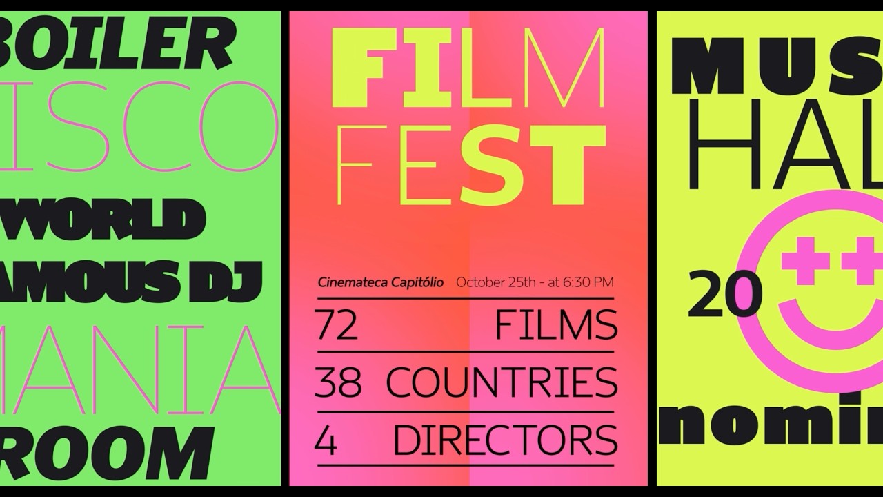
The technical execution of the *Ultratouch* weight features a unique engineering quirk: the letter spacing is specifically calibrated to snap adjacent characters together. This allows designers to create a solid, wall-like texture of text, which the creative team affectionately dubbed a mosh pit. Motion designer Brendon Kowalski leaned into this chaotic potential for the launch video, animating the letters to physically overlap and collide. This narrative choice was intended to prove that a typeface could maintain its identity while shifting from a whisper to a shout.
Simplifying the Licensing Landscape
Beyond its aesthetic, Drika served as the flagship release for a new, simplified licensing model at Fabio Haag Type. The foundry used this launch to strip away complex supplier redistribution rules and traditional web pageview limits, aiming to make professional typography more accessible to global users. This strategic shift in commercial structure was paired with a bilingual marketing rollout in English and Portuguese, ensuring the font reached a diverse international audience immediately upon its June 2026 debut.
4C Framework deconstruction
Company
Fabio Haag Type possessed the technical expertise to engineer a highly versatile, expressive typeface with 14 distinct, functional weights.
Category
Typography marketing typically relies on static, dry technical specifications and sterile, overly polished aesthetic showcases.
Customer
Designers craved tools that offered both high legibility for professional work and raw, authentic personality for creative expression.
Culture
The growing design trend of embracing unpolished, human-centric aesthetics over rigid, corporate perfection made Drika's raw personality resonate.
Company
Fabio Haag Type possessed the technical expertise to engineer a highly versatile, expressive typeface with 14 distinct, functional weights.
Category
Typography marketing typically relies on static, dry technical specifications and sterile, overly polished aesthetic showcases.
Strategy:
Humanize technical tools to bridge the gap between functional utility and emotional creative expression.
Customer
Designers craved tools that offered both high legibility for professional work and raw, authentic personality for creative expression.
Culture
The growing design trend of embracing unpolished, human-centric aesthetics over rigid, corporate perfection made Drika's raw personality resonate.
Strategy:
Humanize technical tools to bridge the gap between functional utility and emotional creative expression.
Strategy Technique
Use the Brand As a Character
By treating the typeface as a protagonist with a story, the brand creates an immediate emotional hook. This strategy transforms a technical product into a relatable persona that designers can identify with.
Explore Technique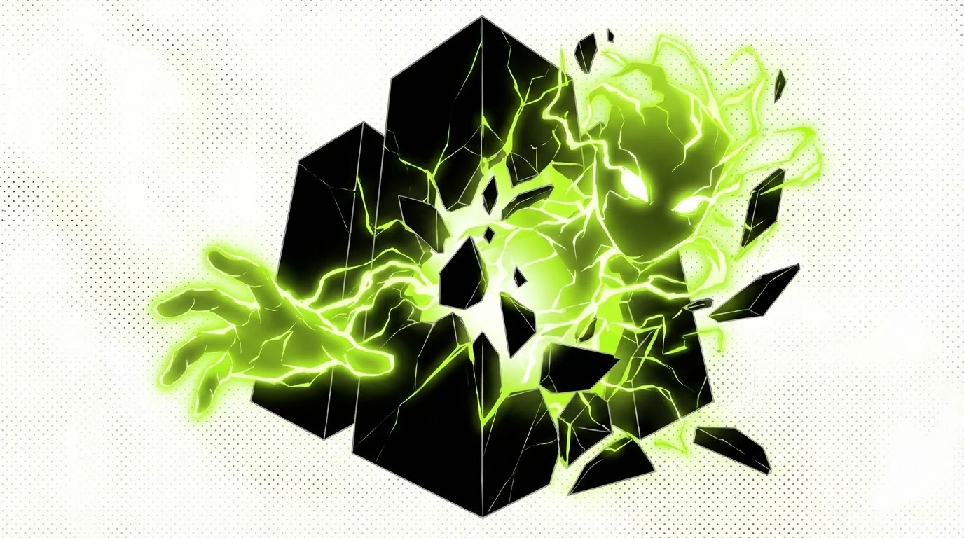
Creative Technique
Character
The campaign personifies the typeface as a living, breathing entity with a distinct personality. This narrative approach allows the audience to emotionally connect with the font's technical versatility and range.
Explore Technique
Craft Breakdown
This campaign's craft excels through brilliant visual design, typography, and motion graphics that turn font design into a dynamic, personality-filled character story.
The central product—a 14-weight variable typeface—is designed with distinctive anatomical quirks like unusual diagonal terminals and extreme weight variations.
The kinetic typography and fluid motion graphics brilliantly synchronize with the voiceover and musical cues to bring static letterforms to life.
A striking neon palette of high-contrast lime, pink, and orange creates an unforgettable visual identity across poster layouts.
Personifying a font family as a bold female character creates a compelling narrative arc out of technical typography specs.
“The seamless rhythm between the energetic voiceover script, upbeat music, and kinetic visual animation elevates a standard font release into a captivating visual music video.”