2025NikkeiMedia & EntertainmentCase video
Nikkei: Playful Stamina
Dentsu Inc. and Taki Corporation developed the visual identity for the 2025 Nikkei Hoshi Awards. The project utilized photography of weathered playground equipment to represent the stamina required for science fiction writing, appearing across posters, event materials, and commemorative books.
Creative Idea
Weathered playground equipment serves as a visual metaphor for sustained creative endurance.
The design identity for the Hoshi Awards uses weathered, chipped playground equipment as a metaphor for creative stamina, arguing that exceptional science fiction is built through the repetitive, enduring effort of play rather than raw, fleeting inspiration.
Finding Beauty in the Chipped and Worn
Elevating Decay Through Art Direction
The visual identity for the 2025 Hoshi Awards required a meticulous approach to photography to transform signs of physical deterioration into a symbol of creative endurance. Rather than viewing chipped paint and peeling surfaces as decay, the production team at Dentsu Creative Pictures Inc. and Taki Corporation treated these textures as luminous, dignified objects. The art direction focused on precise lighting and color composition to elevate the weathered playground equipment, framing them as metaphors for the repetitive, muscle-building nature of science fiction writing.
A Philosophy of Sustained Practice
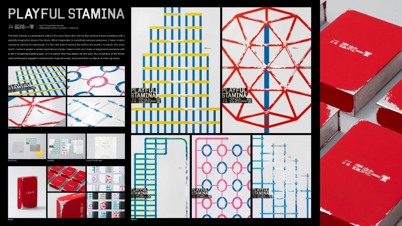
The project was built on the core belief that creativity is not a fleeting gift but a result of consistent effort. By documenting equipment that has been used and returned to repeatedly, the design team created a visual language that honors the stamina required to produce exceptional literature. This conceptual framework extended beyond posters to include the layout of the award-winning anthology book and the staging of the awards ceremony itself. Under the guidance of producer Yuki Mizutani, the work successfully bridged the gap between industrial design and literary promotion, establishing a distinct aesthetic that emphasizes the beauty of things that have been played with over time. The project serves as a testament to the idea that, even in an era increasingly influenced by AI, the foundation of great science fiction remains the enduring, human capacity for dedicated play.
4C Framework deconstruction
Company
Nikkei leveraged its prestige as a literary award sponsor to define the standards of science fiction excellence.
Category
Literary awards typically rely on abstract, futuristic, or highly polished digital imagery to represent science fiction themes.
Customer
Writers and readers sought a deeper, more human connection to the grit and persistence required for creative work.
Culture
The rise of AI-generated content made the human element of sustained, imaginative play feel increasingly valuable and necessary.
Company
Nikkei leveraged its prestige as a literary award sponsor to define the standards of science fiction excellence.
Category
Literary awards typically rely on abstract, futuristic, or highly polished digital imagery to represent science fiction themes.
Strategy:
Reframe creative endurance as a physical, tactile process to elevate the value of human imagination.
Customer
Writers and readers sought a deeper, more human connection to the grit and persistence required for creative work.
Culture
The rise of AI-generated content made the human element of sustained, imaginative play feel increasingly valuable and necessary.
Strategy:
Reframe creative endurance as a physical, tactile process to elevate the value of human imagination.
Strategy Technique
Make the Invisible Visible
The campaign highlights the often-ignored physical reality of creative effort. By connecting the endurance of play to literary excellence, it gives a tangible, visual form to the abstract concept of creative stamina.
Explore Technique
Creative Technique
Spotlight the Overlooked
The design elevates the aesthetic of worn, peeling playground equipment into a symbol of creative endurance. By framing these neglected objects as beautiful, the work transforms mundane decay into a powerful metaphor for sustained imaginative practice.
Explore Technique
Craft Breakdown
This campaign's design craft is elevated by its brilliant conceptual metaphor—translating endurance into weathered playground equipment graphics across a comprehensive branding system.
The identity system flawlessly adapts abstract geometric motifs of playground structures across printed and digital touchpoints.
Extremely detailed texture work seamlessly integrates worn paint effects onto minimalist vector shapes, creating a striking visual contrast.