2026Henry of PelhamConsumer GoodsCase video
Henry of Pelham: The Wine Archive: Developed Through Time
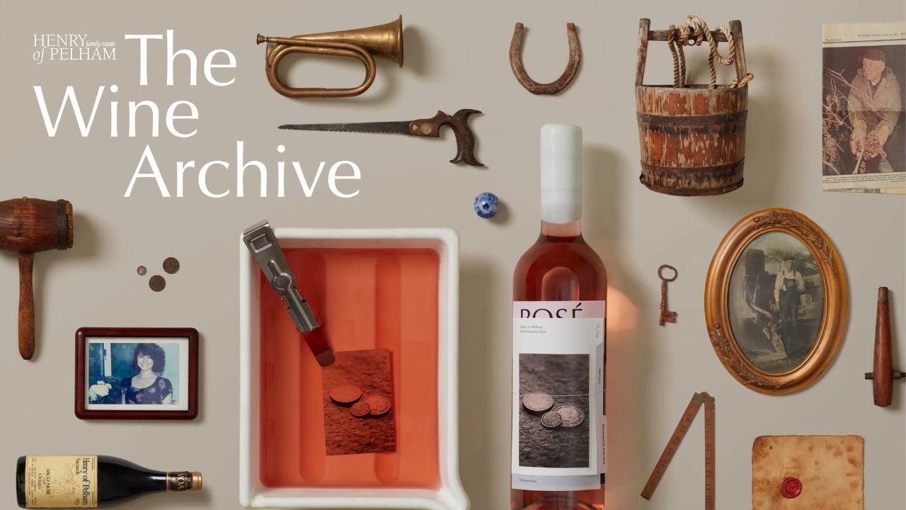
Henry of Pelham and agency Zulu Alpha Kilo created 50 handcrafted bottles featuring photographic labels developed using the winery's own wine. The project aimed to elevate perceptions of Ontario wine quality by physically documenting the estate's 200-year heritage.
Creative Idea
The winery used its own wine as a chemical developer for historical photo labels.
Henry of Pelham turned its 200-year history into a physical archive by using its own wine as a photographic developer for labels, proving the winery's heritage and craft through the literal materialization of its past onto limited-edition bottles.
Developing History Through A Barrel Darkroom
From Cellar to Darkroom
To achieve the project's unique aesthetic, the team transformed the winery's underground barrel cellar into a functional darkroom. The process involved replacing traditional chemical developers with the estate's own Pinot Grigio, Rosé, and Baco Noir. This experimental technique resulted in natural tonal shifting, as the wine oxidized and reacted with the film negatives. Because the chemical composition of the wine changed as batches sat, no two photographs emerged with the same color cast, effectively staining each image with the specific hue of the grape used to develop it.
Crafting the Archive
The collection features 50 unique, handcrafted bottles, each documenting a specific chapter of the winery's 200-year timeline. The labels were constructed using a complex, multi-layer design consisting of four stacked substrates: cotton paper, vellum, recycled fiber, and soft-touch stock. Every bottle underwent a rigorous finishing process, including side-sewn thread binding, blind debossing, custom die-cut tabs, glass etching, and thermography. To finalize the artifact, each bottle top was individually dipped in molten sealing wax and hand-numbered.
Community and Impact
The project served as a tangible bridge between the winery's heritage and its future. The limited-edition bottles were released through an exclusive online drop at henryofpelham.com. In a commitment to the local Niagara region, 100% of sales proceeds were matched by the winery and donated to Pathstone Mental Health, a non-profit organization supporting child and youth mental health. By moving away from traditional advertising, the project reframed the perception of Ontario wine quality through the materialization of history, effectively treating the bottle itself as a collectible archive rather than a standard commercial product.
4C Framework deconstruction
Company
Henry of Pelham possessed 200 years of documented family stewardship and a deep, untapped archive of historical estate artifacts.
Category
Wine brands typically rely on marketing copy and generic claims of quality to compete with imported Old World labels.
Customer
Discerning wine lovers seek authenticity, provenance, and a tangible connection to history rather than just a pleasant taste.
Culture
The rising consumer appreciation for craft, provenance, and tactile, limited-edition objects over mass-produced, intangible marketing claims.
Company
Henry of Pelham possessed 200 years of documented family stewardship and a deep, untapped archive of historical estate artifacts.
Category
Wine brands typically rely on marketing copy and generic claims of quality to compete with imported Old World labels.
Strategy:
Materialize abstract brand heritage into a physical, ownable artifact to prove quality through tangible evidence.
Customer
Discerning wine lovers seek authenticity, provenance, and a tangible connection to history rather than just a pleasant taste.
Culture
The rising consumer appreciation for craft, provenance, and tactile, limited-edition objects over mass-produced, intangible marketing claims.
Strategy:
Materialize abstract brand heritage into a physical, ownable artifact to prove quality through tangible evidence.
Strategy Technique
Make the Invisible Visible
The campaign takes the abstract concept of 'heritage' and makes it physically tangible. By using the wine as a developer, it forces consumers to see the history embedded within the product itself.
Explore Technique
Creative Technique
Turn Message into Product
The brand literally used its wine to develop the photographic labels, merging the product with its own history. This physical process transforms the bottle into a tangible, drinkable artifact of the winery's heritage.
Explore Technique
Craft Breakdown
This campaign elevates wine packaging design into tactile art by literally using wine as a darkroom photo developer to print 50 unique historical labels. The fusion of analog photography craft with multi-layered editorial bookbinding turns each bottle into an archival artifact.
The bespoke, multi-page folder labels incorporate index tabs, hand-stitching, twine ties, and unique numbering, seamlessly transforming each bottle into an interactive historical file.
Using actual wine varietals as darkroom chemicals to develop 35mm film negatives creates authentic, one-of-a-kind chromatic tones for every photograph.
“The brilliant synthesis of analog photo development using wine chemicals and intricate hand-bound packaging design makes the idea completely tangible.”