Embratur: Amazonia
Embratur and RAI sought to unify the nine states of the Brazilian Legal Amazon into a single, recognizable tourism brand. They faced a challenge of fragmented communication and low domestic interest, as many Brazilians overlooked the region. The client required a strategy to boost international tourism, support local producers, and establish a cohesive identity that reflected the scale and importance of the Amazonian territory.
Creative Idea
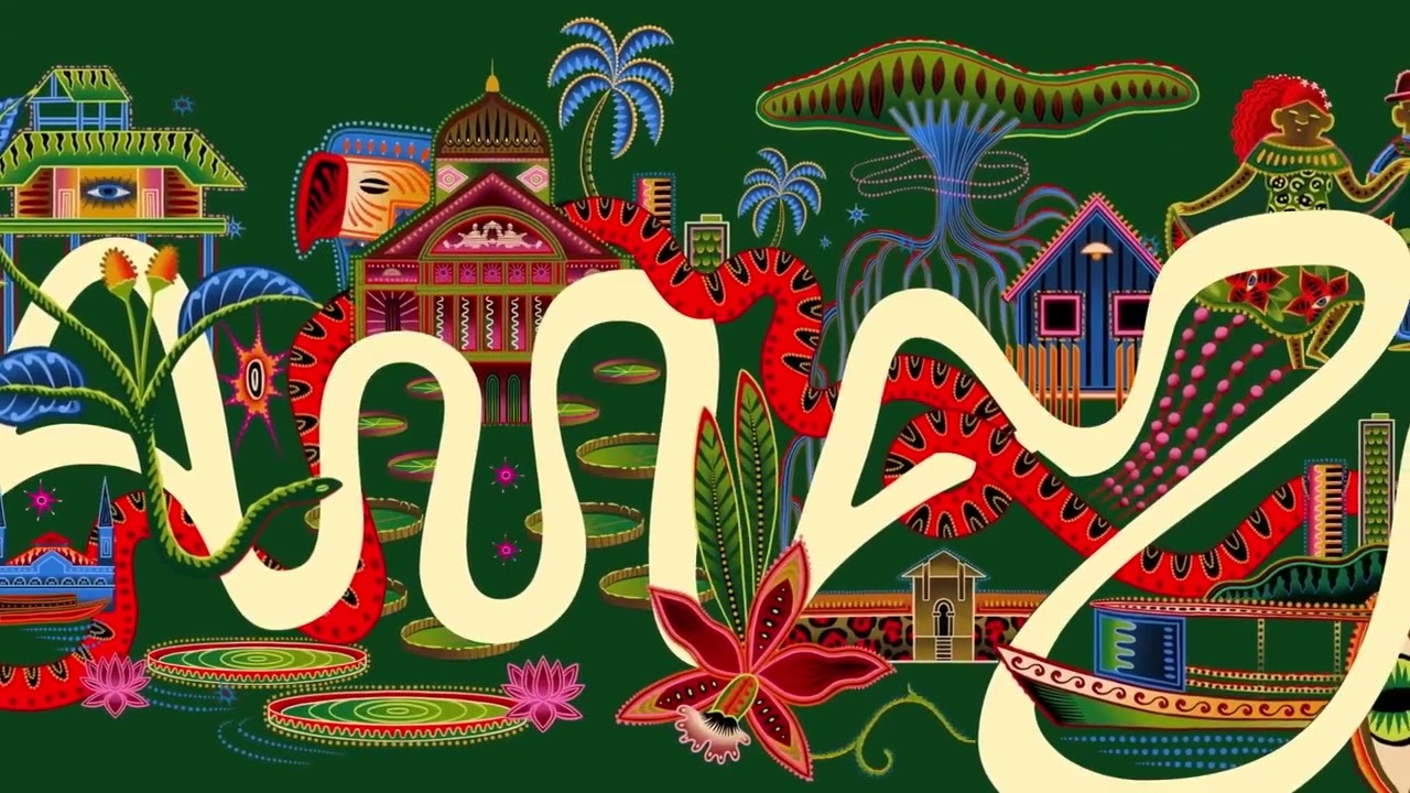
The Amazon River's actual curves were used to generate the region's official typeface.
To unify nine fragmented states, the brand transformed the Amazon River's actual satellite-mapped waterways into a living, generative typeface. This nature-led design system creates a coherent identity that adapts to local cultures while anchoring the region in the global bioeconomy.
Typography Written by the Amazon River
Mapping the Veins of a Continent
The technical execution of the brand identity required an unprecedented level of cartographic precision. To create the custom typeface, the design team mapped 25,000 kilometers of navigable waterways across the Amazon River basin. By utilizing satellite data, the agency translated the actual physical curves and flow patterns of the river into a generative design system. This ensures that the brand identity is not merely a graphic representation but a direct reflection of the region's geography, anchoring the visual language in the literal landscape of the nine Brazilian states that comprise the Legal Amazon.
Unifying a Massive Territory
The project serves as a massive logistical and cultural undertaking, aiming to create a cohesive identity for a region that covers approximately 60% of Brazil's national territory. This area, which is larger than India, encompasses 772 cities and is home to 28 million people. By establishing this unified brand, the initiative seeks to bridge the gap between fragmented local tourism efforts and the global bioeconomy. The launch video, which debuted on the official *Amazônia Brasileira* channel, quickly gained traction, securing over 13,000 views in its first two weeks, while independent design analysis videos further amplified the reach by another 11,000 views. This digital footprint highlights the growing domestic and international interest in a region that has historically struggled with cohesive promotion.
Creative Strategy Deconstructed
Company
Embratur leveraged its authority to unify nine states under one cohesive, nature-inspired visual identity for the first time.
Category
Tourism branding typically relies on generic, fragmented imagery of lush forests and wildlife rather than deep, structural storytelling.
Customer
Brazilians felt disconnected from their own territory, often ignoring the Amazon in favor of international travel destinations.
Culture
The global focus on bioeconomy and sustainability made the Amazon's authentic, river-based identity resonate with modern travelers.
Company
Embratur leveraged its authority to unify nine states under one cohesive, nature-inspired visual identity for the first time.
Category
Tourism branding typically relies on generic, fragmented imagery of lush forests and wildlife rather than deep, structural storytelling.
Strategy:
Unify a fragmented territory by revealing the hidden natural structure that already connects it.
Customer
Brazilians felt disconnected from their own territory, often ignoring the Amazon in favor of international travel destinations.
Culture
The global focus on bioeconomy and sustainability made the Amazon's authentic, river-based identity resonate with modern travelers.
Strategy:
Unify a fragmented territory by revealing the hidden natural structure that already connects it.
Results
The campaign successfully unified the 9 states of the Brazilian Amazon under a single, cohesive brand identity. It established a centralized tourism website and created a standardized 'Made of Amazonia' label for regional products. The initiative brought together local artists and residents from across the region, fostering a sense of shared identity and pride, while providing a structured platform to promote tourism to both domestic and international audiences.
9
Brazilian states unified under one brand
1
centralized tourism platform established
Strategy Technique
Make the Invisible Visible
The strategy highlights the overlooked geographic connection between nine states to solve the problem of fragmented communication. By revealing the river as a natural unifier, it turns a hidden physical reality into a powerful brand asset.
Explore Technique
Creative Technique
Use Art
The campaign uses the natural geography of the Amazon River as the literal source for its typography. This transforms raw satellite data into a beautiful, authentic design language that reflects the region's true identity.
Explore Technique
Craft Breakdown
This campaign's craft is elevated by its brilliant fusion of technology and organic design, turning actual geographical features into a functional, beautiful brand identity.
The creation of a generative typeface directly mapped from the physical curves of the Amazon's rivers is a masterclass in identity design.
The integration of local illustrators' work with the river-based typography creates a visually stunning, culturally authentic brand system.
Using GPS coordinates and mapping data to construct a dynamic design system showcases an innovative use of digital tools.
The fluid, continuous-line typeface beautifully mimics water flow while remaining highly legible and adaptable across mediums.
“The magic lies in how technology (mapping river coordinates) directly informs the design (the typeface), which is then brought to life by local art direction.”