2025InnoceanConsumer Services & B2BVideo ad
Innocean: Glory Over Pain Corp.
Innocean Berlin executed a self-initiated rebrand on April 1, 2025, transforming its identity into a pharmaceutical-themed entity called Glory Over Pain Corp. The project encompassed a full visual system, merchandise, and digital assets to challenge traditional agency-client relationships.
Creative Idea
The agency rebranded as a pharmacy, treating brand problems as medical ailments.
Innocean Berlin rebranded as a pharmaceutical company called Glory Over Pain Corp., treating industry mediocrity as a clinical ailment. By adopting a medical aesthetic, the agency reframed its creative services as therapeutic interventions for brands in need of healing.
The Pharmacy That Prescribed A New Identity
Sterile Meets Subversive Aesthetics
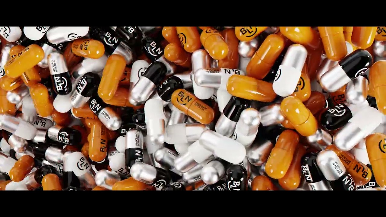
The visual identity was built on a deliberate clash between clinical sterility and Berlin’s underground techno zeitgeist. The design team, led by Will Cega and Rodrigo Sganzerla, moved away from traditional agency branding to adopt a pharmaceutical visual language. This included the creation of The Painkiller logo and a suite of assets ranging from prescription pads to pill-bottle packaging. Every element, including the typeface and office signage, was engineered to function as a medical tool, reinforcing the agency's self-positioning as the industry's first "brand healer."
From Internal Oracle To Public Merch
The project was a multidisciplinary effort involving the entire 90-person agency staff, representing 35 nationalities. A key component of the rollout was GLORIA, a proprietary cultural insights tool used to diagnose "brand health." Beyond internal tools, the agency launched a public-facing online store. This merchandise line - featuring first-aid kits, themed T-shirts, and stickers - allowed the agency to extend its cultural reach beyond its immediate client base. The execution was handled entirely in-house, utilizing the agency's internal design studio for 3D render art, motion design, and specialized photography.
A Satirical Industry Intervention
Released on April 1, 2025, the project served as a tongue-in-cheek critique of how advertising agencies often treat rebrands with excessive self-importance. By framing their services as "strategic surgery" or "cultural acupuncture," the team at Innocean Berlin mocked the industry's tendency to over-promise. The campaign notably referenced the agency's history, including their Cannes Lions Grand Prix for Good win, to ground their satire in a position of established creative authority. The work was widely covered by international trade publications including Mediashotz, Trend Hunter, and Ads of the World.
4C Framework deconstruction
Company
Innocean Berlin leveraged its internal design studio capabilities to execute a comprehensive, high-fidelity pharmaceutical-themed visual identity.
Category
Agencies typically use abstract, self-important mission statements and sterile, minimalist branding to signal professional authority.
Customer
Clients feel the pain of industry mediocrity and desire transformative, effective solutions rather than transactional service.
Culture
The campaign tapped into the Berlin subculture aesthetic, blending sterile medical visuals with subversive, underground design elements.
Company
Innocean Berlin leveraged its internal design studio capabilities to execute a comprehensive, high-fidelity pharmaceutical-themed visual identity.
Category
Agencies typically use abstract, self-important mission statements and sterile, minimalist branding to signal professional authority.
Strategy:
Use satire to reframe professional services as essential, curative interventions for common industry ailments.
Customer
Clients feel the pain of industry mediocrity and desire transformative, effective solutions rather than transactional service.
Culture
The campaign tapped into the Berlin subculture aesthetic, blending sterile medical visuals with subversive, underground design elements.
Strategy:
Use satire to reframe professional services as essential, curative interventions for common industry ailments.
Strategy Technique
Break a Category Convention
By rejecting the standard, self-serious agency rebrand, the agency used satire to stand out. This approach mocks industry tropes while effectively signaling a bold, disruptive shift in their own brand positioning.
Explore Technique
Creative Technique
Borrow a Familiar Format
The agency adopted the visual and linguistic codes of the pharmaceutical industry to present their services. This familiar format creates a humorous, cohesive identity that distinguishes their creative output from traditional agency branding.
Explore Technique
Craft Breakdown
Innocean Berlin transforms agency re-branding into a masterclass in visual design, blending pharmaceutical packaging tropes, Swiss typography, and 3D animation into a cohesive sub-brand identity.
The comprehensive visual system translates pharmaceutical metaphors seamlessly across physical packaging, digital UIs, apparel, spatial signs, and print collateral.
Kinetic multi-lingual type layouts combine precise grid structures with bold, expressive character sizing to command visual attention.
Hyper-realistic 3D pill simulations, blister packs, and metallic accessories give tactile weight to the brand concept.
Witty, self-aware commentary reframes client-agency friction into a medical diagnostic narrative ('medicating mediocrity').
“The craft excels through the seamless fusion of graphic design, 3D motion graphics, and sharp ironic copywriting, making the conceptual rebrand feel like an authentic luxury pharmaceutical launch.”