Heineken - 150 Years of Whateverken
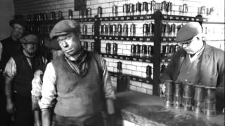
Heineken, celebrating its 150th anniversary, tasked LePub with creating a global campaign that avoided traditional heritage narratives. The objective was to increase brand recall and sales by engaging a diverse audience with a fresh, relatable approach to its long history.
Creative Idea
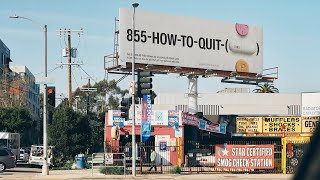
Heineken celebrated its 150th anniversary by intentionally misspelling its name on products and ads.
Heineken embraced its global mispronunciations and misspellings for its 150th anniversary, printing them on labels and marketing materials to celebrate how people enjoy it, regardless of how they say or spell it, turning a perceived weakness into a strength and fostering universal good times.
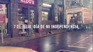
Celebrating 150 Years of Getting It Wrong
The Science of Gezelligheid
To move beyond traditional sales metrics, Heineken collaborated with behavioral scientist Dr. Chris Brauer from Goldsmiths, University of London, to develop the Good Times Index. This proprietary algorithm identified 15 specific factors - such as open-mindedness and inclusivity - that contribute to human connection. By shifting the focus from product quality to the quality of the consumer's experience, the brand successfully quantified the Dutch concept of gezelligheid. This strategic pivot resulted in a +7.7 point increase in recommendation intent among the critical 18 - 35 demographic and a 354% surge in brand recall.
22 Billion Intentional Mistakes
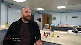
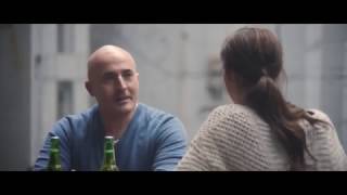
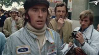
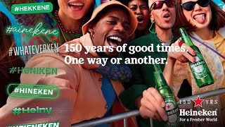 The production scale was a logistical feat, requiring the coordination of 22 billion bottles and cans featuring "incorrect" labels like *Heinekin* and *Whateverken* across 153 countries. While lead agency LePub Milan orchestrated the global vision, directors Bradley & Pablo - known for their work with Harry Styles - brought a high-fashion, music-video aesthetic to the hero film. The spot featured a self-deprecating cameo by F1 legend Mika Häkkinen, emphasizing that the brand’s 150-year legacy is owned by the fans, not the boardroom.
Embracing the Beer Soup
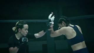
The campaign leaned into "brand mistreatment," showcasing consumers drinking Heineken with straws, over ice, or even using it as a soup ingredient. This unpretentious approach drove an 8.8% global sales growth in 2024. A secondary phase, "Forgotten Beers," highlighted half-empty bottles left at parties to prove that the best part of a beer isn't the liquid itself, but the social environment it facilitates. This cultural resonance was further cemented through high-profile collaborations with Adidas, MSGM, and Monopoly.
Creative Strategy Deconstructed
Company
Heineken's 150-year global presence and confident brand identity allowed it to credibly embrace and celebrate its widespread misspellings.
Category
Beer brands typically emphasize heritage, quality, or perfect branding. This campaign broke convention by celebrating consumer imperfection and relatability.
Customer
Consumers often mispronounce or misspell foreign brands, sometimes feeling self-conscious. The campaign validated this common human experience with humor and inclusivity.
Culture
In an era valuing authenticity and self-awareness, brands embracing imperfections resonate strongly. This campaign tapped into a global trend of relatable, unpretentious communication.
Company
Heineken's 150-year global presence and confident brand identity allowed it to credibly embrace and celebrate its widespread misspellings.
Category
Beer brands typically emphasize heritage, quality, or perfect branding. This campaign broke convention by celebrating consumer imperfection and relatability.
Strategy:
Validate common human imperfections to foster deeper, more authentic brand connection.
Customer
Consumers often mispronounce or misspell foreign brands, sometimes feeling self-conscious. The campaign validated this common human experience with humor and inclusivity.
Culture
In an era valuing authenticity and self-awareness, brands embracing imperfections resonate strongly. This campaign tapped into a global trend of relatable, unpretentious communication.
Strategy:
Validate common human imperfections to foster deeper, more authentic brand connection.
Results
The campaign achieved significant results, including a +354% increase in Brand Recall. Beer sales went up to 32%. It was hailed as "The most successful global PR launch to date." Media mentions included "Heineken pokes fun at its own heritage" (The Independent), "A history of misspelled and misused Heineken" (The Telegraph), and "Heineken truly celebrates the importance of freedom" (GQ). The campaign involved changing 22 billion bottles in 153 countries to feature misspelled labels.
+354%
Brand Recall
32%
Beer sales increase
22 billion
bottles changed
Strategy Technique
Turn Weakness Into Strength
Heineken embraced its widespread mispronunciations and misspellings globally. This transformed a common brand challenge into a unique, self-aware, and celebratory anniversary campaign, resonating with diverse consumers.
Explore Technique
Creative Technique
Lean Into the Problem
Heineken acknowledged and celebrated its frequent misspellings and mispronunciations. This transformed a potential brand weakness into a relatable, humorous, and inclusive campaign, fostering universal good times.
Explore Technique
Craft Breakdown
This campaign's craft is exceptional in its strategic copywriting, transforming a brand's linguistic challenge into a self-aware, globally celebrated platform, executed with meticulous visual and textual precision across all touchpoints.
The ingenious use of diverse, playful misspellings of 'Heineken' as the campaign's central textual content on bottles, billboards, and social media is a masterclass in turning a brand's vulnerability into creative strength.
The visual execution expertly maintained Heineken's premium brand aesthetic while integrating intentionally 'incorrect' names across all media, including product labels, billboards, and partnerships, creating a cohesive and celebratory look.
“The campaign's magic emerged from the seamless synergy between the bold ideological shift, the clever copywriting of the misspellings, and the meticulous art direction and typography that brought these 'errors' to life with brand integrity.”