2026FamìaConsumer GoodsCase video
Famìa: House of Local Products
Famìa, a local producer in Rovinj, needed a brand identity and packaging solution that would stand out in a competitive retail environment. They tasked Studio Tumpić/Prenc with creating a design that captured the essence of Rovinj’s tradition while optimizing limited shelf space. The goal was to convert casual tourists into collectors, turning their olive oil into a premium, giftable souvenir that represented the town's unique architectural identity.
Creative Idea
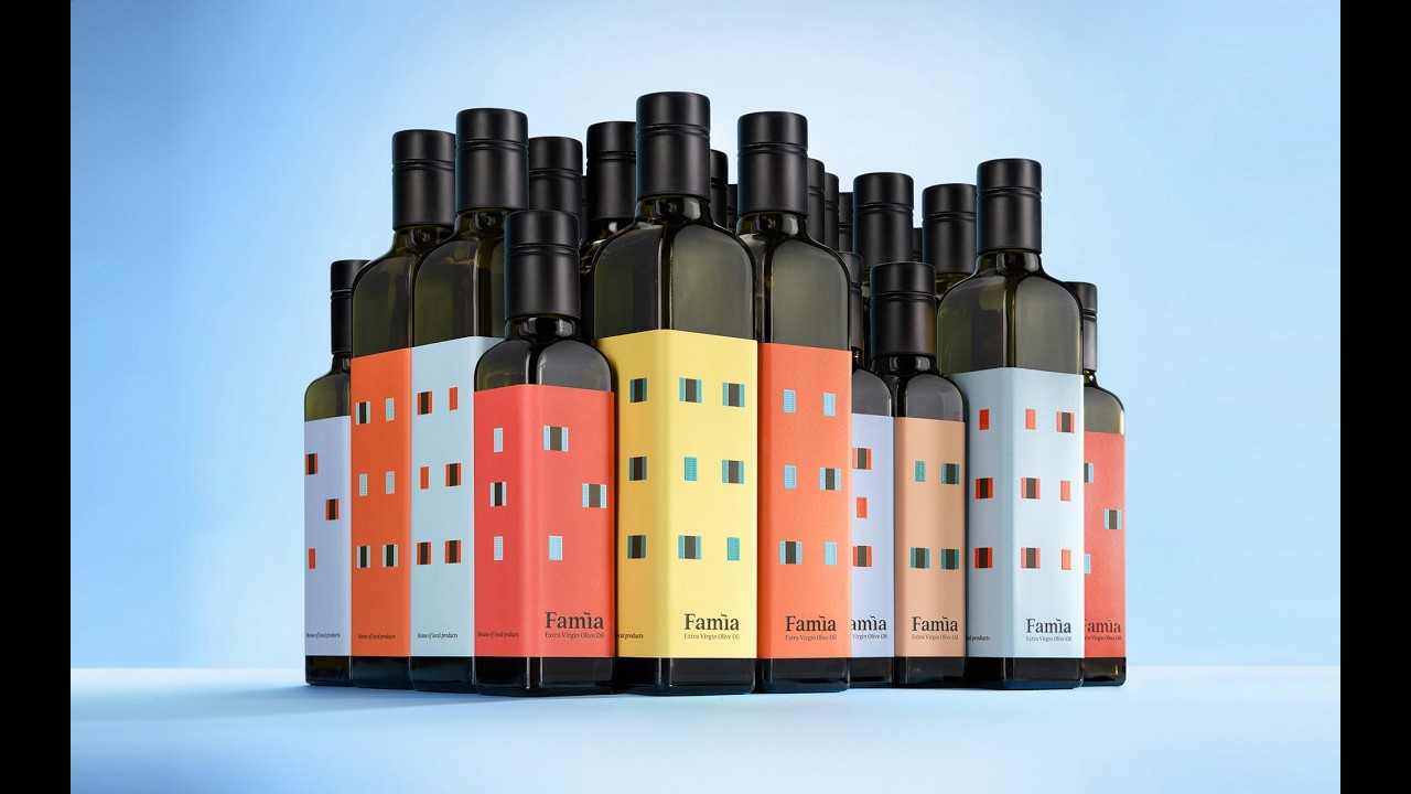
Olive oil bottles form a miniature skyline when stacked together on store shelves.
Famìa transformed olive oil bottles into modular, illustrated building facades that assemble into a miniature model of Rovinj’s historic skyline, turning a simple retail product into a collectible souvenir that physically connects tourists to the town’s architectural heritage.
Building a Miniature Rovinj on Every Shelf
From Dialect to Design
The name Famìa is rooted in the local Istriot dialect, a dying language specific to the Rovinj region, where it translates to "family." Historically, every household in the town maintained a private reserve of olive oil. Anselmo Tumpić and his team at Studio Tumpić/Prenc leveraged this heritage to move away from generic branding. They replaced a confusing corporate identity - which previously juggled multiple names like Vero naše d.o.o. and Mylando - with a singular, cohesive brand that honors the domestic hearth.
Architectural Precision in Print
The packaging design functions as a modular puzzle. By utilizing custom die-cuts and high-end printing techniques in collaboration with Etikgraf d.o.o., the agency ensured that the square bottles align perfectly to form a continuous skyline of the historic old town. The logo itself contains a hidden detail: the letter "ì" is styled to resemble a small rooftop chimney, serving as a subtle nod to the family kitchen.
Solving Retail Constraints
Beyond aesthetics, the project solved a significant logistical hurdle. The shop faced severe space limitations, making large-scale retail displays impossible. By turning the product packaging into the display itself, the agency eliminated the need for expensive store refits. The strategy successfully converted casual tourists into collectors, as customers are encouraged to purchase multiple bottles to complete the "town skyline" on their own shelves. This approach transformed a basic commodity into a premium souvenir, leading to direct corporate gift inquiries from entities including the City of Rovinj-Rovigno.
4C Framework deconstruction
Company
Famìa possessed deep local roots and a commitment to authentic Istrian olive oil production.
Category
Olive oil brands typically rely on generic, uninspired packaging that fails to differentiate or engage tourists.
Customer
Tourists sought a meaningful, authentic piece of Rovinj to take home as a souvenir.
Culture
The rising demand for hyper-local, artisanal products that reflect the unique identity of a destination.
Company
Famìa possessed deep local roots and a commitment to authentic Istrian olive oil production.
Category
Olive oil brands typically rely on generic, uninspired packaging that fails to differentiate or engage tourists.
Strategy:
Transform functional packaging into a collectible retail display to bridge local heritage and consumer desire.
Customer
Tourists sought a meaningful, authentic piece of Rovinj to take home as a souvenir.
Culture
The rising demand for hyper-local, artisanal products that reflect the unique identity of a destination.
Strategy:
Transform functional packaging into a collectible retail display to bridge local heritage and consumer desire.
Strategy Technique
Build an Utility, Not an Ad
The agency solved a retail space constraint by making the packaging itself the display solution. By integrating the product's function with the brand's heritage, they created a self-merchandising tool that eliminates the need for traditional retail displays.
Explore Technique
Creative Technique
Define, Label and Group
The packaging uses specific house-shaped labels to categorize oil intensities while simultaneously functioning as a modular puzzle. This design forces consumers to group bottles to complete the visual cityscape, effectively turning the product into a collectible display.
Explore Technique
Craft Breakdown
The campaign excels through clever modular packaging design that seamlessly translates the architectural heritage of Rovinj into a tangible, collectible retail experience.
The label design turns individual product bottles into modular elements that recreate the town's famous skyline on retail shelves.
The visual language establishes a direct color and structural link between the real town facade and the packaged product.