2025IWC SchaffhausenConsumer GoodsCase video
IWC Schaffhausen: Ingenieur - Form und Technik Posters
Scholz & Friends created a series of posters for IWC Schaffhausen to promote global events for the Ingenieur collection. The designs utilized watch components to construct architectural landmarks, reflecting the brand's 'Form und Technik' design platform.
Creative Idea
Watch components were deconstructed to build graphic illustrations of iconic global city landmarks.
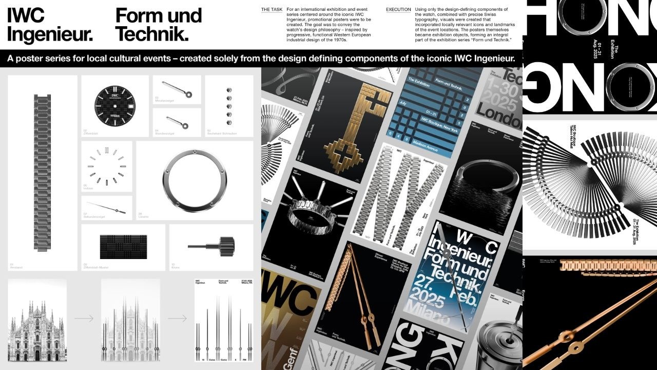
To celebrate the Ingenieur watch, the design team deconstructed its mechanical components to build graphic representations of iconic city landmarks, applying the 'Less but better' principle of 1970s Swiss-German industrial design to create bespoke exhibition art.
Engineering Landmarks Through Watch Components
A Philosophy of Less but Better
The design process was strictly governed by the "Less but better" principle, a hallmark of 1970s Swiss-German industrial design. By limiting the visual vocabulary to the watch’s own mechanical components - such as bezel geometry, dial grids, and integrated bracelet links - the creative team avoided traditional photography. Instead, they treated the timepiece as a construction kit. This approach required a rigorous application of Swiss International Style grid layouts, ensuring that the resulting graphic representations of landmarks remained technically precise while maintaining a minimalist aesthetic.
From Exhibition Pieces to Collectibles
The posters transcended their role as event collateral to become highly sought-after artifacts. During the global rollout, which spanned hubs like London, New York, Hong Kong, Shanghai, Milan, and Zurich, the prints were physically integrated into curated gallery spaces. These exhibitions placed the posters alongside vintage industrial icons from brands like Braun, Vitra, and Mercedes-Benz. This context elevated the work from simple advertising to a design-led cultural experience. The impact was immediate among enthusiasts; the posters became legitimate collector’s items, with secondary market prices on platforms like eBay reaching over EUR 300 per individual print.
A Cohesive Global Language
Maintaining a consistent visual identity across diverse events - ranging from Milan Fashion Week collaborations to intimate dinners at the Matcha Club in Zurich - presented a significant production challenge. The agency, Scholz & Friends, solved this by ensuring that every local landmark was reconstructed using the exact same technical watch elements. This strategy allowed the brand to communicate a unified message under the Form und Technik platform while providing each host city with a bespoke, locally relevant visual identity.
4C Framework deconstruction
Company
IWC leveraged its heritage of functional Swiss-German industrial design and the iconic Gérald Genta watch aesthetic.
Category
Luxury watch brands typically rely on lifestyle photography or celebrity endorsements to market their timepieces.
Customer
Watch enthusiasts appreciate technical depth and design-led narratives that respect the history of horological engineering.
Culture
The resurgence of 1970s industrial design aesthetics and a growing appreciation for minimalist, functional graphic design.
Company
IWC leveraged its heritage of functional Swiss-German industrial design and the iconic Gérald Genta watch aesthetic.
Category
Luxury watch brands typically rely on lifestyle photography or celebrity endorsements to market their timepieces.
Strategy:
Elevate technical product components into a visual language that defines brand identity.
Customer
Watch enthusiasts appreciate technical depth and design-led narratives that respect the history of horological engineering.
Culture
The resurgence of 1970s industrial design aesthetics and a growing appreciation for minimalist, functional graphic design.
Strategy:
Elevate technical product components into a visual language that defines brand identity.
Strategy Technique
Make the Invisible Visible
By deconstructing the watch into its core geometric parts, the campaign highlights the hidden engineering precision of the timepiece. This strategy turns technical specifications into a visual language that defines the brand's aesthetic identity.
Explore Technique
Creative Technique
Use Art
The posters transform technical watch components into architectural art, elevating promotional material into gallery-worthy objects. This approach honors the watch's design heritage while visually connecting the product to global cultural landscapes.
Explore Technique
Craft Breakdown
This campaign elevates graphic design and typography by using the microscopic components of an iconic timepiece to construct bespoke localized poster art.
The posters deconstruct physical watch parts into modular graphic elements to form localized architectural and cultural motifs.
Rigid Swiss international typographical style seamlessly integrates with watch hardware imagery to create pristine posters.
“The fusion of Swiss typographic principles with high-precision macro watch component graphics turns promotional event collateral into museum-grade art pieces.”