MullenLowe - Global Rebrand
MullenLowe U.S. sought to rebrand its global identity, reflecting its dynamic nature and generating significant industry buzz. The agency aimed to deeply engage its 4,000+ employees and attract new business opportunities, solidifying its position as an innovative leader.
Creative Idea
MullenLowe let 4,000+ employees design their own fluid octopus logos using a generative app.
MullenLowe reimagined its iconic octopus logo into a fluid, ever-changing symbol, empowering over 4,000 employees to design their own unique versions via a generative app, fostering internal ownership and generating massive external buzz and new business opportunities.
The Octopus That Edited Its Own DNA
155 Million Organic Impressions
The rebrand delivered immediate commercial impact, driving a 300% surge in Google searches for the agency and a 35% increase in new business opportunities. Beyond the numbers, the project achieved a rare 98.3% positive sentiment across industry platforms. This shift from a static "boxing octopus" to a fluid identity resulted in an estimated $1.3 million in earned media value and a 16% lift in inbound calls, proving that agency self-promotion can function as a high-performance lead generation tool.
A 100 Percent In-House Evolution
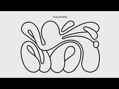 While most global networks outsource their visual identity to specialized branding firms, MullenLowe completed this overhaul entirely in-house. Led by João Paz and Fabio Brigido, the team collaborated with 3D artist Sérgio Paulo to create a "living" texture that felt organic. The production centered on a custom generative app that allowed 4,000+ employees to manipulate tentacles to create personalized logos. This "creative mischief" extended to a bespoke Octo Alphabet, where every letter from A - Z was rendered as a morphing cephalopod limb.
Biological Adaptation as Brand Strategy
The shift was inspired by the biological fact that octopuses are the only organisms capable of routinely editing their own DNA to survive. Former CEO Kristen Cavallo noted this served as the perfect metaphor for a modern agency's need for fluidity. By removing the 2016 "boxing gloves," the brand moved away from a combative challenger stance toward a collaborative, adaptive model. The launch on June 6, 2023, synchronized across 57 global markets, turning staff into ambassadors through "highly anticipated swag" featuring their own unique, algorithmically generated designs.
Creative Strategy Deconstructed
Company
MullenLowe possessed an iconic octopus logo and a visionary head of design, João Paz, capable of leading a bold, internal-facing rebrand.
Category
The advertising agency category often relies on external perception, with rebrands typically presented as finished products, not collaborative processes.
Customer
Employees desired genuine involvement and ownership in the brand's evolution, while the industry craved authentic, innovative expressions of agency identity.
Culture
A prevailing cultural trend emphasized transparency, co-creation, and employee empowerment, making internal engagement a powerful external statement.
Company
MullenLowe possessed an iconic octopus logo and a visionary head of design, João Paz, capable of leading a bold, internal-facing rebrand.
Category
The advertising agency category often relies on external perception, with rebrands typically presented as finished products, not collaborative processes.
Strategy:
Empower internal stakeholders to co-create brand identity, transforming rebrand into an authentic, engaging collective movement.
Customer
Employees desired genuine involvement and ownership in the brand's evolution, while the industry craved authentic, innovative expressions of agency identity.
Culture
A prevailing cultural trend emphasized transparency, co-creation, and employee empowerment, making internal engagement a powerful external statement.
Strategy:
Empower internal stakeholders to co-create brand identity, transforming rebrand into an authentic, engaging collective movement.
Results
+300% Brand Surge on Google, +1.3 Million Earned Media Value, 155 Media Impressions, 98.3% Positive Sentiment, "The most talked about agency rebrand in 2023" (Meltwater)
+300%
brand surge on Google
$1.3M
earned media value
98.3%
positive sentiment
Strategy Technique
Turn the Brand Into a Movement
By empowering 4,000+ employees to co-create the new logo, MullenLowe transformed its rebrand into a collective experience. This internal movement fostered immense pride and advocacy, generating widespread external buzz and business growth.
Explore Technique
Creative Technique
Customize and personalize
By allowing 4,000+ employees to design their own octopus logo, the campaign fostered deep personal connection and ownership. This personalization amplified internal pride and external engagement, driving significant earned media.
Explore Technique
Craft Breakdown
The MullenLowe rebrand showcases exceptional generative design and digital craft, creating a highly adaptable and personalized visual identity that resonated across diverse applications and garnered significant positive media attention.
The core concept of a fluid, generative octopus logo and typeface is highly innovative and executed with precision, allowing for endless unique variations while maintaining brand recognition.
The development of the "Make Your Own Logo" app and the "Octo Alphabet" demonstrates advanced digital design and generative art techniques, making the brand interactive and personalized.
The custom "Octo Alphabet" is a creative extension of the core logo concept, offering a distinctive and playful typographic system that is both functional and artistic.
The overall visual presentation, from the minimalist aesthetic to the dynamic animations and real-world applications, is cohesive and effectively communicates the brand's new, adaptable identity.
“The synergy between generative design, digital craft, and typography is exceptional, allowing the core "fluid octopus" concept to manifest in a highly personalized and adaptable brand identity across all touchpoints, driving engagement and recognition.”