2025PumpuiConsumer GoodsCase video
Pumpui: Nolingual Font
Pumpui tasked Yell Bangkok with increasing brand awareness for their Korean-style spicy baby clams in a highly saturated market. The client needed a way to stand out against numerous competitors using similar Korean-themed visual cues. The goal was to drive engagement among Thai consumers by creating a unique, memorable brand identity that would spark curiosity and conversation across digital and physical touchpoints.
Creative Idea
A custom font disguised as Korean text that only Thai speakers can read.
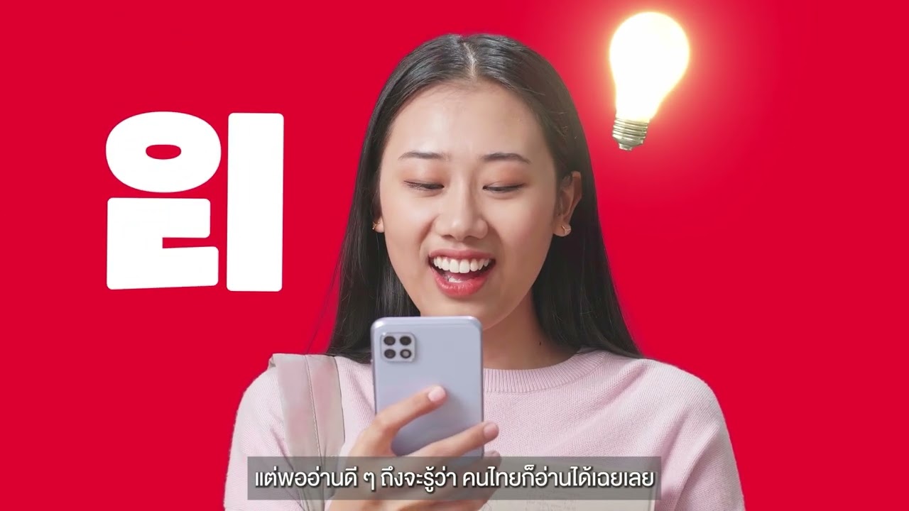
Pumpui created a custom font that mimics Korean Hangul script but is actually legible in Thai. By turning typography into a visual puzzle, the brand forced consumers to pause and decode the text, driving massive engagement in a saturated market.
Decoding the Korean Illusion for Thai Palates
Deconstructing the Hangul Grid
To achieve the visual illusion, the design team at Yell Bangkok performed a deep structural analysis of the Hangul alphabet. Designers deconstructed Korean characters into their foundational grid system, focusing on basic graphic strokes like circles, straight angles, and block layouts. By using this Korean blueprint as a structural guide, the team meticulously reconstructed Thai characters to mimic the aesthetic of K-food packaging. This created an optico-linguistic trick where the text appears as authentic Korean at first glance but remains perfectly legible to native Thai speakers.
Street Level Interaction
The campaign moved beyond digital screens by deploying micro-influencers into high-traffic public spaces across Bangkok. These influencers wore t-shirts featuring the Nolingual Font, displaying phrases such as "If you can read this, you're not Korean—but you get the vibe!" and specific product information about the Pumpui Fried Baby Clams. This strategy turned offline public spaces into live word-puzzle games, forcing passersby to stop and decode the text. The effort successfully generated 841,000 in total reach and sparked over 9,800 direct interactions as consumers engaged in debates over the visual decoding.
Brand Social Takeover
The brand further committed to the concept by executing a complete social media takeover. During the launch window, Pumpui replaced all standard typography on its official Facebook page with the Nolingual Font. This move provoked immediate curiosity, leading to a surge in user comments and inquiries asking "What language is this?" By shifting typography from a passive branding element into the hero of the campaign, the agency successfully reframed Korean culture into an interactive experience for the Thai market.
4C Framework deconstruction
Company
Pumpui leveraged its expertise in Korean-style spicy baby clams to create a unique, brand-specific typography system.
Category
Competitors in the Korean-style food market typically rely on standard Hangul text to signal authenticity and flavor.
Customer
Thai consumers felt overwhelmed by generic K-food marketing and craved more interactive, authentic, and clever brand experiences.
Culture
The widespread popularity of Korean culture in Thailand created a visual language that consumers were already primed to recognize.
Company
Pumpui leveraged its expertise in Korean-style spicy baby clams to create a unique, brand-specific typography system.
Category
Competitors in the Korean-style food market typically rely on standard Hangul text to signal authenticity and flavor.
Strategy:
Use familiar cultural aesthetics to create interactive friction that demands active consumer participation.
Customer
Thai consumers felt overwhelmed by generic K-food marketing and craved more interactive, authentic, and clever brand experiences.
Culture
The widespread popularity of Korean culture in Thailand created a visual language that consumers were already primed to recognize.
Strategy:
Use familiar cultural aesthetics to create interactive friction that demands active consumer participation.
Results
The campaign achieved strong social media performance and brand visibility: 1.3M Impressions, 112,000 Engagements, and 108% Brand / Product Mentions Growth.
1.3M
Impressions
112,000
Engagements
+108%
Brand / Product Mentions Growth
Strategy Technique
Break a Category Convention
The campaign ignores the standard practice of using authentic Korean text for K-style products. Instead, it breaks the convention by creating a hybrid script that forces consumers to engage with the brand through a playful, interactive puzzle.
Explore Technique
Creative Technique
Use Different Language
The campaign uses a custom font that visually mimics Korean characters while remaining readable in Thai. This linguistic optical illusion forces consumers to stop and decode the text, turning passive reading into active engagement.
Explore Technique
Craft Breakdown
This campaign excels through brilliant custom typography that functions as both a visual trick and a compelling creative hook. By ingeniously combining Hangul structural rules with Thai character shapes, it creates an engaging brand experience across channels.
The bespoke font meticulously maps Thai letters onto Korean Hangul design grids, creating a seamless optical illusion.
Consistent brand red color palette and clear visual deconstruction graphics make complex typographic concepts instantly digestible.