2026CoralConsumer GoodsVideo ad
Coral: Prompts Coral
Coral needed to reduce consumer anxiety regarding paint color selection. The brand challenged VML Brazil to find a way to help customers visualize their chosen colors accurately in their own homes. The goal was to increase purchase confidence and decrease post-purchase regret by leveraging emerging technology to provide a reliable, high-precision preview tool for the Brazilian market.
Creative Idea
Coral turned its color catalog into a language that AI tools can finally understand.
Coral bridged the gap between imagination and reality by creating a library of optimized prompts for generative AI, allowing consumers to visualize specific paint shades in their own environments with 100% certainty before buying.
Translating Paint Palettes Into Artificial Intelligence
Bridging the Visualization Gap
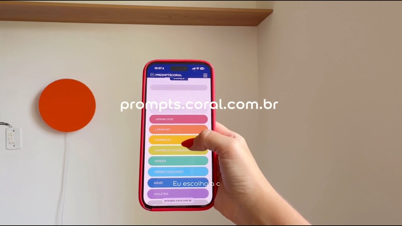
The campaign addressed a specific technical friction point: when users prompted AI tools for a color like "terracotta," the results were inconsistent and lacked the accuracy required for home renovation. By creating a chromatic translation system, VML Brazil bypassed the need for a proprietary app. Instead, they optimized 2,000+ paint shades into structured text prompts compatible with DALL-E 3, Google Gemini, and Midjourney. This approach allowed Coral to meet consumers within the existing generative AI ecosystem rather than forcing them to download new software.
Expert Endorsement and Workflow
Architect and interior designer Maurício Arruda became the face of the initiative, demonstrating how the tool functions as a professional asset. For designers, the primary challenge is often managing client expectations regarding color behavior in specific lighting conditions. By using the pre-formulated prompts, professionals could generate high-precision previews in real-time, effectively reducing the "doubt factor" during the decision-making process.
Strategic Risk Mitigation
The initiative was designed to complement the Garantia Coral Premium, which offers a product replacement if the customer is dissatisfied with their chosen color. By pairing the AI-driven visualization tool with this physical guarantee, the brand successfully lowered the barrier to entry for hesitant consumers. Juliana Zaponi, the LATAM Communication & Color Manager at AkzoNobel, emphasized that for home decor, "almost" is not enough, positioning the prompt library as a precision instrument for consumer confidence. The campaign was led by a broad creative team including Eduardo Marques and Frederico Teixeira, with technical oversight from Eduardo Andreoli.
4C Framework deconstruction
Company
Coral leveraged its massive, proprietary database of over 2,000 physical paint shades to create a unique digital translation system.
Category
Paint brands typically rely on static color cards or generic digital visualizations that fail to capture real-world lighting and texture.
Customer
Consumers felt anxious about color choices and wanted total certainty that their chosen shade would look perfect on their walls.
Culture
The rapid rise of generative AI tools created a new behavior where people attempt to visualize home improvements digitally.
Company
Coral leveraged its massive, proprietary database of over 2,000 physical paint shades to create a unique digital translation system.
Category
Paint brands typically rely on static color cards or generic digital visualizations that fail to capture real-world lighting and texture.
Strategy:
Solve a common consumer friction point by integrating brand expertise into existing popular digital tools.
Customer
Consumers felt anxious about color choices and wanted total certainty that their chosen shade would look perfect on their walls.
Culture
The rapid rise of generative AI tools created a new behavior where people attempt to visualize home improvements digitally.
Strategy:
Solve a common consumer friction point by integrating brand expertise into existing popular digital tools.
Strategy Technique
Build an Utility, Not an Ad
By creating a tool that translates paint colors into AI-ready language, Coral solves a real consumer friction point. The product utility itself becomes the primary marketing vehicle for the brand.
Explore Technique
Creative Technique
Unexpected Utility
The campaign provides a functional digital tool that solves the specific problem of AI color inaccuracy. It turns a complex technical hurdle into a simple, helpful utility for the consumer.
Explore Technique
Craft Breakdown
This digital video excels through authentic Art Direction and relatable Copywriting, blending creator UGC aesthetics seamlessly with brand storytelling.
The interior styling thoughtfully balances the featured paint color with warm wood accents, greenery, and vibrant pop items like the orange lamp.
The script uses conversational Portuguese tailored for social media creators while seamlessly pitching the AI prompt feature and brand tagline.
“The combination of natural creator-style narrative with clean aesthetic interior styling makes the paint demonstration feel authentic and achievable.”