2026Lake of BaysConsumer GoodsCase video
Lake of Bays: The Holiday Detox Pack
Lake of Bays Brewing Co. and Leo Toronto sought to address the post-holiday struggle of transitioning into Dry January. The objective was to help consumers move from heavy holiday drinking to sobriety without the difficulty of going cold turkey. The client needed a creative, tangible way to support customers during this specific seasonal transition, aiming to increase brand relevance and consumer loyalty through a helpful, structured product experience.
Creative Idea
A six-pack of beers that gradually lowers alcohol content to ease holiday detoxing.
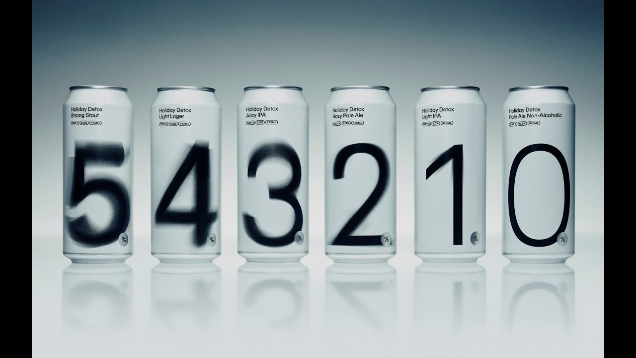
To ease the transition into Dry January, Lake of Bays created a six-pack of beers that progressively decrease in alcohol content from 5% to 0%, turning the struggle of going cold turkey into a manageable, intuitive, and rewarding daily ritual.
Graduating From Holiday Excess Through Design
A Visual Metaphor for Sobriety
The design team, led by Senior Design Director Marcelo Hong and Senior Art Director Leo Janusauskas, utilized a sophisticated visual system to represent the transition from indulgence to clarity. The packaging features a 6-day progression where the typography mirrors the drinker's mental state. The numerals start as soft, smoky, and heavily blurred on the 5.0% ABV stout, gradually sharpening day-by-day until they reach a razor-sharp, crisp finish on the 0.0% ABV non-alcoholic pale ale. To maintain this focus, the team opted for minimalist white cans, stripping away decorative illustrations to ensure the Leo Repro custom typography remained the sole focal point.
Iterative Design and Behavioral Science
Before finalizing the blurred numeral concept, the agency explored several alternative directions, including adjusting type weights, shifting color palettes, and testing entirely different font pairings. The final product functions as a "graduation model" of packaging, a concept frequently cited by trend agencies like TrendWatching. By treating the resolution as a structured ritual rather than a binary choice, the pack subverts the beer category. It shifts the focus from the deprivation of "Dry January" to the positive momentum of a descending alcohol sequence.
From Corporate Gift to Retail
Originally conceived as an exclusive holiday gift for Leo Toronto employees and agency clients, the project gained significant traction in the design community. Following its organic coverage in publications like The Dieline, The Brand Identity, and Mindsparkle Mag, the campaign moved beyond its initial internal scope. Lake of Bays Brewing Company entered discussions to scale the concept for commercial retail distribution, proving that behavioral design can successfully bridge the gap between niche corporate gifting and mass-market consumer products.
4C Framework deconstruction
Company
Lake of Bays leveraged its craft brewing expertise to develop a structured, six-day tapering program of varying alcohol strengths.
Category
Alcohol brands typically focus on maximizing consumption volume during the holiday season rather than encouraging moderation or sobriety.
Customer
Consumers felt the pressure of holiday excess and desired a more accessible, less daunting way to start their Dry January resolution.
Culture
The growing cultural movement of Dry January and the trend toward mindful drinking made this structured detox approach highly relevant.
Company
Lake of Bays leveraged its craft brewing expertise to develop a structured, six-day tapering program of varying alcohol strengths.
Category
Alcohol brands typically focus on maximizing consumption volume during the holiday season rather than encouraging moderation or sobriety.
Strategy:
Solve a behavioral friction point by embedding the solution directly into the product's consumption cycle.
Customer
Consumers felt the pressure of holiday excess and desired a more accessible, less daunting way to start their Dry January resolution.
Culture
The growing cultural movement of Dry January and the trend toward mindful drinking made this structured detox approach highly relevant.
Strategy:
Solve a behavioral friction point by embedding the solution directly into the product's consumption cycle.
Results
What started as a promotional holiday gift in 2025 is expected to evolve into a retail product during the holiday season in 2026.
Strategy Technique
Build an Utility, Not an Ad
Instead of running a traditional awareness campaign, the brand created a functional tool that solves the specific consumer pain point of holiday overconsumption. This utility-first approach makes the brand an active partner in the consumer's sober journey.
Explore Technique
Creative Technique
Turn Message into Product
The campaign transforms the abstract concept of tapering alcohol consumption into a physical, six-day product experience. By making the beer itself the tool for moderation, the brand provides a tangible solution to a common behavioral friction.
Explore Technique
Craft Breakdown
The campaign excels through brilliant design and art direction, using custom packaging typography to visually express the physical and mental clarity of tapering off alcohol.
The minimalist numerical typography transitions from heavy blur to ultra-crisp focus, brilliantly communicating the product's functional promise.
The pristine monochromatic studio styling and sleek packaging create a premium, clean aesthetic that elevates craft beer packaging.