Big Yellow Storage: Tide
Big Yellow Storage wanted CHI & Partners to create an advertising campaign. The client needed to connect with people undergoing significant life transitions, like moving or downsizing. The challenge was to position storage as an empathetic solution for preserving meaningful possessions during these changes, moving beyond a purely functional offering. They aimed to reassure customers that their cherished items would be safe, helping them navigate life's shifting stages with confidence.
Creative Idea
Big Yellow animated objects transforming to show storage keeps cherished possessions safe during life's transitions.
Big Yellow Storage created a stop-frame animation that metaphorically shows how life changes and transitions can be managed by keeping the things you love safe in storage. The ad uses a creative visual narrative where objects transform and adapt, symbolizing personal life changes while emphasizing that Big Yellow Storage can help people preserve their meaningful possessions during shifting life stages.
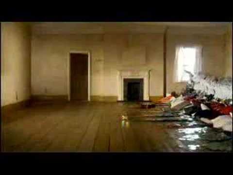
Choreographing a Tsunami of Household Clutter
The Physics of Domestic Debris
Director Dougal Wilson and animation director Drew Lightfoot moved away from traditional stop-motion puppets to treat mundane household items as fluid matter. To achieve the "wave" effect, thousands of physical objects - including toys, books, and heavy washing machines - were moved frame-by-frame. The most grueling sequence involved a wave of hundreds of loose CDs, each meticulously positioned to catch the studio lights at specific angles in every single frame. While MPC performed digital cleanup to remove the wires and rigs holding the "waves" in place, the movement itself was entirely physical. This tactile "jitter" provided a visceral quality that CGI simulations of the era could not replicate.
Soundscapes Without a Score
 The auditory experience was as unconventional as the visuals. Rather than a traditional musical track, Anthony Moore at Factory Studios crafted a rhythmic, percussive soundscape. Every "crash" and "recede" of the tide was composed using the actual sounds of the objects depicted - the clattering of plastic, the thud of appliances, and the rustle of paper - creating a literal symphony of clutter.
Dominating the London Market
The campaign successfully reframed storage from a functional utility into an emotional solution for life's "drowning" moments. By 2008, Big Yellow achieved an unprompted brand awareness in London that was five times higher than its nearest competitor. Prompted awareness reached 72% in the capital and 41% across the UK, cementing the brand as the definitive category leader during the global financial crisis. Creative Director Charles Inge noted the relatability of the chaos, remarking that the set looked exactly like his own home after a long day.
Creative Strategy Deconstructed
Company
Big Yellow Storage possesses a dominant, recognizable physical footprint and a brand identity built on being the 'bright' solution to dark, cluttered problems. They provide the physical space required to navigate the logistical mess of life's transitions.
Category
Storage marketing usually highlights cold utility, focusing on padlock security, dry units, and price per square foot. It traditionally ignores the messy, human emotions and life events that actually drive the need for extra space.
Customer
People facing major life shifts—like a new baby or downsizing—feel a 'tide' of belongings threatening their peace. They want to preserve their history and identity without being physically overwhelmed by the objects themselves.
Culture
In an era of shrinking urban living spaces and increasing consumerism, people face a growing tension between their emotional attachment to 'stuff' and the physical limitations of modern homes.
Company
Big Yellow Storage possesses a dominant, recognizable physical footprint and a brand identity built on being the 'bright' solution to dark, cluttered problems. They provide the physical space required to navigate the logistical mess of life's transitions.
Category
Storage marketing usually highlights cold utility, focusing on padlock security, dry units, and price per square foot. It traditionally ignores the messy, human emotions and life events that actually drive the need for extra space.
Strategy:
Frame storage as an emotional facilitator of life transitions to move the brand beyond functional utility into human relevance.
Customer
People facing major life shifts—like a new baby or downsizing—feel a 'tide' of belongings threatening their peace. They want to preserve their history and identity without being physically overwhelmed by the objects themselves.
Culture
In an era of shrinking urban living spaces and increasing consumerism, people face a growing tension between their emotional attachment to 'stuff' and the physical limitations of modern homes.
Strategy:
Frame storage as an emotional facilitator of life transitions to move the brand beyond functional utility into human relevance.
Strategy Technique
Reframe the Problem
The campaign reframes storage from a purely functional space solution to an empathetic partner. It addresses the emotional challenge of preserving meaningful possessions during life's transitions.
Explore Technique
Creative Technique
Analogy
The stop-frame animation uses transforming objects as a visual metaphor for life's shifting stages. It turns the entire storage solution into an understandable analogy for preserving cherished items during change.
Explore Technique
Craft Breakdown
This campaign's craft is exceptional in its use of visual effects to convey the core problem and solution, supported by sharp editing and complementary sound design. The seamless, almost magical organization of items is central to its impact.
The CGI for the 'flooding' and 'receding' items, and their subsequent magical organization within the storage unit, is flawlessly executed and central to the ad's concept and impact.
The rapid cuts and precise timing of the item sequences, combined with the smooth transition to the storage facility, are crucial for conveying the narrative efficiently and maintaining viewer engagement.
The immersive whooshing, clattering, and rumbling sound effects perfectly synchronize with the visual effects, amplifying the sense of chaos and then the neatness, significantly enhancing the ad's sensory experience.
The deliberate contrast between the slightly worn, chaotic domestic setting and the clean, bright, and organized storage facility effectively communicates the brand's promise of creating 'space in your life'.
“The true magic of this campaign arises from the seamless synergy between exceptional visual effects, dynamic editing, and supportive sound design, all working in concert to tell a compelling story about managing life's clutter.”