2026Domino'sTravel, Leisure, Retail & RestaurantsCase video
Domino's: Global Brand Refresh
Domino's tasked agency WorkInProgress with refreshing its global brand identity for a digital-first landscape, modernizing packaging, typography, colors, and audio touchpoints to unify its visual and physical assets across global markets.
Creative Idea
Domino's embedded craveability into its name and identity using custom typography and sonic branding.
Domino's modernized its identity by embedding sensory craveability directly into its name and packaging, stretching the 'mmm' into a distinct sonic mark and unifying high-vibrancy physical and digital assets without altering its core logo.
How a 13-Year-Old Identity Got Doughier
Baking Craveability into the Spoken Name
To modernise the identity without altering its core logo, agency WorkInProgress (WIP) collaborated with 5-time GRAMMY-nominated artist Shaboozey to create the audio identity. Instead of a traditional tagline, the team introduced a sonic and visual mark dubbed the "Cravemark." This identity stretches the middle of the brand's name visually and vocally into “Dommmino’s” to bake sensory craveability directly into the spoken word.
Crafting a Flamed-Inspired Palette
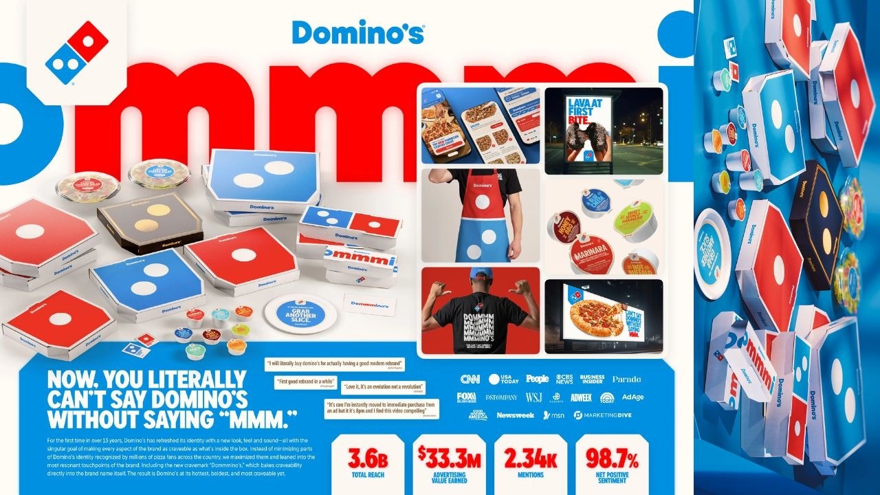 The physical and digital redesign focused on tactile, food-centric details. WorkInProgress developed a custom, rounded typeface called Domino’s Sans, engineered to feel "doughier" and more approachable across screen and store environments. The primary color palette was intensified to the highest possible vibrancy, with the signature blue specifically color-matched to the hottest core of a flame. Traditional black elements were replaced with soft whites, warm dough tones, and rich browns, while premium products like the *Handmade Pan* and *Parmesan Stuffed Crust* pizzas were assigned metallic-gold and black packaging designed to double as visual props.
High Sentiment in a Tough Climate
> *"Most companies rebrand themselves when they're struggling, but after years of category-defying growth, this refresh is about continuing to push to be the best version of ourselves."*
> - Kate Trumbull, Executive Vice President & Global Chief Marketing Officer, Domino's
Launched in October 2025, this marked the brand's first identity update in 13 years. Pre-testing revealed a 67% consumer preference for the new visual system over the 2012 look, rising to 73% among Gen Z and 70% among Millennials. The rollout achieved 3.6+ billion total impressions and 98.7% Net Positive Sentiment, avoiding the public backlash common to legacy rebrands.
Production Credits
The visual assets were brought to life with production company Morton Jankel Zander (MJZ), post-production studio 11 Dollar Bill, and editorial team Cut + Run.
4C Framework deconstruction
Company
Domino's leveraged its market dominance to boldly evolve its global visual identity system without changing its recognizable core logo.
Category
Legacy QSR brands often initiate dramatic visual overhauls reactively during business slumps, risking major consumer backlash.
Customer
Modern digital-first consumers expect cohesive, vibrant visual experiences across mobile app interfaces and physical delivery packaging.
Culture
Sonic branding and tactile packaging details now drive brand recall in a fast-moving, social-first landscape.
Company
Domino's leveraged its market dominance to boldly evolve its global visual identity system without changing its recognizable core logo.
Category
Legacy QSR brands often initiate dramatic visual overhauls reactively during business slumps, risking major consumer backlash.
Strategy:
Embed multisensory craveability across all touchpoints to modernise identity from a position of strength.
Customer
Modern digital-first consumers expect cohesive, vibrant visual experiences across mobile app interfaces and physical delivery packaging.
Culture
Sonic branding and tactile packaging details now drive brand recall in a fast-moving, social-first landscape.
Strategy:
Embed multisensory craveability across all touchpoints to modernise identity from a position of strength.
Results
The brand refresh earned 3.6B total earned reach and 98.7% net positive sentiment across media and social platforms. The campaign generated $33.3M in earned advertising value.
3.6B
total earned reach
98.7%
net positive sentiment
33.3M
earned advertising value ($)
Strategy Technique
Create a New Mental Shortcut
The strategy transforms the brand name itself into a sensory trigger, linking the vocal sound of 'Dommmino's' directly to an immediate, subconscious craving for pizza.
Explore Technique
Creative Technique
Unexpected audio
By embedding a stretched 'mmm' sound directly into the brand name, the identity uses a custom vocal mnemonic created with Shaboozey to make the spoken brand name an active sensory experience.
Explore Technique
Craft Breakdown
The identity system seamlessly merges custom typography, high-vibrancy color palettes, tactile packaging, and a distinct sonic mnemonic into a cohesive design ecosystem.
Re-architected the global identity system around doughier custom typography and vibrant flame-inspired colors while preserving the core logo.
Partnered with musician Shaboozey to establish a custom vocal 'Cravemark' that embeds sensory imagery into the brand's spoken name.
Developed the custom Domino's Sans font with stretched letterforms that bridge the auditory mnemonic with physical visual touchpoints.
Redesigned packaging suites, apparel, delivery vehicles, and app interfaces into bold visual props for everyday customer interactions.
“The stretched typography directly mirrors the vocal sonic mark, connecting visual design seamlessly with audio identity across digital and physical media.”