SOS Oceano: No Blue, No Green
SOS Oceano, a coalition of NGOs, tasked Droga5 São Paulo with elevating marine conservation in Brazilian climate discourse. The challenge was the massive disparity in attention between forests and oceans. The goal was to influence public perception and pressure the government to expand marine protected areas ahead of COP30, targeting both the general public and climate policy leaders.
Creative Idea
Removing colors from the national flag proved the ocean's essential role in terrestrial life.
By stripping the blue and green from the Brazilian flag, the campaign exposed the invisibility of marine ecosystems, using color theory to prove that without the ocean's blue, the land's green cannot exist, ultimately driving policy change for marine protection.
Turning Color Theory Into National Policy
A Scientific Approach to Pigments
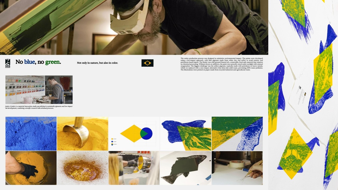
To maintain the campaign's integrity, the team rejected synthetic inks that contribute to marine pollution. Droga5 partnered with Joules & Joules Laboratory to engineer custom, 100% natural mineral-based pigments. This process required months of research to achieve the exact chromatic precision needed for the screen prints while ensuring the materials remained free of petrochemicals and synthetic solvents. The result was a series of artworks that were as environmentally responsible as the message they carried.
From Visual Protest to Legislation
The campaign addressed a massive disparity in public discourse, where the ocean was mentioned 689% less than forests in Brazilian climate discussions. By utilizing the national flag as a canvas for environmental anxiety, the agency successfully shifted the narrative. This pressure culminated on March 6, 2026, when the federal government signed Decree No. 12,868. This legislation established the Parque Nacional Marinho do Albardão, protecting over 1.6 million hectares of ocean and safeguarding 25 threatened marine species.
The Art of Naturalist Iconography
The Phase 2 screen prints were designed to honor the tradition of 19th-century naturalist illustration. Each of the six prints paired a marine species with its corresponding terrestrial flora, such as a humpback whale alongside Amazonian vegetation. By centering these illustrations within the yellow diamond of the Brazilian flag, the campaign visually reinforced the interdependence of the two biomes. Diego Limberti, Chief Design Officer at Droga5 São Paulo, noted that the project proved how design can condense complex environmental truths into a single, felt symbol that resonates with national identity.
Creative Strategy Deconstructed
Company
A coalition of NGOs with the authority to frame environmental policy and national identity.
Category
Environmental campaigns typically focus on forest preservation, ignoring the ocean's role in climate stability.
Customer
Brazilians feel deep pride in their national symbols and forests but lacked awareness of marine interdependence.
Culture
The lead-up to COP30 created a high-stakes environment for climate policy and national sustainability discourse.
Company
A coalition of NGOs with the authority to frame environmental policy and national identity.
Category
Environmental campaigns typically focus on forest preservation, ignoring the ocean's role in climate stability.
Strategy:
Expose systemic neglect by linking overlooked environmental assets to core national identity symbols.
Customer
Brazilians feel deep pride in their national symbols and forests but lacked awareness of marine interdependence.
Culture
The lead-up to COP30 created a high-stakes environment for climate policy and national sustainability discourse.
Strategy:
Expose systemic neglect by linking overlooked environmental assets to core national identity symbols.
Results
The campaign successfully launched a powerful visual movement during COP30, reimagining Brazil's national flag to highlight the interdependence of marine and terrestrial ecosystems. In partnership with Joules & Joules, the campaign created natural, petroleum-free inks made with linseed oil and sustainably sourced pigments. These inks were used to produce handcrafted prints using traditional, sustainable techniques, visually demonstrating how blue and yellow reunite to form green. The campaign raised awareness for ocean conservation under the tagline 'You can't protect what you don't see' and directed viewers to sosoceano.org.br.
Strategy Technique
Make the Invisible Visible
The ocean was consistently ignored in climate discourse despite its critical importance. By highlighting this omission, the campaign forced a shift in national priorities toward marine conservation.
Explore Technique
Creative Technique
Break visual expectations
The campaign subverted a powerful national symbol by removing its colors. This visual disruption forced the public to confront the absence of the ocean in their national identity.
Explore Technique
Craft Breakdown
This campaign's craft is elevated by its brilliant graphic design and physical production, turning a conceptual environmental message into a tangible, beautiful work of art.
The clever geometric deconstruction of the Brazilian flag to illustrate the ecological relationship between land and sea is visually brilliant and highly impactful.
The transition from stark black-and-yellow imagery to rich, hand-printed organic textures creates a powerful visual narrative that perfectly supports the campaign's message.
The physical creation of custom, petroleum-free inks and the traditional screen-printing process grounds the campaign in authentic sustainability.
The core copy 'Without blue, there is no green' is a simple, poetic, and undeniable truth that perfectly encapsulates the environmental message.
“The magic of the campaign lies in how the graphic design concept of color mixing is physically realized through sustainable paint production and printmaking.”