2025PenguinMedia & EntertainmentCase video
Penguin: Inclusive Sans
Penguin commissioned independent designer Olivia King to create a custom, accessible typeface for its global publishing house. The project aimed to standardize the brand's visual identity while honoring its 90-year mission of making reading accessible to everyone.
Creative Idea
The brand's mission of accessibility was hardcoded into its primary global typeface.
Penguin embedded accessibility into its visual identity by commissioning a custom typeface, Inclusive Sans, ensuring that its 90-year mission of democratic access to literature is structurally integrated into every page of its global publishing output.
Hardcoding Accessibility Into The Penguin Brand
From Archive Research To Modern Humanism
To develop the typeface, Olivia King conducted an extensive audit of the Penguin Archives in Bristol. She analyzed decades of historic book covers, original drawings, and typography notes to understand the brand's visual evolution. While the project evolved from the open-source Inclusive Sans (2022), the final Penguin Inclusive Sans shifted from a neo-grotesque structure to a Humanist design. This transition introduced softer curves, rounded forms, and playful flicks, ensuring the font felt approachable rather than purely clinical.
Engineering Legibility At The Glyph Level
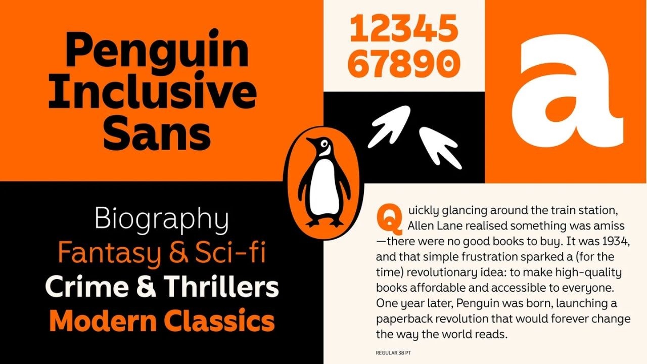
The design process prioritized character-level legibility to support readers with dyslexia and low vision. King implemented specific structural changes, such as distinct differentiation between uppercase I, lowercase l, and the digit 1, as well as non-mirroring forms for b, d, p, and q. The font features an elevated x-height and generous counter-forms to maintain clarity at small sizes. The family includes 4 main weights in Roman and Italic styles, plus a specialized Display Weight with tighter kerning for high-impact marketing headlines.
Hidden Details In The Typeface
The design team embedded subtle brand homages throughout the character set. The dots on the lowercase i and j are modeled after the eye of the iconic Penguin mascot. Furthermore, functional arrows within the glyph set are shaped like miniature penguin footprints, and various punctuation marks mirror the organic curves found in the brand's primary logo. To ensure global utility, the font supports 600+ languages, including specific character sets for Australian Aboriginal and Torres Strait Islander languages, developed in consultation with Dr. Sasha Wilmouth.
4C Framework deconstruction
Company
Penguin leveraged its 90-year history of democratizing access to books to justify a foundational shift in its global visual identity.
Category
Publishers often treat accessibility as a secondary formatting requirement rather than a core component of their primary brand design system.
Customer
Readers with dyslexia and low vision require typography that prioritizes character-level legibility without compromising the aesthetic quality of the book.
Culture
The growing industry pressure to audit foundational brand choices for inclusivity made this structural design approach both timely and culturally relevant.
Company
Penguin leveraged its 90-year history of democratizing access to books to justify a foundational shift in its global visual identity.
Category
Publishers often treat accessibility as a secondary formatting requirement rather than a core component of their primary brand design system.
Strategy:
Embed core brand values into the functional infrastructure to make inclusion an inherent, permanent product feature.
Customer
Readers with dyslexia and low vision require typography that prioritizes character-level legibility without compromising the aesthetic quality of the book.
Culture
The growing industry pressure to audit foundational brand choices for inclusivity made this structural design approach both timely and culturally relevant.
Strategy:
Embed core brand values into the functional infrastructure to make inclusion an inherent, permanent product feature.
Strategy Technique
Turn Brand Values Into Action
Instead of using marketing to claim inclusivity, the brand invested in a foundational infrastructure change. This proves their commitment by making accessibility a permanent, functional reality rather than a temporary messaging campaign.
Explore Technique
Creative Technique
Turn Message into Product
The brand's core mission of accessibility was transformed into the literal typeface used for all books. By making the font itself the solution, the message of inclusion becomes an inseparable part of the reader's experience.
Explore Technique
Craft Breakdown
This work stands out through exceptional type design craftsmanship, balancing Penguin's classic brand heritage with modern legibility and accessibility principles.
The bespoke typeface carefully engineers stroke weights, terminals, and glyph shapes for optimal readability while retaining brand character.
The typography specimen presentation demonstrates meticulous attention to kerning, hierarchy, and structural glyph construction.