2025TypeTogetherConsumer Services & B2BVideo ad
TypeTogether: Poltik
Patrycja Walczak designed the Poltik typeface family, which was published by TypeTogether in 2025. The project originated from the designer's research into 1960s Polish industrial design, resulting in a 12-style reverse contrast font family for commercial use.
Creative Idea
A retro alarm clock inspired a modern, expressive reverse contrast typeface family.
The campaign introduces Poltik, a reverse contrast typeface, by blending retro 1960s industrial aesthetics with modern, expressive typography to demonstrate how historical inspiration can create a versatile, contemporary design tool for global branding.
From Grandfather’s Desk to Global Typeface
A Clockwork Origin Story
The genesis of Poltik lies in an unlikely place: a 1970s Polish alarm clock discovered in the desk drawer of Patrycja Walczak’s grandfather. The distinct, organic, and psychedelic numeral design on the clock face served as the primary visual foundation for the entire family. By extrapolating these ten specific digits, Walczak transformed a personal heirloom into a professional, 12-style display and text typeface family.
Engineering the Reverse Contrast
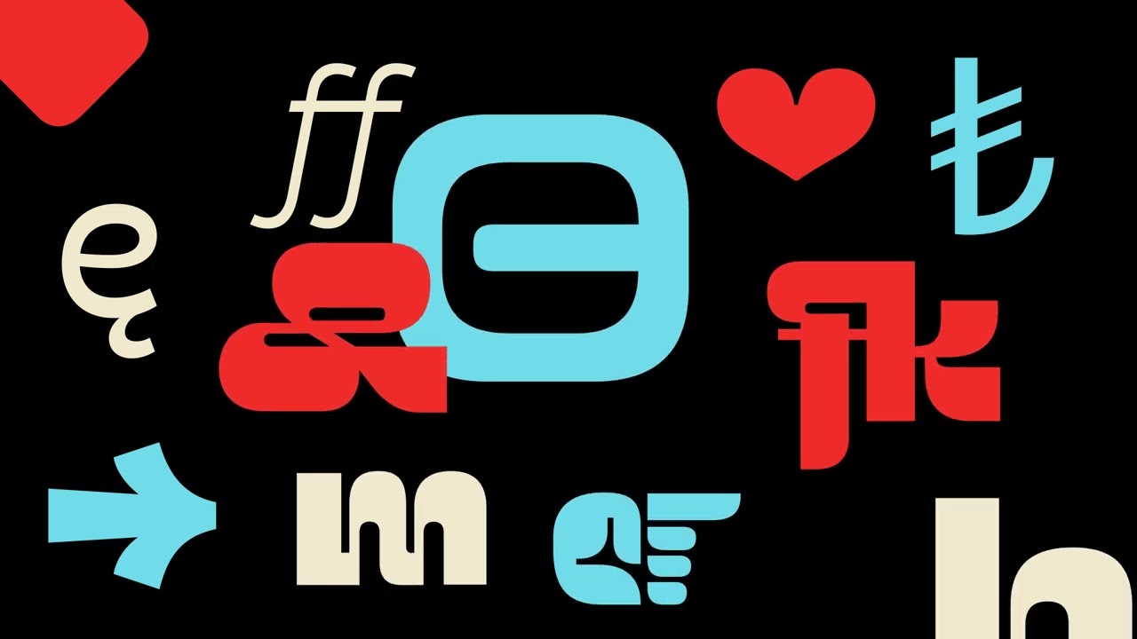
The design process focused on balancing industrial brutalism with mid-century nostalgia. The typeface features a unique two-toned, reverse-contrast structure where the weight is concentrated in the northern and southern hemispheres of each glyph. This technical choice ensures that while the display cuts offer high-impact, expressive headlines, the ten text styles remain readable and reliable for body copy. Signature details include interactive counter shapes in characters like a and e, alongside a distinct swooped leg on the K and R.
Mentorship and Industry Reception
The project gained momentum after Walczak won the 2023 Gerard Unger Scholarship, which facilitated a year of intensive development alongside TypeTogether founders José Scaglione and Veronika Burian. Scaglione noted that the design effortlessly fuses the self-assuredness of a seasoned professional with the creative ingenuity of a student. Following the April 2025 commercial launch, the collaboration extended into an educational tour across Polish design hubs, including Warsaw, Poznań, and Gdańsk, where the team hosted workshops and lectures on type critique and development. The typeface has since been adopted for diverse applications ranging from retro-modern branding and packaging to digital website headers.
4C Framework deconstruction
Company
TypeTogether leveraged its expertise in typeface development to refine and publish a student-led, high-character display and text font family.
Category
Type specimen videos often focus purely on technical glyph display rather than building a narrative around the font's historical inspiration.
Customer
Designers seek expressive, statement-making typography that balances historical charm with the reliability required for modern, functional digital and print applications.
Culture
The ongoing design trend of reviving mid-century industrial aesthetics and brutalist typography created a receptive market for retro-inspired, character-rich typefaces.
Company
TypeTogether leveraged its expertise in typeface development to refine and publish a student-led, high-character display and text font family.
Category
Type specimen videos often focus purely on technical glyph display rather than building a narrative around the font's historical inspiration.
Strategy:
Use historical artifacts to anchor contemporary design tools in recognizable, emotive cultural narratives.
Customer
Designers seek expressive, statement-making typography that balances historical charm with the reliability required for modern, functional digital and print applications.
Culture
The ongoing design trend of reviving mid-century industrial aesthetics and brutalist typography created a receptive market for retro-inspired, character-rich typefaces.
Strategy:
Use historical artifacts to anchor contemporary design tools in recognizable, emotive cultural narratives.
Strategy Technique
Lean Into Nostalgia
By anchoring the design in the specific aesthetic of a 1960s Polish alarm clock, the campaign transforms mid-century industrial nostalgia into a fresh, relevant tool for modern designers.
Explore Technique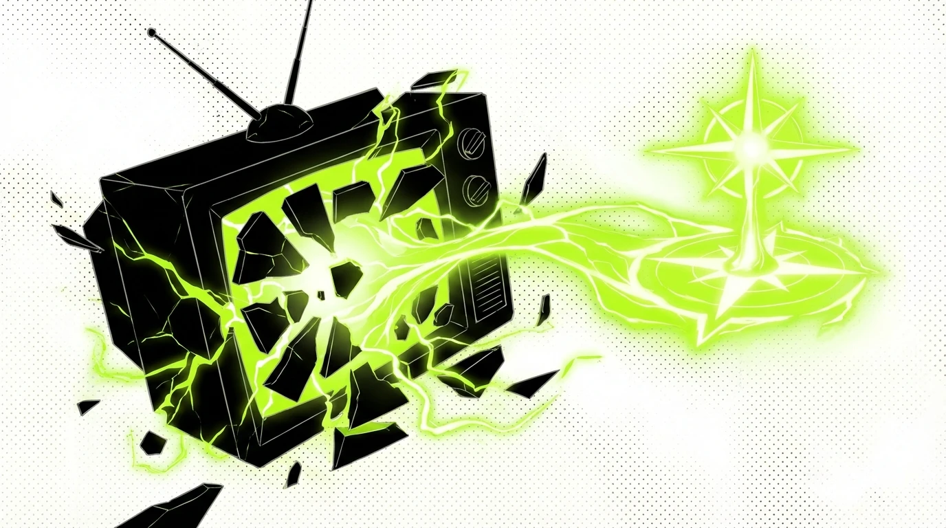
Creative Technique
Create Fantasy Worlds, People and Things
The video uses a rhythmic, retro-futuristic visual world to frame the typeface as a character. This immersive environment highlights the font's personality and versatility through dynamic motion graphics.
Explore Technique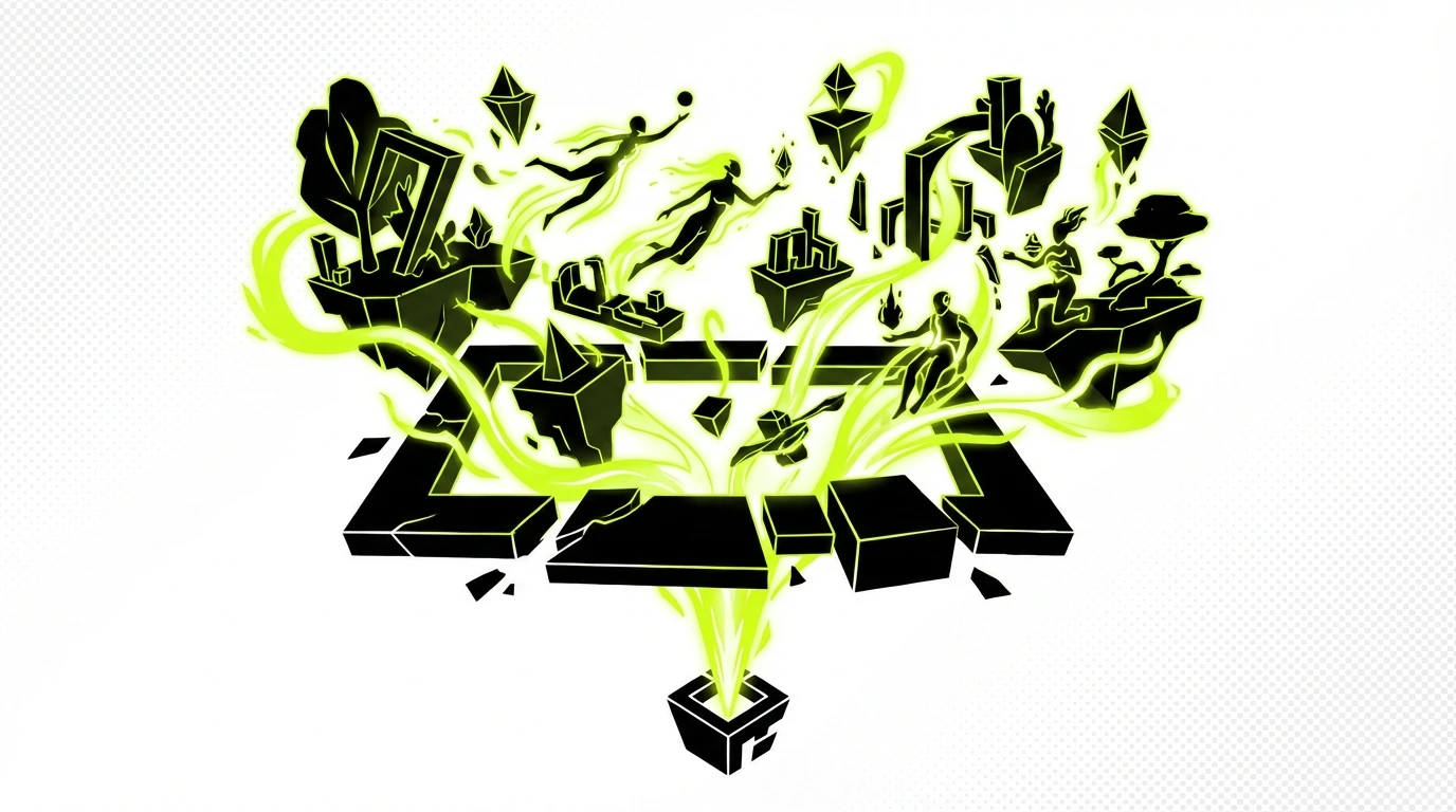
Craft Breakdown
This type specimen excels through exceptional Type Design and Animation, transforming font mechanics into a rhythmically synchronized visual performance.
The reverse-contrast typeface design strikes a remarkable balance between funky display eccentricities and clean sans-serif legibility across its 12 styles.
Kinetic typographic motion is perfectly synchronized to the musical beat, playfully illustrating the font's features and personality.
“The vibrant art direction and rhythmic motion animation seamlessly bring the unique character of the reverse-contrast typography to life.”