2025TypeTogetherConsumer Services & B2BVideo ad
TypeTogether: Sakkal Saad
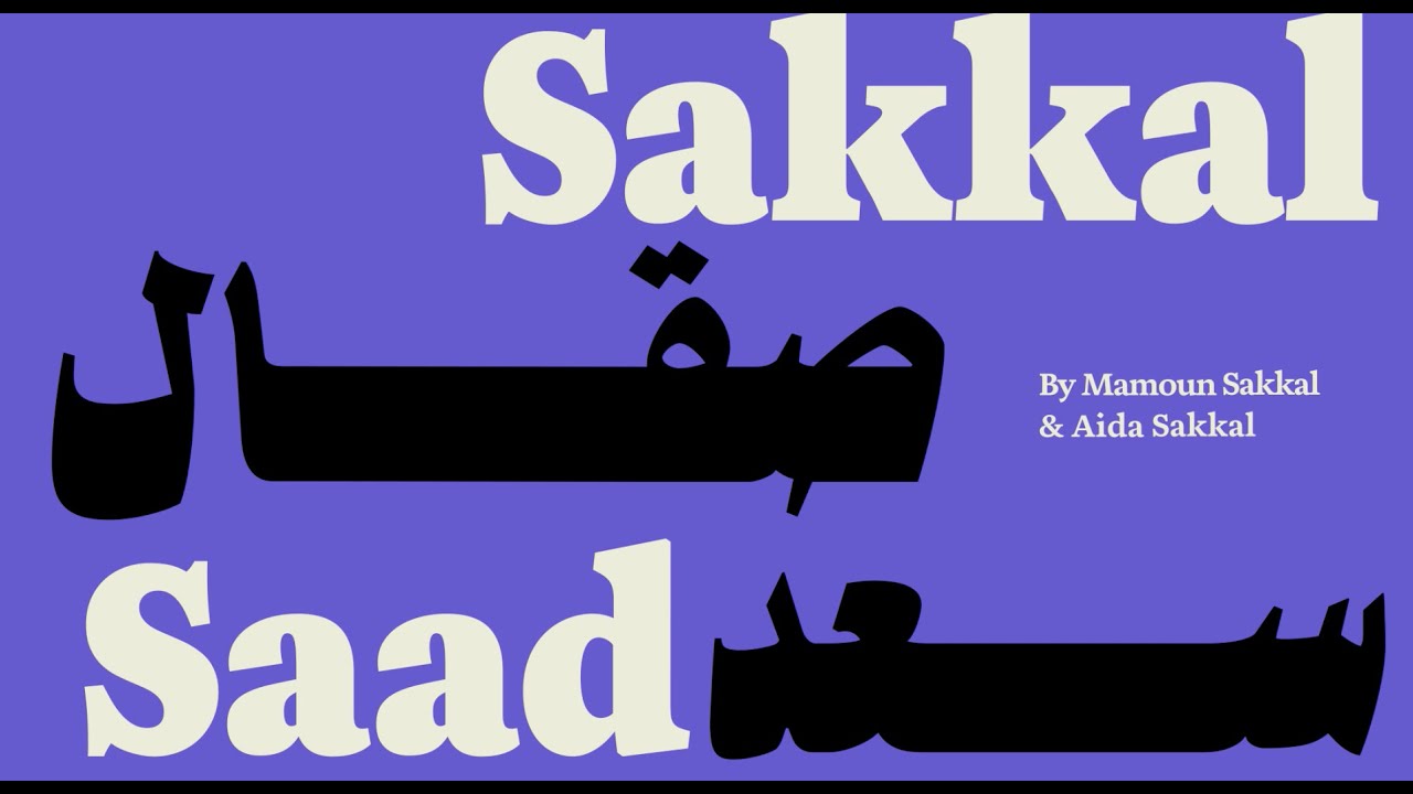
Designed by Dr. Mamoun Sakkal and Aida Sakkal, the Sakkal Saad font family was released by TypeTogether. It serves as a versatile design system that fuses mid-20th-century Middle Eastern editorial typography with contemporary sensibility for bilingual applications.
Creative Idea
Animated jazz rhythms brought the nostalgic, handwritten Naskh letterforms to life.
The typeface system revives the energetic, optimistic typography of mid-20th-century Middle Eastern editorial design, blending nostalgic handwritten Naskh aesthetics with contemporary technical precision to provide a versatile, expressive tool for modern multilingual communication.
Bridging Mid-Century Nostalgia with Digital Precision
A Technical Feat of Calligraphy
The development of Sakkal Saad involved a massive technical undertaking, resulting in a library of over 3,000 glyphs per style. The design team, led by Dr. Mamoun Sakkal and Aida Sakkal, focused on translating the energetic modulation of 1960s–1980s Arabic newspaper and film poster lettering into a functional, modern typeface. By balancing the warmth of traditional handwritten Naskh with sharp, contemporary pen strokes, the foundry created a system that maintains cultural authenticity while meeting the rigorous demands of digital screen rendering and tight print layouts.
Harmonizing Multilingual Systems
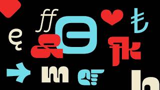
A critical component of the project was the inclusion of a custom-designed, harmonized version of the Aneto Latin font. To ensure seamless bilingual typesetting, the Latin characters were specifically adjusted to feature Arabic-styled dots and punctuation marks. This integration allows designers to pair the Arabic script with a Latin counterpart that shares the same visual DNA, preventing the disjointed aesthetic often found in multilingual editorial design.
Versatility Through Contrast
The system is divided into two distinct sub-families: Sakkal Saad, which is optimized for body text and long-form reading, and Sakkal Saad Poster, which utilizes high-contrast strokes to command attention in headlines. Across the 12 total weights - ranging from Thin to Extrabold - the Poster variant increases contrast along the baseline, allowing for a commanding presence that maximizes vertical impact without requiring excessive horizontal space. Advanced OpenType features, including kashida justification controls and 20 stylistic sets, provide users with granular control over the flow and rhythm of the text.
4C Framework deconstruction
Company
TypeTogether leveraged its expertise in multilingual typography to release a sophisticated, dual-script design system.
Category
Typeface releases often focus purely on technical utility, ignoring the emotional resonance of historical design styles.
Customer
Designers sought a contemporary Arabic font that captured the warmth and optimism of mid-century editorial typography.
Culture
A growing interest in preserving and modernizing regional cultural heritage through high-quality digital design tools.
Company
TypeTogether leveraged its expertise in multilingual typography to release a sophisticated, dual-script design system.
Category
Typeface releases often focus purely on technical utility, ignoring the emotional resonance of historical design styles.
Strategy:
Bridge historical aesthetic warmth with modern technical versatility to create culturally resonant design systems.
Customer
Designers sought a contemporary Arabic font that captured the warmth and optimism of mid-century editorial typography.
Culture
A growing interest in preserving and modernizing regional cultural heritage through high-quality digital design tools.
Strategy:
Bridge historical aesthetic warmth with modern technical versatility to create culturally resonant design systems.
Strategy Technique
Lean Into Nostalgia
The design leverages the specific aesthetic appeal of 1960s-1980s Middle Eastern typography to create a sense of cultural warmth. This strategy connects modern digital utility with a cherished, recognizable historical visual vernacular.
Explore Technique
Creative Technique
Use Art
The specimen video uses animated musical instruments and jazz rhythms to showcase the typeface's expressive, handwritten character. This artistic approach visually demonstrates the font's rhythmic quality and historical connection to vibrant editorial design.
Explore Technique
Craft Breakdown
This type specimen brilliantly synthesizes jazz music rhythms with Arabic dynamic typography, turning font demonstration into a lively animated musical performance.
The design of Sakkal Saad gracefully harmonizes Arabic calligraphic heritage with modern Latin proportions and a rich range of poster weights.
The kinetic motion seamlessly translates jazz rhythms into bouncy, expressive typographic choreography.
“The rhythm of the jazz soundtrack directly drives the kinetic typography animation, seamlessly uniting sound and graphic design.”