Empathy Map Canvas
Get Inside Your Customer's Head on One Page
The Empathy Map Canvas is the whiteboard tool everyone reaches for when they realise they've been designing for a customer they've never actually met. Six sections - Says, Thinks, Does, Feels - and a simple promise: stop guessing what's in someone's head and start writing it down where the whole team can argue about it.
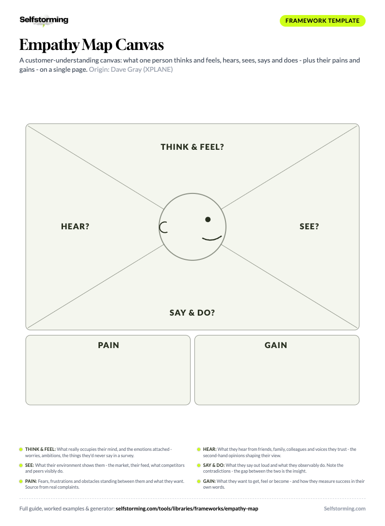
Print it. Fill it in.
The Empathy Map Canvas as a printable A4 worksheet - write straight into the framework, on paper or in any PDF app.
Download the PDF templateKnowledge Worth Paying For
A working library of brand strategy frameworks - with worked examples on real brands, sources, and decision criteria. Not vibes.
One good deck covers the subscription. The rest is profit.
One person, one situation, six sections. Four sectors around their head: Think & Feel (what occupies their mind and the emotions attached), Hear (what friends, colleagues and influencers keep telling them), See (their environment - what the market, feed and competitors show them), and Say & Do (what they voice out loud and what they observably do - watch for the gap between the two). Below the head: Pain (fears, frustrations, obstacles) and Gain (wants, needs, measures of success). Fill it from real research - interviews, reviews, support tickets - never from a brainstorm about what people 'probably' feel.
Monzo
UK challenger bank (founded 2015)A textbook case of designing from the Thinks and Feels quadrants. Monzo built its early product around the unspoken anxiety people feel about money - the dread of checking a balance, the embarrassment of asking a friend to split a bill - rather than the rational 'I want lower fees' that customers actually say out loud.
Calm
Meditation and sleep app (USA, founded 2012)Shows the danger of trusting the Says quadrant alone. Users say they want to 'meditate more' and 'be mindful,' but their Does and Feels quadrants reveal the actual job: getting to sleep at 1am while doom-scrolling. Calm leaned into Sleep Stories because the behaviour, not the stated aspiration, pointed there.
Patagonia
Outdoor apparel (USA, founded 1973)An Empathy Map where the Thinks quadrant explains a contradiction the Says quadrant hides. Customers say they buy for quality and durability, but the unspoken thoughts - guilt about consumption, a desire to signal values - are what make 'Don't Buy This Jacket' land instead of backfire.
Monzo, Calm, Patagonia - filled in, line by line. Unlock to read them.
Monzo (UK challenger bank (founded 2015))
A textbook case of designing from the Thinks and Feels quadrants. Monzo built its early product around the unspoken anxiety people feel about money - the dread of checking a balance, the embarrassment of asking a friend to split a bill - rather than the rational 'I want lower fees' that customers actually say out loud.
Think & Feel: Am I bad with money or is the app just confusing? I'm scared to look at my balance after the weekend. I don't want to be the friend who chases people for £8. Anxious because traditional statements are unreadable. Relieved because instant notifications make spending feel controllable. Proud because the spending breakdown feels like a small win.
Say & Do: I want to see where my money actually goes. The big banks treat me like a number. I just want bill-splitting that isn't awkward. Checks the app multiple times a day, screenshots spending charts to share, sets up pots before payday, asks the in-app chat instead of calling.
Hear: Flatmates rave about instant notifications; parents warn 'keep a proper bank too'; finance Twitter says the big banks are fleecing you.
See: Coral cards tapping everywhere, split-the-bill screenshots in group chats, high-street branches with queues out the door.
Pain: Unreadable statements, overdraft shame, the fear that being 'bad with money' is a personality trait.
Gain: Seeing where every pound goes, spending without dread, feeling like someone who finally has it handled.
Calm (Meditation and sleep app (USA, founded 2012))
Shows the danger of trusting the Says quadrant alone. Users say they want to 'meditate more' and 'be mindful,' but their Does and Feels quadrants reveal the actual job: getting to sleep at 1am while doom-scrolling. Calm leaned into Sleep Stories because the behaviour, not the stated aspiration, pointed there.
Think & Feel: I'll probably quit this like every other wellness app. Meditation feels like homework. I just want to stop lying awake. Guilty because they aren't 'doing it properly.' Calm because a soothing voice beats their own racing thoughts. Skeptical because past apps over-promised.
Say & Do: I want to be more mindful. I know I should meditate. I just can't switch my brain off at night. Opens the app in bed in the dark, skips past the meditation courses, plays a Sleep Story, falls asleep before it ends, never finishes a streak.
Hear: A therapist friend says 'just try ten minutes'; podcasts preach sleep hygiene; a partner keeps mentioning the snoring app ads.
See: Colleagues with meditation streaks, App Store charts full of wellness apps, Instagram serenity that feels unreachable at 1 AM.
Pain: Racing head at bedtime, guilt about quitting every wellness habit, dread of another subscription that becomes a monthly reproach.
Gain: Falling asleep without doomscrolling, and the identity upgrade of being a person who 'does mindfulness' - without the incense.
Patagonia (Outdoor apparel (USA, founded 1973))
An Empathy Map where the Thinks quadrant explains a contradiction the Says quadrant hides. Customers say they buy for quality and durability, but the unspoken thoughts - guilt about consumption, a desire to signal values - are what make 'Don't Buy This Jacket' land instead of backfire.
Think & Feel: I feel guilty about buying more stuff. I want my purchases to say something about me. Is this brand actually ethical or just marketing it? Reassured because the warranty signals real durability. Aligned because the brand confronts overconsumption out loud. Wary because greenwashing is everywhere.
Say & Do: I want gear that lasts. I'll pay more if it holds up. I hate fast fashion. Reads the repair guides, keeps a jacket for a decade, sends gear back to be fixed, checks the supply-chain page before buying.
Hear: Climbing partners judge gear by decades not seasons; the group chat mocks fast-fashion puffers; repair-cafe evangelists everywhere.
See: Worn-in jackets treated as trophies, Worn Wear patches on the trail, competitors dropping a new colourway every six weeks.
Pain: Guilt about consumption, distrust of greenwashing, the fear of paying premium for a logo that doesn't outlast the receipt.
Gain: Gear that survives a decade of abuse, and purchases that quietly say 'I buy less, but better'.
1. Think & Feel
What occupies this person's mind about the situation, and what are they feeling - including everything they'd never admit in a survey?
The unvoiced thoughts - the doubts, the calculations, the things people are too polite or too self-conscious to admit. This quadrant is mostly inference, so it's the one most in need of evidence. The gap between Says and Thinks is the most valuable real estate on the map. Pair each thought with the emotion attached and its trigger - the canvas merges the head and the heart because in real customers they never come separated.
Good answer: What if my boss thinks I overpaid? Am I the only one who finds this confusing? Everyone else seems to get it. Private anxieties that drive the decision but never make it into the testimonial.
Wrong answer: The customer thinks our product is great. Wishful projection, not inference. If your Thinks quadrant flatters you, you filled it with hope. Real Thinks notes are uncomfortable to read.
2. Hear
What is this person hearing from friends, family, colleagues, reviews and the voices they actually trust?
The second-hand layer: recommendations, warnings and received wisdom that shape their view before your brand ever gets a word in. A customer who 'heard it's a scam' from one friend will out-stubborn any landing page.
Good answer: Monzo: 'my flatmate swears by it', 'my dad says keep a real bank account too' - two voices pulling in opposite directions, both worth writing down.
Wrong answer: Filling this with YOUR media plan ('they hear our radio spot'). It's what trusted humans tell them, not what you broadcast at them.
3. See
What does this person's environment look like - what do the market, their feed and their peers visibly show them?
The visual field: what competitors promise, what their peer group visibly uses, what their feed keeps serving. It sets the baseline of what feels normal, premium or embarrassing in the category.
Good answer: Monzo: coral cards tapping at every pub table, TikToks of spending breakdowns, high-street branches with queues - the contrast does half the selling.
Wrong answer: Describing their environment from your office instead of theirs. If you haven't looked at their actual feed or street, you're decorating, not observing.
4. Say & Do
What does this person say out loud, and what do they observably do - and where do the two contradict each other?
Direct quotes - verbatim if you have them. What the customer voices in interviews, support tickets, reviews, sales calls. The most reliable quadrant because it's observable, but also the most performed: people say the socially acceptable thing. Put it side by side with behaviour: Actions you can watch, not motivations you imagine. What the person does before, during, and after - the tabs they open, the workarounds they build, the people they ask. Behaviour is honest in a way that stated preference rarely is. The gap between the quote and the action is usually the sharpest insight on the whole canvas.
Good answer: Opens three competitor tabs, reads reviews on their phone in bed, screenshots the pricing to send to a colleague, abandons the cart twice before buying. Each one is a thing you could film.
Wrong answer: Treating the quote as the truth. People say 'price doesn't matter' and then screenshot discount codes - map both, trust the behaviour.
5. Pain
What fears, frustrations and obstacles stand between this person and what they want?
The friction ledger: risks they dread, hassles they tolerate, past disappointments they generalise from. Sourced from real complaints, reviews and support tickets - not imagined objections.
Good answer: Calm: guilt about 'not doing it properly', fear of becoming the person who bought another unused subscription.
Wrong answer: Writing product gaps ('lacks feature X') instead of human pains. The pain is the shame, anxiety or wasted evening - the feature gap is merely where it comes from.
6. Gain
What does this person want to get, feel or become - and how do they measure success in their own words?
The payoff column: outcomes wished for, feelings chased, the identity they're quietly buying. Write it in their words ('no dread when the card taps'), not yours ('financial wellness').
Good answer: Patagonia: gear that outlives the trend cycle, and the quiet identity payoff of being the person who repairs instead of replaces.
Wrong answer: Listing your value proposition as their gain. If they wouldn't say it in a pub, it doesn't belong in the box.
Decide your starting point: You don't need a wall of sticky notes and a free afternoon to begin. Right here on Selfstorming you can generate a first-draft Empathy Map in minutes from what you already know about your customer. Treat that draft as a hypothesis, not a conclusion - then run it through the steps below to pressure-test every quadrant against real evidence. Workshop-from-scratch and AI-draft-then-verify are both valid; most teams move faster starting from a draft and then hunting for what's wrong with it.
Pick one person and one situation: An Empathy Map of 'our users' covers nobody. Choose a single archetypal person in a single moment - 'a first-time buyer at the checkout,' not 'customers.' The same human Thinks and Feels completely different things at onboarding vs at cancellation.
Gather the raw material before you draw: Pull interview transcripts, support tickets, reviews, sales-call notes, session recordings. The map is a sorting exercise - if you have nothing to sort, you'll fill it with invention and call it insight.
Fill Says and Does first - they're observable: Start with the two quadrants you can source from evidence. Quote people verbatim in Says. Describe watchable behaviour in Does. Anchoring on the observable keeps the inferred quadrants honest.
Infer Thinks and Feels, but tag every guess: These two are mostly inference, so mark each note evidence or assumption. An unlabelled assumption in the Thinks quadrant is how a team convinces itself it understands a customer it has never met.
Hunt the Says-Thinks gap: Put the two quadrants side by side. Where someone says one thing but the evidence suggests they think another, you've found the most useful line on the page - that gap is usually where the real product opportunity lives.
Treat empty quadrants as a research backlog: If a quadrant is thin or blank, don't fill it to look complete. Write the question you can't answer yet and book the interview. The gap is the map earning its keep.
Turn the map into one design decision: A finished Empathy Map that changes nothing was decoration. End every session by naming one thing you'll do differently - a copy change, a feature cut, a support tweak - because of what the map revealed.
Best for: Aligning a team on who they're designing for early in a project. Synthesising messy qualitative research into one shared, scannable picture of a customer in a specific situation. / Quantitative segmentation, market sizing, or any decision that needs statistical confidence. The Empathy Map is qualitative scaffolding, not a data model.
Output: A one-page, four-quadrant artifact - Says, Thinks, Does, Feels - around a single person in a single moment, with each note traceable to evidence. / A polished persona document with names, photos, and demographics, or a full end-to-end journey. Those are downstream artifacts the map feeds, not the map itself.
Time to complete: 20 to 60 minutes per map once the research is gathered. The structure is so simple the time goes into sourcing notes, not drawing boxes. / Multi-week research programmes with recruiting, fieldwork, and analysis. The map is the synthesis step at the end of that, not the whole study.
vs Customer Persona: Empathy Map is faster, narrower, and behaviour-first - one person, one situation, four quadrants. Great as the raw input you build a persona from. / A Customer Persona consolidates across many people into a reusable archetype with goals, demographics, and channels. Use the persona when you need a durable reference, not a single-moment snapshot.
vs Value Proposition Canvas: Empathy Map captures the whole emotional and behavioural picture of a person without forcing it toward a product fit yet. Better for open exploration. / The Value Proposition Canvas zeroes in on jobs, pains, and gains and maps them directly to your offer. Use it when you're ready to connect customer needs to product features.
vs Jobs To Be Done: Empathy Map is a snapshot of a person's inner and outer state in a moment - rich on emotion, light on causality. Good for building team empathy fast. / Jobs To Be Done asks what progress the customer is hiring the product to make, and is stronger on causal 'why.' Use JTBD when you need the underlying motivation, not the surface state.
The Empathy Map was created in the mid-to-late 2000s at the design consultancy XPLANE, where founder Dave Gray refined an earlier 'big heads' sketching technique into a structured four-quadrant tool. It was first widely published in the 2010 book Gamestorming: A Playbook for Innovators, Rulebreakers, and Changemakers by Dave Gray, Sunni Brown and James Macanufo, and spread through Stanford's d.school curriculum and design-thinking workshops worldwide. In 2017 Gray released an updated Empathy Map Canvas, built with input from Alex Osterwalder (of the Business Model Canvas), which added goals, numbered the sections to suggest a sequence, and moved Think and Feel to the centre to sharpen the line between observable behaviour and internal mental states. Gray's stated motivation for the update was that the original concept had 'gotten lost in translation' as degraded versions proliferated online.
The most common criticism is that an Empathy Map filled without real research is just confident guesswork - all assumption, no evidence - that gives a team false certainty about a customer it has never spoken to. Practitioners also point out that the quadrants overlap awkwardly: the same note often fits both Says and Thinks, and Thinks blurs into Feels, so a weakly facilitated map ends up fuzzy and duplicated. A third objection is simple reductiveness - four boxes can't hold context, environment, goals, and social pressure, so the map flattens a human into stickies. The honest defence is the one Dave Gray and NN/g both make: treat empty quadrants as a research backlog, tag every inferred note as an assumption, and never mistake the map for the interviews it's supposed to summarise.
What is an Empathy Map Canvas?
An Empathy Map Canvas is a four-quadrant tool for capturing what a specific person Says, Thinks, Does, and Feels in a specific situation. It turns scattered qualitative research - interviews, support tickets, reviews - into one shared, scannable picture of a customer that a whole team can align on. Crucially, it's a synthesis tool, not a research method: it organises insight you already gathered and shows you where your understanding has gaps.
Who created the Empathy Map Canvas?
The Empathy Map Canvas was created at the design consultancy XPLANE in the mid-to-late 2000s, refined by founder Dave Gray from an earlier sketching technique. It was popularised in the 2010 book Gamestorming by Gray, Sunni Brown and James Macanufo. Gray released an updated Empathy Map Canvas in 2017, developed with input from Alex Osterwalder, that added goals and re-sequenced the sections.
What's the difference between the Says and Thinks quadrants in an Empathy Map Canvas?
Says is what the person voices out loud - verbatim quotes from interviews, calls, or reviews. Thinks is what occupies their mind but they won't say, often because of politeness or self-consciousness. The two frequently overlap, and that's fine, but the real value is in the gap: when someone says one thing and the evidence suggests they believe another, you've usually found the product opportunity.
How is an Empathy Map Canvas different from a Customer Persona?
An Empathy Map Canvas is a snapshot of one person in one moment, organised by Says/Thinks/Does/Feels and built directly from research. A Customer Persona consolidates many people into a durable, reusable archetype with a name, goals, demographics, and channels. The Empathy Map Canvas is often the raw input you build a persona from - faster and narrower, where the persona is the polished, long-lived reference.
Does an Empathy Map Canvas need real user research?
Yes, and skipping it is the single biggest failure mode. An Empathy Map Canvas built from imagination is confident-looking fiction that gives a team false certainty. Source every note from an interview, a ticket, a review, or a recording, and tag inferred notes (mostly in Thinks and Feels) as assumptions. If a quadrant has nothing real to put in it, that empty space is the map telling you which research to do next.
How many Empathy Map Canvass should we make?
One per person per situation that matters. The same customer thinks and feels completely different things at sign-up than at renewal or cancellation, so a single map covering 'our users' across 'their whole experience' ends up describing nobody. Scope each map tightly to one archetype in one moment, then make as many as the journey requires.
Does the Empathy Map Canvas work for B2B?
Yes, and the Thinks quadrant does extra work in B2B because buying decisions carry career risk. The unvoiced 'what if this makes me look bad to my boss?' rarely shows up in a sales call but heavily drives the decision. Mapping a specific role in a specific buying moment - 'a mid-level manager evaluating a new tool' - surfaces the political and emotional pressures that a feature comparison sheet completely misses.
A customer-understanding canvas: what one person thinks and feels, hears, sees, says and does - plus their pains and gains - on a single page.
Done well, it's the fastest way to turn a pile of messy interview notes into one shared picture of a real human. Done badly, it's four sticky-note clusters of pure invention, dressed up as research, that make a room feel like it understands a customer it has never spoken to.
The Empathy Map Canvas doesn't generate insight. It organises it - and, more usefully, it shows you the gaps. An empty quadrant is the map doing its job: it's telling you which question you can't yet answer. This page walks through each quadrant, the question that unlocks it, and how to tell an Empathy Map Canvas built on evidence from one built on vibes.
Related Frameworks
Value Proposition Canvas
Two halves, one rule. The customer profile (a circle) maps Customer Jobs (what they're trying to get done), Pains (what gets in the way), an
Jobs To Be Done
Jobs To Be Done says customers hire products to make progress in a situation, not because of who they are demographically. The mechanism is
Bullseye Customer
The Bullseye Customer is three concentric rings of audience. The core is your sharpest, single best-fit early customer - the beachhead you w
Customer Persona
A Customer Persona compresses real research into one archetypal person you can design and write for. Five parts: Profile (who they are in on