Kotex: Art's Missing Period
Kotex tasked DAVID with addressing the persistent stigma surrounding menstruation. The goal was to challenge the cultural double standard that accepts violent imagery in art while censoring menstrual themes. The agency needed to reach a broad audience, including art enthusiasts and women, to spark a global conversation about bodily autonomy and the normalization of the female cycle, effectively shifting the brand from a product provider to a cultural advocate.
Creative Idea
Exposed the hypocrisy of celebrating violent art while censoring menstrual art.
Kotex launched a virtual gallery of censored menstrual art to expose the double standard where art depicting violent blood is celebrated, while art depicting the blood of life and creation is systematically silenced and shamed.
Exposing the Double Standard of Blood
Curating the Censored
The virtual gallery serves as the campaign's backbone, housing over 40 pieces of art that were historically rejected or labeled as too sensitive by traditional institutions. By digitizing these works, the agency bypassed the very gatekeepers who previously silenced these artists. The exhibition is designed to remain active for one full year, ensuring the conversation persists well beyond the initial launch window.
Guerrilla Tactics in New York
To bridge the gap between digital advocacy and physical reality, the team deployed high-impact mobile billboards and wild postings strategically placed outside New York City’s most prestigious art museums. This guerrilla approach forced a direct confrontation with the art world's establishment, highlighting the irony of celebrating violent, blood-soaked historical masterpieces while simultaneously shaming the natural, life-giving blood of the female cycle.

A Global Creative Collaboration
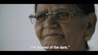
The project was a massive cross-continental effort, spearheaded by DAVID London and Ogilvy Singapore. The creative vision was driven by a diverse leadership team including Pancho Cassis, Nicolas Courant, and Daniel Lobaton. The campaign’s centerpiece is an 8 minute and 44 second documentary that provides a deep dive into the artists' experiences with censorship. By framing menstruation as an act of creation rather than a taboo, the campaign successfully shifted the brand’s narrative from a simple product provider to a vocal cultural advocate, setting a new benchmark for how feminine care brands engage with social issues on a global stage.
Creative Strategy Deconstructed
Company
As a leader in feminine care, Kotex has the authority to challenge societal stigmas surrounding menstruation.
Category
Feminine care brands typically use clinical, sanitized imagery to avoid offending consumers or retailers.
Customer
Women feel frustrated that their natural biological reality is treated as shameful, dirty, or invisible.
Culture
The growing movement to de-stigmatize menstruation and demand authentic representation in art and media.
Company
As a leader in feminine care, Kotex has the authority to challenge societal stigmas surrounding menstruation.
Category
Feminine care brands typically use clinical, sanitized imagery to avoid offending consumers or retailers.
Strategy:
Expose systemic hypocrisy by highlighting the contrast between accepted violence and rejected natural creation.
Customer
Women feel frustrated that their natural biological reality is treated as shameful, dirty, or invisible.
Culture
The growing movement to de-stigmatize menstruation and demand authentic representation in art and media.
Strategy:
Expose systemic hypocrisy by highlighting the contrast between accepted violence and rejected natural creation.
Strategy Technique
Find the Missing Conversation
The brand identified a cultural taboo that everyone avoids discussing in art spaces. By claiming this uncomfortable conversation, Kotex positions itself as the champion of authentic female expression.
Explore Technique
Creative Technique
Expose the Hidden
The campaign unearths and displays artworks that were previously censored or rejected due to menstrual themes. It directly challenges institutional silence by giving a public platform to the suppressed reality of the female cycle.
Explore Technique
Craft Breakdown
The campaign's exceptional craft lies in its powerful copywriting and thoughtful art direction, which elevate a sensitive topic into a compelling historical narrative.
The script beautifully frames menstruation as a symbol of life and creation, contrasting it against accepted depictions of violence.
The cohesive use of red color grading, symbolic ink imagery, and elegant typography unifies diverse historical and modern art pieces.
The interview setups are beautifully composed with soft, natural lighting that lends dignity and intimacy to the subjects.
The atmospheric, rhythmic score builds tension and emotional resonance without overpowering the spoken testimonies.
“The synergy between the poetic copywriting and the striking red-dominated art direction creates a deeply moving and visually unforgettable argument against censorship.”