Aster DM Healthcare: The Nazar Initiative
Aster DM Healthcare tasked The Classic Partnership Advertising Dubai with increasing eye health awareness among the UAE's blue-collar construction workers. The brand faced a significant challenge: standard vision tests were ineffective because the target audience was largely illiterate or did not read the Latin alphabet. They needed a way to make vision screening accessible and encourage workers to seek professional medical help for work-related eye damage.
Creative Idea
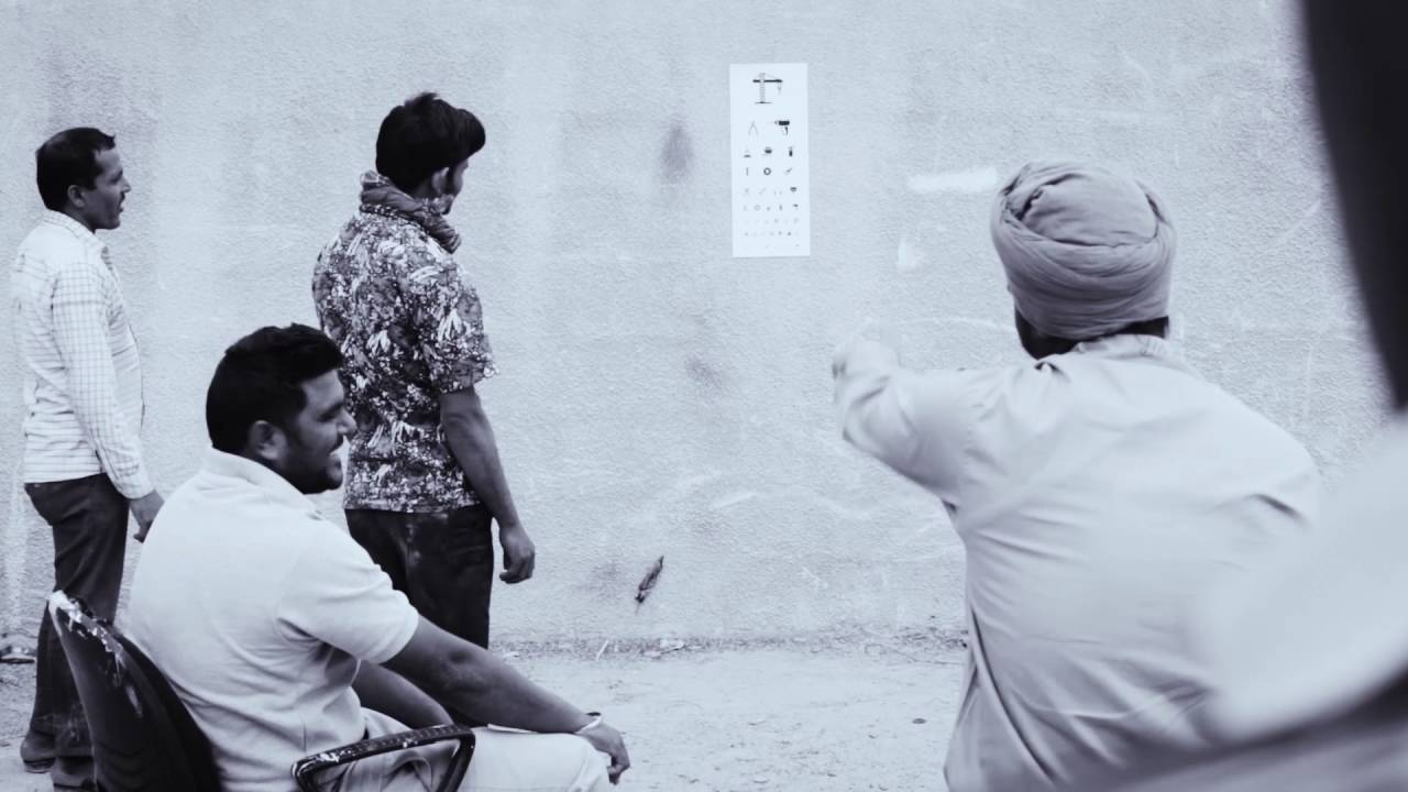
Replaced letters on eye charts with construction tool icons to enable illiterate workers to self-screen.
Aster DM Healthcare replaced standard Snellen eye charts with a pictorial version featuring construction tools, allowing illiterate blue-collar workers to self-screen for vision damage caused by harsh site conditions and overcome language barriers to access essential medical care.
The Eye Chart That Spoke Without Letters
Tools of the Trade
The production team recognized that construction workers in Dubai face a unique environmental hazard: high albedo. This phenomenon occurs when intense sunlight reflects off light-toned desert sand, causing gradual but severe vision impairment. To bridge the literacy gap, The Classic Partnership meticulously selected icons of hammers, wrenches, and screwdrivers - objects the workers handled daily. By transforming these tools into a "universal language," the agency bypassed the need for the Latin alphabet used in traditional Snellen charts.
Impact Beyond the Site
The initiative reached over 7,000 workers in its inaugural year, revealing that 15% of the population tested suffered from poor vision. Beyond mere awareness, Aster provided hundreds of free toolkits and prescription glasses to those identified during the screenings. CEO Rahul Nagpal noted that the primary hurdle was the workers' inability to engage with standard medical infrastructure, leading the team to design a solution that could be interpreted by anyone, regardless of their educational background.
A Linguistic and Cultural Bridge
The name Nazar was a deliberate choice, as it translates to "Vision" or "Sight" across Hindi, Urdu, and Arabic - the primary languages of the UAE's diverse labor force. While the campaign was localized for Dubai's construction sector, the creative team highlighted that the pictorial system is a scalable model for illiterate populations globally. This project marked a shift in regional CSR, moving away from temporary "health camps" toward inclusive design tools that empower individuals to initiate their own medical care.
Creative Strategy Deconstructed
Company
Aster DM Healthcare offered extensive medical facilities and a commitment to inclusive community health for the UAE's diverse workforce.
Category
Healthcare providers typically rely on standard diagnostic tools and English-language communication that exclude non-literate or non-English speaking populations.
Customer
Blue-collar workers faced deteriorating vision from harsh site conditions but couldn't use standard eye charts due to literacy barriers.
Culture
The UAE's massive construction sector relies on a migrant workforce that communicates through shared vocational symbols rather than formal language.
Company
Aster DM Healthcare offered extensive medical facilities and a commitment to inclusive community health for the UAE's diverse workforce.
Category
Healthcare providers typically rely on standard diagnostic tools and English-language communication that exclude non-literate or non-English speaking populations.
Strategy:
Redesign essential diagnostic tools using universal vocational symbols to bypass literacy barriers and democratize healthcare access.
Customer
Blue-collar workers faced deteriorating vision from harsh site conditions but couldn't use standard eye charts due to literacy barriers.
Culture
The UAE's massive construction sector relies on a migrant workforce that communicates through shared vocational symbols rather than formal language.
Strategy:
Redesign essential diagnostic tools using universal vocational symbols to bypass literacy barriers and democratize healthcare access.
Results
The Nazar Initiative reached over 7,000 workers within its first year of implementation. Screening results identified that 15% of the workers tested had poor vision and required medical intervention. In response, Aster DM Healthcare provided hundreds of free toolkits, professional eye check-ups, and prescription glasses to those in need. The campaign achieved significant industry recognition, becoming the first UAE campaign to win both a Gold and Silver Lion in the Healthcare category at the Cannes Lions International Festival of Creativity. It also secured multiple awards at Dubai Lynx, the AME Awards, and was recognized at The One Show and D&AD.
7,000+
Workers reached in first year
15%
Identified with vision impairment
1st
UAE Gold Lion in Healthcare
Strategy Technique
Build an Utility, Not an Ad
Instead of traditional awareness advertising, the brand created a functional tool that solved the immediate barrier to diagnosis, making the service accessible to the illiterate.
Explore Technique
Creative Technique
Unexpected Utility
The campaign transformed a standard medical diagnostic tool into a culturally relevant, pictorial chart that functioned as a practical utility for a specific, underserved demographic.
Explore Technique
Craft Breakdown
The campaign brilliantly re-engineers a standard medical diagnostic tool into a culturally relevant, pictorial language that bypasses literacy and language barriers.
The transformation of the Snellen chart into a pictorial system using construction tools is a masterclass in inclusive, functional design.
By enabling self-screening at labor camps, the campaign redesigned the patient journey to be accessible for marginalized communities.
The visual execution uses high-contrast, recognizable iconography that maintains the scientific integrity of an eye test while remaining approachable.
The initiative successfully positioned a corporate healthcare provider as a community-first advocate, generating global prestige for regional CSR.
“The magic lies in the intersection of medical science and semiotics, where the 'universal language' of tools turned a barrier to care into a bridge for health.”