Apple: Apple TV Rebrand
Apple tasked TBWA\Media Arts Lab with resolving the brand confusion surrounding its streaming service. The goal was to unify the app, hardware, and subscription under one cohesive identity. The client needed a strategy that would elevate the service's perception to match its award-winning content, ensuring global audiences could instantly identify the brand across all touchpoints.
Creative Idea
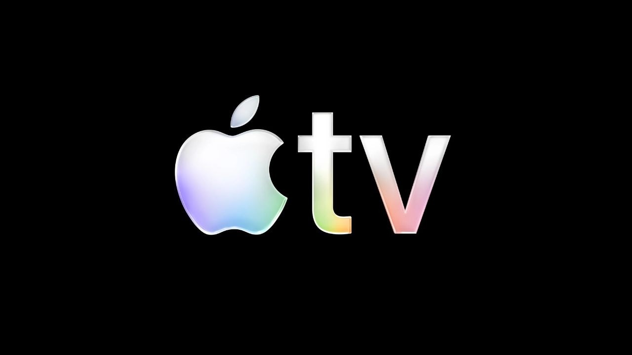
Transformed the logo into a physical, cinematic object to signify premium storytelling quality.
Apple unified its fragmented streaming identity by replacing the 'Plus' suffix with a bold, cinematic visual language. By using real glass and light to create physical mnemonics, the brand transformed its logo into a badge of premium storytelling intent.
Crafting the Physicality of Cinematic Light
A Masterclass in Practical Effects
To move away from the digital-first aesthetic of the previous "Plus" era, the production team at Optical Arts insisted on capturing the new identity through in-camera practical effects. Rather than relying on CGI, the team utilized custom-built glass prisms and high-intensity light arrays to refract the Apple TV logo. This approach ensured that the brand’s new visual language possessed a tangible, cinematic weight that mirrored the high-production value of the platform’s original programming.
The Sonic Architecture of Finneas
The sonic identity was a deliberate departure from traditional corporate jingles. Finneas O'Connell was brought in to compose a mnemonic that functioned less like a brand alert and more like a film score cue. By utilizing a blend of analog synthesizers and organic room acoustics, he created a soundscape that signals the start of a premium viewing experience. The goal was to trigger a Pavlovian response in the viewer, signaling that the content following the logo is of a specific, high-budget caliber.
Unifying the Ecosystem
The strategic pivot was driven by Eddy Cue, who identified that the "Plus" suffix had become a point of friction for consumers navigating between hardware and software. By stripping the name down to just Apple TV, the brand successfully aligned its streaming service with its hardware identity. This consolidation was not merely cosmetic; it was a structural change that simplified the user interface across tvOS 26.1, effectively removing the cognitive load for users trying to distinguish between the app, the service, and the physical set-top box. The result was a seamless, unified ecosystem that solidified Apple's position in a crowded streaming market.
Creative Strategy Deconstructed
Company
Apple possessed a deep library of award-winning original content and a reputation for uncompromising design and technical craft.
Category
Streaming services typically clutter their branding with complex naming conventions and generic, flat digital logos that lack physical presence.
Customer
Viewers struggled to distinguish between the app, the hardware, and the service, leading to brand confusion and diminished perceived value.
Culture
The rise of subscription fatigue demanded that platforms prove their premium status through immediate, unmistakable visual recognition and brand authority.
Company
Apple possessed a deep library of award-winning original content and a reputation for uncompromising design and technical craft.
Category
Streaming services typically clutter their branding with complex naming conventions and generic, flat digital logos that lack physical presence.
Strategy:
Simplify brand architecture to a single, iconic anchor to command immediate recognition and premium status.
Customer
Viewers struggled to distinguish between the app, the hardware, and the service, leading to brand confusion and diminished perceived value.
Culture
The rise of subscription fatigue demanded that platforms prove their premium status through immediate, unmistakable visual recognition and brand authority.
Strategy:
Simplify brand architecture to a single, iconic anchor to command immediate recognition and premium status.
Strategy Technique
Drill Down to a Single Word
The strategy stripped away the confusing 'Plus' suffix to focus entirely on the core brand name. This ruthless simplification created a singular, powerful mental shortcut for consumers across all platforms.
Explore Technique
Creative Technique
Celebrate a Symbol
The campaign elevates the Apple TV logo into a physical, cinematic object. By filming real glass and light, it transforms a simple brand mark into a tangible representation of high-end production quality.
Explore Technique
Craft Breakdown
This campaign's craft is elevated by its exceptional cinematography and lighting, which transform a simple glass logo into a dynamic and mesmerizing visual experience.
The dynamic camera movement and precise framing capture the intricate details and reflections of the glass logo beautifully.
The use of vibrant, shifting color palettes and high-contrast lighting creates a visually stunning and modern aesthetic.
“The synergy between the dynamic cinematography and the vibrant art direction creates a cohesive and visually captivating experience.”