Sydney Opera House: Shifting Perspectives
The Sydney Opera House faced a challenge: while millions visited the site to photograph the exterior, few engaged with the performances inside. Interbrand Sydney was tasked with creating a unified brand identity that could house everything from opera to contemporary music, moving the icon from a 'selfie backdrop' to a vibrant cultural destination for both locals and international tourists.
Creative Idea
Created a 3D typeface derived from the building's geometry to unify all internal performances.
To unify its diverse cultural offerings, the Sydney Opera House created a sculptural 3D typeface derived from its iconic architecture, transforming a static landmark into a dynamic, content-led brand that reflects the building's core philosophy of shifting perspectives.
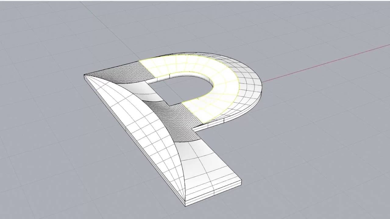
The Typeface Built With Engineering Software
The Spherical Solution in 3D
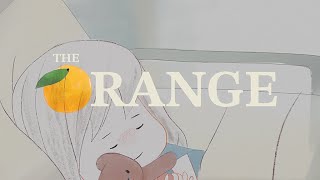
To move beyond a static logo, Interbrand Australia collaborated with Studio Laurenz Brunner and Collider to develop the Utzon typeface. Unlike standard fonts, this was built using engineering software to mirror the structural integrity of the building’s sails. The geometry is so precise that the letters can be 3D printed as physical objects. This design honors Jørn Utzon’s original Spherical Solution, where he proved all the building's sails could be derived from the surface of a single orange.
A Custom Script for In-House Design
 Because the 3D typography was technically complex, the agency developed a custom InDesign script for the Opera House’s internal team. This allowed staff to type in plain text and automatically render it into the Utzon style with accurate shading and geometry. The color palette was equally grounded in the site’s DNA, with primary tones Shell, Dusk, and Clay sampled directly from the exterior tiles and concrete, while secondary colors were pulled from Utzon’s 1960s interior tapestries.
From Selfie Backdrop to Sales Engine
The two - year project transformed the site’s economic performance. Following the launch, the Opera House’s economic contribution rose 44% to $1.2 billion, and digital engagement surged by over 400%. A 2017 digital initiative integrated with the new brand generated $2 million in ticket sales within just 24 hours. Executive Creative Director Chris Maclean noted the goal was to show that while the building looks great from the harbor, "the real magic happens inside," successfully shifting the brand from a passive landmark to a content - led cultural powerhouse.
Creative Strategy Deconstructed
Company
A world-famous architectural icon with a diverse but fragmented range of world-class cultural performances and experiences.
Category
Cultural institutions often rely on static logos and traditional advertising that fails to capture the dynamic nature of live performance.
Customer
Visitors admired the building's exterior as a tourist landmark but lacked a clear connection to the creative magic happening inside.
Culture
The rise of digital-first, content-driven branding required a visual language that could adapt across multiple platforms and artistic genres.
Company
A world-famous architectural icon with a diverse but fragmented range of world-class cultural performances and experiences.
Category
Cultural institutions often rely on static logos and traditional advertising that fails to capture the dynamic nature of live performance.
Strategy:
Translate physical architectural geometry into a dynamic visual system to unify disparate sub-brands under a master identity.
Customer
Visitors admired the building's exterior as a tourist landmark but lacked a clear connection to the creative magic happening inside.
Culture
The rise of digital-first, content-driven branding required a visual language that could adapt across multiple platforms and artistic genres.
Strategy:
Translate physical architectural geometry into a dynamic visual system to unify disparate sub-brands under a master identity.
Strategy Technique
Reframe the Problem
Instead of treating the building as a static backdrop, the strategy reframed the Opera House as a living, breathing brand that invites visitors to experience the art within.
Explore Technique
Creative Technique
Use Art
The campaign uses custom sculptural typography as a primary artistic medium to bridge the gap between the building's famous exterior and the diverse performances happening inside.
Explore Technique
Craft Breakdown
The campaign's craft is exceptional due to its deep integration of architectural principles into a modern brand identity, particularly through the creation of a custom sculptural typeface.
The creation of a comprehensive visual system that translates complex architectural geometry into a functional and inspiring brand identity.
The development of a custom sculptural typeface that mirrors the building's contours and provides a unique and recognizable voice for the brand.
The use of 3D modeling and animation to bring the brand's geometric language to life and demonstrate its dynamic nature.
The cohesive and sophisticated visual style that consistently reflects the brand's core values and the building's iconic status.
“The synergy between design, typography, and 3D modeling creates a brand identity that is not just a logo, but a living, breathing extension of the Sydney Opera House's architecture.”