2025D&ADNot-for-Profit & GovernmentCase video
D&AD: Drawn to D&AD
D&AD commissioned Jones Knowles Ritchie to develop a new identity system. The project, which included the creation of the Pencil Gothic typeface, aimed to reposition the organization around the intrinsic drive to create rather than the pursuit of awards.
Creative Idea
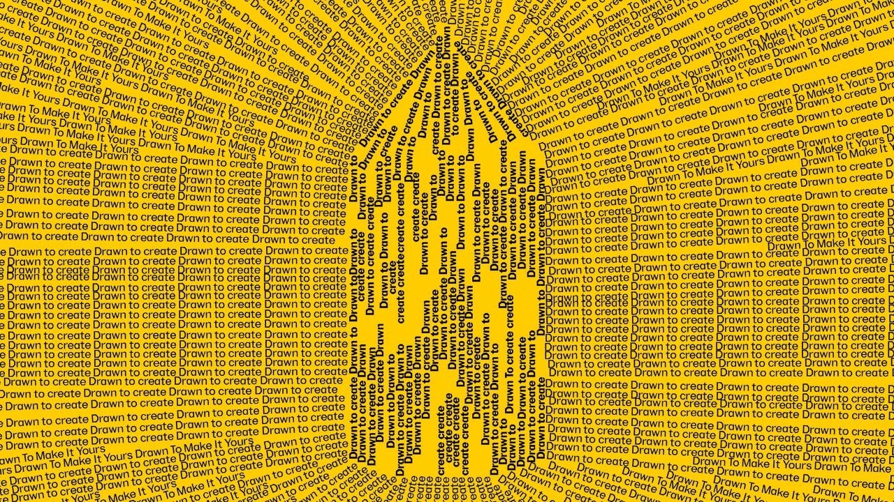
The Pencil icon became a magnetic force that pulled all design elements together.
D&AD repositioned its iconic Pencil as a magnetic symbol of creative drive rather than just a trophy, using a custom typeface and kinetic design to connect the act of drawing with the community's intrinsic compulsion to create.
Designing for the World's Toughest Critics
The Geometry of a Pencil
The development of the custom typeface, Pencil Gothic, was a technical exercise in brand geometry. Created by JKR in collaboration with Studio DRAMA, the font features 30-degree terminals and hexagonal counters that mirror the physical structure of the D&AD Pencil. The design team intentionally built the typeface to respond in real-time to motion and user proximity, allowing the letterforms to intensify as viewers approached festival touchpoints. Lead type designers Diego Aravena and William Richardson noted that the process included an "unhinged" early iteration of the ampersand, which featured a complex hexagonal buckle before being refined for legibility.
A Robot at the Festival
The physical activation at the Southbank Centre pushed the identity into the realm of robotics. Studio DRAMA deployed a pencil-wielding robotic arm that performed live, automated calligraphy for festival attendees, bridging the gap between digital design and physical craft. This installation was part of a broader effort to transform the event from a static awards ceremony into an interactive environment featuring customized print stations and living 3D sculptures.
Shifting the Creative Narrative
The project served as a strategic pivot for the organization, moving away from the singular focus on winning trophies. By reframing the Pencil as a symbol of the "creative calling," the initiative successfully reversed declining entry rates, resulting in record-breaking submission numbers from a record number of countries. The festival's Net Promoter Score (NPS) reached +31, outperforming pre-pandemic benchmarks from 2018 and 2019. Lisa Smith, Global Executive Creative Director at JKR, described the challenge as one of the most intimidating in the industry, as the team was tasked with designing for an audience of the world's most critical design judges.
4C Framework deconstruction
Company
D&AD leveraged its 60-year legacy and the iconic status of the Yellow Pencil to anchor a new identity system.
Category
Award bodies typically focus on the prestige of winning trophies rather than the intrinsic motivation of the creative process.
Customer
Creatives felt disconnected from the trophy-focused narrative and sought a deeper connection to the act of making and community.
Culture
The post-pandemic desire for physical community and shared creative purpose made the magnetic 'Drawn to' concept resonate with global audiences.
Company
D&AD leveraged its 60-year legacy and the iconic status of the Yellow Pencil to anchor a new identity system.
Category
Award bodies typically focus on the prestige of winning trophies rather than the intrinsic motivation of the creative process.
Strategy:
Reframe the award as a magnetic symbol of creative purpose to unify a fragmented community.
Customer
Creatives felt disconnected from the trophy-focused narrative and sought a deeper connection to the act of making and community.
Culture
The post-pandemic desire for physical community and shared creative purpose made the magnetic 'Drawn to' concept resonate with global audiences.
Strategy:
Reframe the award as a magnetic symbol of creative purpose to unify a fragmented community.
Results
The rebrand resulted in the most entrants from the highest number of countries in D&AD awards history.
Most entrants
in awards history
Highest number
of countries entering
Strategy Technique
Drill Down to a Single Word
By focusing on the double meaning of 'drawn to', the strategy strips the brand down to a single core concept. This provides a clear, unifying anchor for all visual and verbal expressions.
Explore Technique
Creative Technique
Celebrate a Symbol
The campaign centers on the D&AD Pencil, transforming the award into a versatile design element. This elevates the brand icon from a static trophy into a dynamic, meaningful representation of the creative process.
Explore Technique
Craft Breakdown
The rebrand elevates graphic design and visual identity by transforming the iconic D&AD Pencil into a flexible, typographic storytelling engine across digital, physical, and environmental touchpoints.
Creates a unified brand identity by using modular typography shaped into the physical silhouette of the iconic D&AD pencil.
Uses expressive dynamic typography and witty copy phrasing to form shapes, graphics, and directional patterns across all media.
“The combination of strict brand architecture (Design) with fluid typographic manipulation (Typography) seamlessly re-anchors D&AD's identity around its core symbol.”