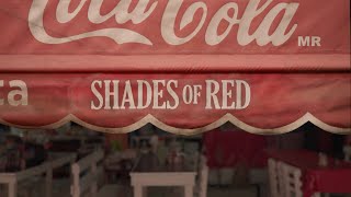
Coca-Cola: Recycle Me
Coca-Cola tasked Ogilvy New York / Open X to significantly boost recycling rates for its packaging. The brand aimed to use its global recognition to inspire a mass audience to recycle every bottle and can, supporting its 2030 sustainability goals.
Creative Idea
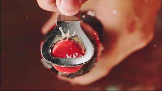
Coca-Cola deliberately crushed its iconic logo to visually represent the recycling process.
By deliberately crushing its universally recognized logo into unique, imperfect designs for OOH and digital, Coca-Cola transformed its brand identity into a powerful, unmissable call to action, visually embodying the recycling process and inspiring mass participation.
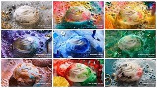
The Art of Crushing a Billion Dollar Asset
Analogue Purity in a Digital Age
While most modern campaigns lean on generative AI or Photoshop, the creative team at Ogilvy New York and WPP Open X opted for "analogue authenticity." To create the visuals, production houses Lobo NY and Hogarth used mechanical presses and vacuums to physically crush actual Coca-Cola cans. Each execution featured a unique, one - of - a - kind logo extracted from a real piece of aluminum, mimicking the exact way consumers handle the product. Even the "Recycle Me" call to action was not a standard font; it was a high - resolution scan of the recycling request found on the side of every Coke can.
Breaking the Rules of Brand Equity
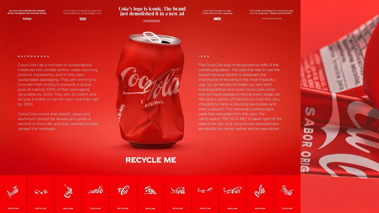 The campaign served as a masterclass in brand recognition, proving that a logo known by 94% of the world's population does not need to be pristine to be effective. Guillermo Vega, Global Creative Network Lead, noted that while a brand's logo is typically considered "untouchable," the crushed versions remained instantly identifiable. This bold move paid off with 80% brand recall in testing by *Behavio*, significantly outperforming the 60% industry average.
Sonic Recycling and Sorting Realities
The initiative extended into a sister project called Recycled Records, where musical legends Mark Ronson and Madlib used the actual sounds of recycling facilities to create an EP. However, the campaign also sparked industry debate. Environmental critics pointed out a practical irony: crushing cans can sometimes make them harder for automated sorting machines to recognize, potentially leading to them being discarded as waste rather than recycled. Despite this, the campaign generated over 140 million impressions in its first week, supporting Coke's report that 99% of its primary packaging is now recyclable.
Creative Strategy Deconstructed
Company
Coca-Cola possessed a universally recognized brand identity and a clear commitment to making its packaging 100% recyclable.
Category
Beverage brands typically maintain pristine, consistent branding, often highlighting product freshness or lifestyle, rarely altering their core visual identity.
Customer
Consumers needed a simple, impactful, and visually arresting reminder to recycle, often overlooking the physical transformation involved.
Culture
A growing global awareness and urgency around environmental sustainability and waste reduction provided a receptive cultural context for action.
Company
Coca-Cola possessed a universally recognized brand identity and a clear commitment to making its packaging 100% recyclable.
Category
Beverage brands typically maintain pristine, consistent branding, often highlighting product freshness or lifestyle, rarely altering their core visual identity.
Strategy:
Leverage iconic brand assets to visually embody a critical environmental process, driving mass participation through disruption.
Customer
Consumers needed a simple, impactful, and visually arresting reminder to recycle, often overlooking the physical transformation involved.
Culture
A growing global awareness and urgency around environmental sustainability and waste reduction provided a receptive cultural context for action.
Strategy:
Leverage iconic brand assets to visually embody a critical environmental process, driving mass participation through disruption.
Strategy Technique
Use Radical Simplicity
The crushed logo is instantly recognizable yet disrupted, forcing engagement - simplifying the recycling message. This bold visual shortcut bypasses lengthy explanations, directly linking Coca-Cola's brand to tangible recycling action.
Explore Technique
Creative Technique
Break visual expectations
The campaign intentionally deformed Coca-Cola's iconic, pristine logo. This unexpected visual disruption immediately grabs attention and powerfully symbolizes the physical act of recycling.
Explore Technique
Craft Breakdown
The campaign's craft excels in transforming a physical act of recycling into a visually striking and brand-relevant design system, demonstrating innovative use of typography and design to convey a powerful message.
The core idea is manifested through the ingenious design of hundreds of unique logos from crushed cans, maintaining brand recognition while conveying a message of recycling.
The iconic Coca-Cola script is masterfully adapted and distorted to reflect the physical crushing, yet remains legible and instantly recognizable across all variations.
The product photography of the crushed cans is precise and high-quality, capturing the physical deformation that serves as the direct inspiration for the digital designs.
The overall visual consistency, from the studio shots to the outdoor media placements, is meticulously maintained, reinforcing the brand's message with a cohesive and impactful aesthetic.