2025National Blood CentreNot-for-Profit & GovernmentCase video
National Blood Centre: 3% Red Ads
The National Blood Centre faced a chronic blood shortage in Thailand, with only 3% of eligible donors contributing. They needed to drive urgent awareness and increase donations nationwide. The client sought a high-impact strategy to reach millions of citizens, aiming to convert passive observers into active blood donors by highlighting the disparity between the supply and the potential donor pool.
Creative Idea
Brands removed 97% of their red color to visualize the national blood donor shortage.
To combat a critical blood shortage, major brands across Thailand voluntarily desaturated their iconic red logos and advertisements to exactly 3% on World Blood Donor Day, visually representing the tiny fraction of eligible citizens who actually donate blood.
Turning Iconic Red Brands Into Data Visualizations
Synchronizing a Nationwide Visual Shift
The campaign launched on June 14, 2024, to coincide with World Blood Donor Day. The production required an unprecedented level of cooperation between Plan B Media and major commercial entities including Coca-Cola, KFC, Pocky, Nissan, AirAsia, Tops, Mama, Vitamilk, Ready Energy Drink, and Brand’s Essence of Chicken. These brands agreed to deviate from their strict global visual identity guidelines to desaturate their assets, effectively turning their commercial presence into a public health advocacy tool. The execution was managed by Hello Bangkok LED, ensuring the altered creative was synchronized across static billboards, digital screens in office buildings, and shopping malls nationwide.
Redefining Commercial Media Space
By utilizing Plan B Media’s extensive network, the campaign transformed high-traffic urban areas into a massive data visualization project. The core insight driving this effort was the stark reality that while 48 million people in Thailand are eligible to donate, only 1.78 million—roughly 3%—actively contribute to the Thai Red Cross Society. This initiative marked a significant moment in Thai advertising history, as it was one of the first instances where competing top-tier brands unified their visual identity to address a national public health crisis. By removing 97% of their signature red colors, the brands forced consumers to confront the statistical scarcity of blood reserves during their daily commute. This strategy successfully shifted the perception of outdoor advertising from a purely commercial medium into a shared civic platform for national giving.
4C Framework deconstruction
Company
The National Blood Centre leveraged its authority and urgent need for donors to mobilize a massive cross-industry media partnership.
Category
Public health campaigns typically rely on standard awareness posters that often fail to cut through the noise of commercial advertising.
Customer
The public was unaware of the severity of the shortage, needing a visceral wake-up call to bridge the gap between eligibility and action.
Culture
World Blood Donor Day provided the perfect timing to turn commercial visual assets into a nationwide conversation about civic duty.
Company
The National Blood Centre leveraged its authority and urgent need for donors to mobilize a massive cross-industry media partnership.
Category
Public health campaigns typically rely on standard awareness posters that often fail to cut through the noise of commercial advertising.
Strategy:
Transform abstract statistical data into a visceral, unavoidable visual reality to trigger immediate public action.
Customer
The public was unaware of the severity of the shortage, needing a visceral wake-up call to bridge the gap between eligibility and action.
Culture
World Blood Donor Day provided the perfect timing to turn commercial visual assets into a nationwide conversation about civic duty.
Strategy:
Transform abstract statistical data into a visceral, unavoidable visual reality to trigger immediate public action.
Results
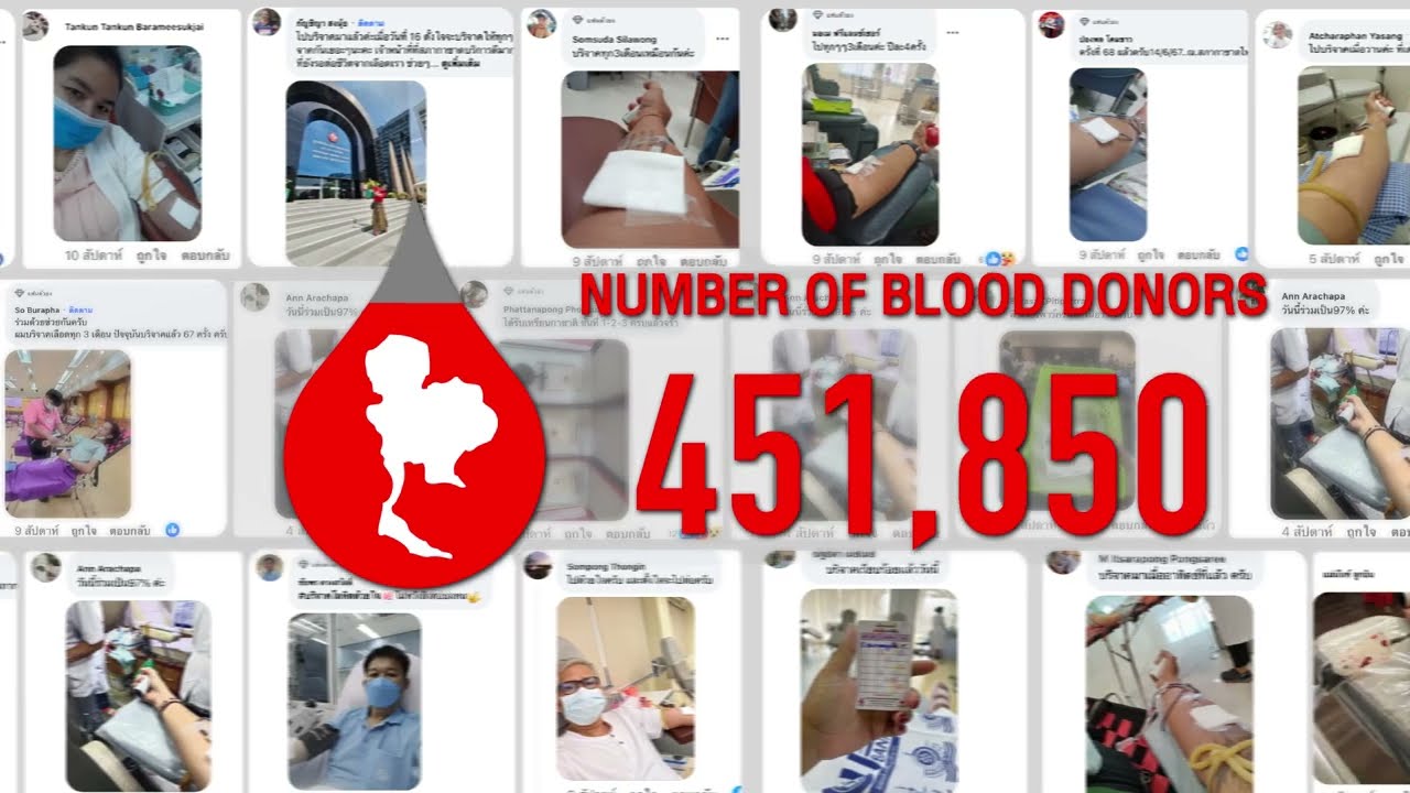
The '3% Red Ads' campaign achieved massive participation across major global and local brands. Results include: - 451,850 blood donors registered during the campaign period. - 86,643,706 total eyeballs reached via outdoor digital billboards and public media. - 1,960,208 digital impressions across media platforms. - 12,500,000 THB in earned PR value. - +10% increase in the overall number of blood donors compared to the previous two months.
451,850
blood donors
86.6M
total eyeballs
+10%
increase in blood donors
Strategy Technique
Turn Data Into Drama
By visualizing the 3% donor statistic through iconic brand colors, the campaign made abstract data feel urgent and personal. It turned a dry public health metric into an unignorable visual crisis.
Explore Technique
Creative Technique
Collaborate with another brand
The campaign united competing commercial giants to share a single visual identity. This collaboration transformed everyday advertising space into a powerful, unified public service message.
Explore Technique
Craft Breakdown
This campaign excels through brilliant brand partnership and graphic intervention, hijacking the iconic red visual assets of major corporate brands to dramatize a national blood shortage statistic in real life.
Orchestrating simultaneous color modification across dozens of competing top-tier brands across nationwide billboards and social media channels.
Using the exact 3% desaturation of brand red assets as a clever, immediate visual metaphor for the 3% donor statistic.